


Twenty years ago, “above the fold” only referred to the upper half portion of a newspaper. Now, above the fold can be applied to many things, especially a website or web magazine, and the first screen of content a user will see when they go to your website.
Several years ago, we heard a case study of Men’s Health where they were able to increase their pages per visit by 78% by putting story navigation above the fold, in a table of contents style. The following year, they saw another 64% jump. They still follow this internal best practice, but now they feature five click-worthy stories at the top of article pages.
[text_ad]
Failing to lead visitors from point A to point B is a major usability error most websites make, and one we focus on especially hard when building magazine membership websites for our publishing partners. Increasing page views on a web magazine with a metered paywall is a major job of the site’s design, to run the user through their credits quickly, in order to get them closer to the subscription page.
Let’s take a look at the web magazines of two major players from our list of web magazines we love, Time, and I Like Crochet.
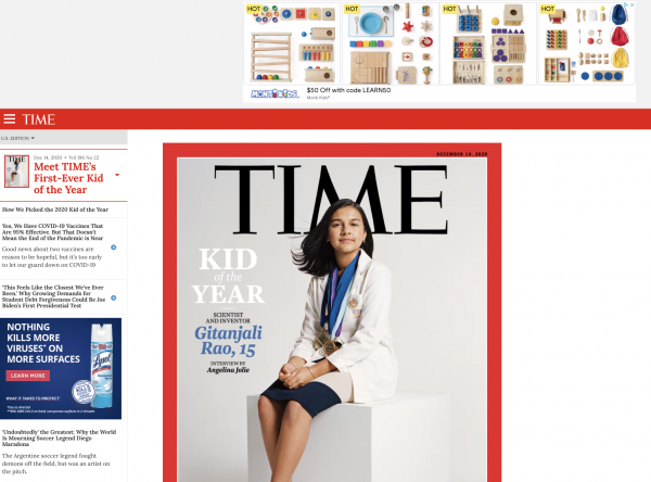
On TIME’s web magazine, the table of contents remains on the left-hand side of the page, while the article remains on the right-hand side. Subscribers can easily flip through all of the articles at will without losing their place. Two other elements that remain above the fold for non-subscribers: the subscribe button, and two sticky ads, which benefit their advertisers. As an ad-driven publisher, this is a great blend of a user-friendly interface for both of their customers: advertisers and subscribers.

Our next example is I Like Crochet, a subscriber-driven web magazine that caters to a large community of avid crocheters looking for patterns and ideas.
We think they’re doing a great job designing “above the fold” and we are certainly also biased because we designed the site and business model behind I Like Crochet with Stuart Hochwert, President of Prime Publishing.
I Like Crochet offers free “Preview” content, which are editorials that point to articles and issues within their Magazine Library, however once you get inside, you’ll find a metered paywall for their bi-monthly web magazine and special collections, so visitors get some limited access to the content.
As an unregistered visitor, you’ll first see your desired article for a few seconds, before meeting the paywall for the first time, which tells how many of the three complimentary articles you’ve viewed this month.
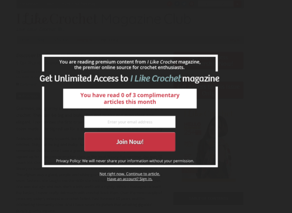

New visitors can exit the paywall and access their free article, but not without some free and paid conversion architecture designed to convert them into subscribers, including a button to join the Gold Club, their all-access offering in the top-right corner of the content.
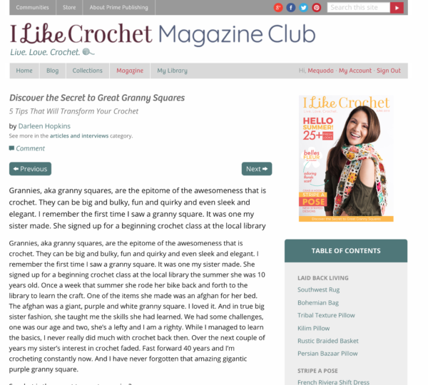
To increase page views and use up the visitor’s monthly allowance so they arrive at the subscribe page faster, they have “next” and “back” buttons above each article, and a table of contents for the whole issue on the right-hand side of the page at all times.


Subscribers of I Like Crochet have a positive experience above the fold, as well. They, too, can click through the articles in the issue or special collection by hitting the “previous” and “next” buttons, but the Table of Contents rises to the top, making it easy for the user to peruse each issue, and also take note of which issue they’re in.

Having a web library is not the end of your task list as a magazine publisher. We have run into more publishers than not, who have beautiful web editions on the free side of the paywall, and once you enter their library archive, it’s all PDFs and the navigation completely disappears so that you have no idea where you are.
Designing a better “above the fold” experience in your web magazine is not just great usability for subscribers, but also increases conversions from your metered paywall and retains subscribers longer when they know how to find the content they paid for.
Having a web library that you can bundle with a magazine subscription allows you to dramatically increase your promotional frequency which leads to even higher online revenues. When building your library consider how you can make it a true resource. Read more about all the good reasons why it’s worth developing and selling a web library subscription.

