
How to set goals for your users and use website architecture to lead them directly to the pot of gold
When you set a goal, you probably have an idea in your head of how you’re going to accomplish it.
For example, if you have the goal of running a marathon in a year, and you’re not a runner, you might start trying the Couch-to-5K ® program. Every couple of days, you’re instructed to run a certain distance, and in the following days you’re instructed to run a little further. After a couple months, you can run the length of a 5K. Then, maybe, you run a few official 5K races. Then you run a half-marathon. Eventually, you train enough to run in the Boston Marathon.
Your course from the couch to running the Boston Marathon is your architecture. It’s a to-do list, and the outline, that guides you directly to your goal of running the marathon.
Now think of architecture in the way you might set it up for someone else. For example, if you have kids, surely you’ve given them goals. If they clean their room, they get a star. When they get ten stars, then they get to go out for ice cream. But if you never give your kids a goal, or if you never ask them to clean their room, will it get done? Likely not.
[text_ad]
Web architecture follows the same lead. If you want a user to perform a specific task, organize the steps to get them there.
On any landing page, whether it’s for a free product or a paid product, your goal is represented by a button that says “buy now,” “subscribe now” or “download now.” For this purpose, let’s say your landing page is for a paid magazine subscription. Your goal is to turn a web visitor into a magazine subscriber.
When your architecture is confined to the four walls of their screen, all there is, is design and words. At this point, you’ve driven them to this page through successful SEO website architecture on the rest of your site, and you’ve collected email addresses through good website architecture, but this landing page is one more micro-component of the magic.
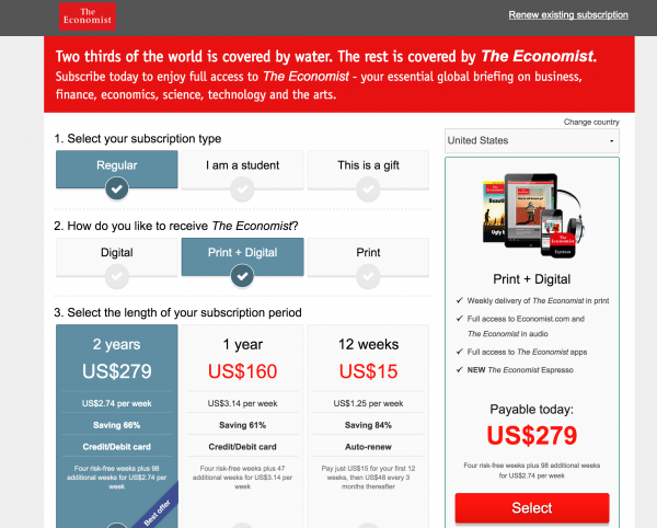
To lead your reader down the yellow-brick road, begin with an awesome headline. Make a promise, and make it a big one that you can deliver. Here’s a headline that was once on the Economist’s subscription page.
Two thirds of the world is covered by water. The rest is covered by The Economist.
Next, focus on the subhead. If you can hook them with the first line, then this second line should reel them in.
Subscribe today to enjoy full access to The Economist – your essential global briefing on business, finance, economics, science, technology and the arts.
Next, dive into the benefits. The Economist is constantly testing, but in this version from a couple year ago, they showed pricing up front, while delivering the benefits at the same time to the right. The Economist has probably done enough testing to learn that customers are looking for the price first.

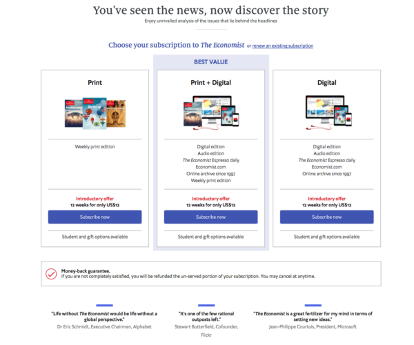
Below is the updated version of this page they’re currently testing with a new headline, subline, and package wording. It’s a bit less benefit-driven and doesn’t give a great description of what The Economist covers for someone who is new to publication. But hey, that’s what testing is for!

Finally, use your body copy to distinguish who you are and what your magazine offers that nobody else does. What will they get when they subscribe?
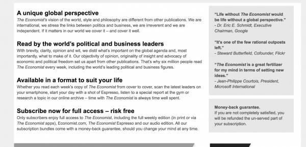
The Economist’s vision of the world, style and philosophy are different from other publications. We are international, we stress the links between politics and business, we are irreverent and we are independent. If it matters in our world we cover it – and cover it well.
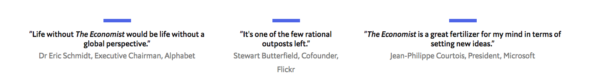
Next, lead into testimonials, or some kind of social proof that there are others in the world who think you’re the bees knees. In the case of The Economist, they’re really nailing this two-column design. Not convinced on the left? Move to the right. The user is bounced from side to side of their design like a pinball machine. In a good way.

In their updated design, they have also tried this format below, before the benefits.

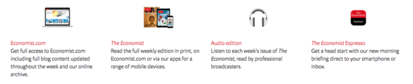
And when the user is done being guided through the pinball machine of this landing page for the Economist, there’s one last reminder of everything that’s included in their subscription, then they’re bounced back to the top where they can order.

It doesn’t take the potential subscriber long to be guided through this page, but it’s certainly architected in a way that makes sure the most important parts are on display and absolutely nothing else. The design is intentional and captivating.
Would you consider The Economist good website architecture, or is it too pinball-y for you?
Another type of landing page, more often used for products like books and webinars, is more simple and guided.
It begins with the headline, subhead, and then there’s a big opening paragraph followed by a call to action. The publisher guides you through a 2,000 word sales letter that has no links to external pages, even on their own site. The only thing in front of you is the letter, a story they’ve crafted, and the buttons that lead you to buy their product.
That right there is as simple as landing page architecture gets. It stares at the call to action and makes sure the reader always has it in their peripheral vision, as they’re guided down the page through the story that the publisher weaves about their product.
Which type of landing page do you prefer? More straightforward and short, or long and informational? As a consumer, what leads you off a page, versus what keeps you on it?
This article was originally published in 2015 and has been updated.

