
MeansBusiness.com, while a very viable and intriguing online content model, makes some critical areas in their website design practices, lagging behind their peers in the areas of community building, affordance and labeling.
MeansBusiness.com targets a business learning audience. They have a database that includes 20,000 verbatim extracts from 1,000 business books—all of which are intelligently selected and packaged into short segments. Their goal is to repurpose high-quality business content to build a new digital product that they can sell to corporations, universities and individuals. They make money by getting visitors to become paid subscribers, or to opt-in with their email for future contact. They also aim to get corporate or academic visitors to buy a customized institutional-level subscription. Additionally, they earn extra revenues via book sales. This is a great online business model, but their website design is missing the boat in many instances.
- Homepage is not well presented or prioritized, you don’t get what they actually do right away
- Site indicates a relationship on every page, with the excellent personalization tool “MyLibrary”—yet a “Sign In” link shows up persistently, even when signed in
- No community building efforts on the site; book reviews, forums and discussion boards would be perfect for this intelligent and inquisitive audience
- Affordance was bad, icons didn’t make sense and weren’t clickable, image links didn’t look like links and text looked like a link but wasn’t
- Marketing Quadrants were not fully utilized for primary tasks
- Some serious brushing up would put MeansBusiness on the right track
Introduction
MeansBusiness has an intriguing online content model. They’ve determined a clearly defined customer need, built partnerships with the top business publishers, targeted a business learning audience, created an editorial method to segment content and have weathered through the Internet storms of the last five plus years. They have a database that includes “20,000 verbatim extracts from 1,000 business books”—all of which are intelligently selected and packaged into short segments… in other words, a good online content product. For all of these reasons, MeansBusiness was on our list for review. At Mequoda, we pick profitable sites for scorecard reviews, giving us an opportunity to highlight successful website design methods. In this case we have a business that should be viable, but a website design that is missing the boat in many instances.
After running the site through the Mequoda Website Scorecard, I can’t help but wonder how much better they could be doing with just some simple improvements in the usability area of their design. Without speaking to the business managers, I’m assuming that attention is being paid on the corporate content delivery end, and not on MeansBusiness.com, as many of the dates on the newsletter content are from 2001. We still chose to review the site as we see all the elements for a great subscription site in place. With a little attention to usability, we think this site could really do some mean business.
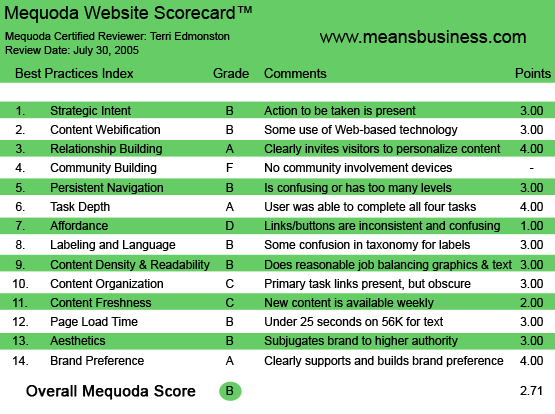

MeansBusiness.com’s Mequoda Scorecard
[text_ad]
1. Strategic Intent – B
MeansBusiness repurposes high-quality business content to build a new digital product that they can sell to corporations, universities and individuals. According to their site:
- “MeansBusiness, Inc. has created the largest and fastest growing database of business ideas in the world. MeansBusiness brings expert thinking and strategic content to… knowledge workers in corporate, academic and consulting communities.”
MeansBusiness has agreements with business publishers including Harvard Business School Press and the Financial Times/Prentice Hall, among others. Academic and corporate clients include Duke Corporate Education, INSEAD and Peppers and Rogers. MeansBusiness.com targets the individual, with several levels of subscriptions: Free Registration, $90/90 days, $299/Year and Corporate Subscriptions.
Therefore, the business goals of the site MeansBusiness.com should be:
- Get visitors to become paid subscribers, or to opt-in with their email for future contact.
- Get corporate or academic visitors to contact a sales rep and discuss a customized institutional level subscription.
- Earn additional revenues via book sales. (MeansBusiness doesn’t sell books, but adds a link to Amazon for a revenue share.)
And the goals of the site visitor? Simple: it’s content, either to purchase as an individual, or, an institutional purchase if the visitor is sitting on a corporate budget. In either case, high-quality, useful, easy-to-read and easy-to-access business content is the carrot the visitor wants. In addition, all company websites must provide a method to find corporate information for the media, investors and partners.
How does MeansBusiness do on these tasks?
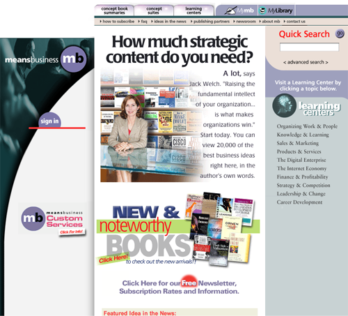
The homepage in this case is pretty clearly a dedicated sales page. The majority of the center block is focused on getting the customer’s value proposition across, and getting the visitor to subscribe.
The problems on this page are not the available items—these are all there, from existing subscriber navigation “Sign In” and “MyLibrary,” to new visitor funnels “How to Subscribe” and “Quick Search,” to corporate visitors “Click here for Custom Services” and “Publishing Partners.” The trouble is the layout.
What’s wrong with the page?
- First, I don’t get what they actually do right away. Visitors need to “get” your business model—what you want from them—before they trust you. At first glance I see a woman in front of books, and below her a bunch of books with a headline “New and Noteworthy” and I think I’m looking at a bookstore—the one thing that this site is not. This is not good.
- The second immediate problem is that my eye is not guided to the actions the site wants me to take. Instead, I am left to guess where to go. Looking at a random jumble of images, my confused eye jumps back and forth.
Specific issues:
- “Sign In” looks like a graphic not a link; the links on the right don’t look like links (see affordance),
- the newsletter signup is below the fold (see marketing quadrants),
- some of the navigation text is too small (see readability).
The good news is that a visitor can find content quickly from the homepage. The main content navigation is a bit obscure for a new visitor, but we’re happy with the very visible “Quick Search” in the upper right corner.
The homepage is given a B—the correct actions for business and customer stakeholders are present, but they are not well presented or prioritized.
2. Content Webification – B
We have webified text and graphics on the site. I’ve got a prominently placed “Search,” an “advanced search” option, and even an interesting “Hot Search” option (although the code wasn’t working for my browser—oh those darn technical issues!).
Additional ways the site improves on a bricks-and-mortar library: I can browse in several ways, by author, by concept or by publisher. And finally the content is displayed in several different packages, allowing me versatile use of the site.
The “B” grade is because we have nothing innovative to rave about. For example, there is no use of multimedia (additional audio files of authors speaking would be a fantastic addition).
3. Relationship Building – A
The site indicates a relationship on every page, with the excellent personalization tool of “MyLibrary.” Every time I see “MyLibrary” I start to think of this location as a place that I am storing something, much like a webmail or a groups page, I know that something of mine is sitting on this server.
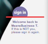
Once again, the problem is not with the website element of relationship building, this element exists and is promoted. The trouble is in small parts of the site design. The site knows me, and knows my name, but I see a ‘”Sign in” link persistently, even when I am signed in. This is confusing; it should simply switch to “Sign out” when I’m logged in. Also, my name is displayed on the homepage in a welcome message (good), but it’s hard to read as the text is a light color and has very low contrast (bad).

4. Community Building – F
There are no community building efforts on the site. Options such as book reviews, forums and discussion boards come to mind immediately for such an intelligent and inquisitive audience.
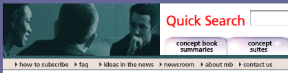
5. Persistent Navigation – B
They have a slightly confusing navigation, with too many levels. Mostly there have affordance issues, which are covered in that section. We’re giving the site a B because user goals are attainable, mostly via the persistent and clear, top tab-style navigation bar. However, within a section there are section-specific left hand navigation bars, and a third-level-down central navigation—it has too many options, changes too often and moves the position slightly of similar types of actions. For example—”Concept Book Summaries,” “Concept Suites” and “Learning Centers” all have top level navigation tabs, but click on them and you see two different layouts—one of which uses an image map for navigation. That took me about 10 views before I tried clicking on it. “Oh! That’s how you get inside this section!”
6. Task Depth – A
The site gets an A as I was able to do all four tasks with minimal hair pulling. (Not a small thing, as most sites drive me to at least a little baldness.)
Subscribe.
This is easily accomplished in the top nav, “how to subscribe.” I’m shown a basic landing page (see Labeling and Language for comments on the “Register” button), and a vaguely confusing, but serviceable, order flow.
Find a specific concept, fast!
Obviously, I chose the Internet and Marketing as the business concept that I wanted to read about. I tried first by using search. (My feeling on the search landing page is that all the elements are there, they just need to be visually juggled around. Put this page in front of a user lab and I guarantee you the managers would be shocked at the things the users see and don’t see.) I liked the results, and I liked being able to see that I could choose the type and length of the content I selected to read, via the “concept suites” vs. “extracts” and “book summaries” tabs.
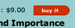
Second, I had to test the navigation method. I found in the right navigation the “Sales and Marketing” concept, and then browsed the landing page for a book title “Cyber Rules.” This gave me a Summary Preview, then I clicked on “View it” (displays as “Buy it” for non-members).
Result: Not bad, four clicks to the content from the homepage.
Store and Find my content in My Library.
After reading my search results and clicking on a title, I saw a nice, friendly tab, grabbing my attention at the top—”Add to MyLibrary”—very nice placement, very useful. Unfortunately the actually Library was a bit more confusing. My content was put into separate tabs for me based on type (summary, extract or suite), which I wasn’t expecting. From the search perspective I guess the different types are useful, but once I choose something, I just want it on the shelf, not segmented by size. I want to see it all at once, on one page, and then choose how to organize it.
Manage my subscription.
My MB takes me to an account page, where I can find my personal information and modify it. But I can’t see my subscription start or end date, and I can’t figure out how to cancel or renew. I decide to use the customer support email address provided in “Contact us.” Not optimal, but manageable.
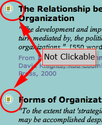
7. Affordance – D
This one drove me nuts. Although the standards of tabs and blue underlined links were applied, there were simply too many problems:
- icons that didn’t make sense and weren’t clickable
- image links that didn’t look like links
- text that looked like a link, but wasn’t
For example, there were several examples of useless icons that created clutter, confused me and added no value. The worst offender was this little icon that appears next to summaries and short snippets. It looks clickable, doesn’t it? It wasn’t. Even knowing this, I still regularly clicked on it while browsing—it looked so clickable!

On the homepage, I didn’t know the “Sign In” image was a link—it was too graphic-y. There is a text “Sign In” at the top right, this is all you need on the page. Also, there is a right navigation bar with sections of the site such as “Organizing Work and People” and “Sales and Marketing.” I get that these indicate content on the site that is related to these topics, but didn’t get that they were links! They are a light, Serif grey text, and look completely static until you mouseover and get the red highlight effect. (Note: The site consistently uses red to indicate something you should click on—immediately a bad choice. Red = Stop in most people’s mental make-up, and therefore should be avoided when indicating a “go” type of action.)
I hate leaving on a negative note, so I have to mention the excellent use of buttons that said what they do. For example the “View it” and “Buy it” buttons— these very clear action words were a sight for sore eyes.

8. Labeling and Language – B
In general the site uses standard words such as “Sign In,” “MyLibrary.” Also, from an editorial standpoint we see very understandable content segment titles such as “Organizing Work and People” and “Finance and Profitability” which speak in the business customer’s language.
The grade of “B” is earned for the following reasons. One of the major flaws here is the use of the word “concept.” The site calls their content sections “Concept Book Summaries” and “Concept Suites.” Great labels, but not clear to a new user—a fact that they seem to know, since they explain it at several places on the site. No matter how great they sound to the business owners, confusing words should not be used as navigation labels. A little market research should help identify the words users will immediately understand in this context.
On the landing page for the subscribe link, the language is again confusing. I see the word “subscribe” with a price, but the button says, “register.” On this site there actually is a free registration option, so using a “register” button next to subscribe is unnecessarily confusing. (Yes, yes, you do actually register at the same time that you subscribe on a website, but the money is based on the subscription. Therefore “Subscribe” is the more important word, and should be on the action button.)
9. Readability (Content Density) – B
About 10 percent of the pages, in the “Summary” or “Preview” sections, have colored background behind the text. No good, it’s too hard to read. However, as a paying subscriber I can see the actual content, and now we’re back on good usability guidelines—black text on white, different font weights and styles to break up the copy, good image to content ratio.
There were many times when I felt there was simply too much white space around graphic areas. This needs to be tightened up considerably to improve the overall page layout. Finally, text size was simply too small in the second level top navigation bar. It might be my browser, in which case it’s a technical issue, but it is simply too small to read.

10. Organization – C
Marketing Quadrants were not fully utilized for primary tasks. Pluses in this category include: primary task links consistently displayed along the top and left side of the page. The middle is used for content. These are good standards to follow. Minuses include: the barren lower right quadrant, occasionally well utilized with a clickable book image but for the most part wasted space throughout the site, and on the homepage the newsletter sign up link falls below the fold. The newsletter sign up is a major task for the homepage for business needs. Get permission to contact the visitor again. Putting a graphically confusing newsletter sign up where no one will see it is simply counterproductive.
11. Content Freshness – C
Thanks to the “Ideas in the News,” MeansBusiness’s biweekly updated newsletter culling ideas from top business magazines, the site earns somewhere between a C (weekly) and a D (monthly). Since this content is printed first mostly in monthly journals, this is still research information, not late-breaking news stories. Therefore there’s no reason this content can’t be distributed in a different frequency. One solution could be to keep the newsletter printed on a biweekly schedule, for over-emailed business readers, but to put the excerpts on the home page or a updates news page in a blog-like format, updated daily.
12. Load Time – B
A typical content page on the site downloads at 18 seconds on a 56K modem. Not bad, but there’s still room for improvement, especially considering that such a simple site (in terms of data, scripts, text and graphics) shouldn’t need that much time. Grade earned: B.
13. Aesthetics – B
The general look is of a non-profit library, or a school’s intranet. The design is simply too loosy-goosy to hold to a business user mental model. Pastel colors, icons all over the place, not a tight text/white space ratio. We’ve got a serviceable site, clearly branded and displays readable text, but seems outdated and a little too amateur for this point in the evolution of Web design.

14. Brand Preference – A
On every page I felt the brand was supported and improved. There is consistent logo placement and usage, all the copy is written supporting MeansBusiness’ unique product and extolling the credentials of the editors who sift through and select content for the site. It would be easy to fall down the rabbit hole of letting the publishers or authors names take precedence. They have stood behind their brand. The value in the product is not just the source material, but in MeansBusiness’ editing and the site’s digital, manageable presentation.
Conclusion
From the start I saw a site with great potential, but lagging behind their peers with room for improvement in usability design. We have seen some As in relationship building, task depth and branding. Other than the regrettable F in community building, the rest of the grades hover between Cs and Bs. Great content segmented and presented well, with a specific target audience can make a profit online, but all the eggs have to be in place. With some serious site brushing up, MeansBusiness could be on the right track.

