
Social posts with links need to be strong in three areas: image, article title, and description. If you nail the trifecta, your posts will get more reach, shares, and traffic.
An image is worth a thousand words, am I right? Consider how little a social post could be worth without an image, or worse, no image and a bad headline. When I see posts from the publishers I follow come across my feed, I’m always surprised by how many so clearly don’t watch their own Twitter feeds or Facebook pages. Or if they do, maybe they’re not sure what a good-looking, clickable feed is supposed to look like.
Let me give you an example of one publisher (who shall not be named because they just started tidying up.) Their Facebook posts, for as long as I can remember, all used the same image, always used the name of the article in the Facebook description (note: this already shows up in the post preview, so you don’t need to include it) and *shudder* they included the permalink in the description as well. It looks a little something like this:
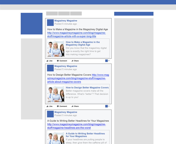

Clearly this looks a whole lot cleaner, and a whole less hot mess than the real thing. But, try to picture it with ads blazing from the right side, and begin to see what kind of headache it might look like on a real Facebook profile. Not to mention, are these all the same article? Why is the image so small? Which link am I supposed to click? How come I’m seeing all of these posts in a row?


1. Tiny image = no social love.
The image used here is too small, that’s why Facebook is not using their wide-image format for these posts. They switched to wide-image formatting because people clicked on them more. Images display at 470 pixels wide by 246 pixels tall, so your image should be at least those width dimensions.
2. Repeating image = nonsensical.
The image is the same in every post. Most likely because Facebook opengraph isn’t set up using the og:image tag. This will assist in pulling the right images from your site instead of any image. In the case of my example publisher (still nameless), it was pulling in a single product image. Over, and over, and over again.
3. Link in description = lost FB and SEO algorithm love.
By including the permalink in the description, not only does it make the whole thing hard to read and confuse readers on where to click, but it’s not giving your Facebook post proper credit in the algorithm. You want your link posts to be highly clicked so that they get more visibility. By including the link in the description, you could be sabotaging your posts. This also goes for posting images with links in the description, because Facebook doesn’t see those posts as link posts. In both instances, any Social-SEO credit you hoped to get from Google for these posts are likely diminished if not gone completely.
4. Repeating title = HUGE lost opportunity.
There’s no good reason to repeat the title of the post in the description, because it gets pulled in automatically in the article preview. Instead, you can use this space to write compelling copy, or paste interesting quotes that would get people to click.
5. Multiple posts = lost in the dark.
Space out your posts so that they don’t all post at once, at least an hour apart. Posting all at once will drastically reduce your chances of posts being seen, and in many cases I’ve seen posts get almost zero visibility when posted right before or after another one.
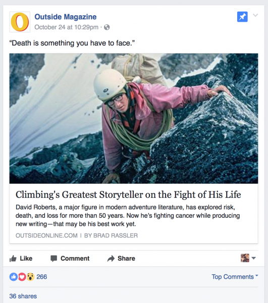
Here’s how a good Facebook link post will look (notice how images add context):
A strong image, a strong headline, and a bold quote from Outside Magazine.

A summary of the article using a name (proper nouns always get people to read and click),
and a hook to get you to click from Ceramic Arts Daily.


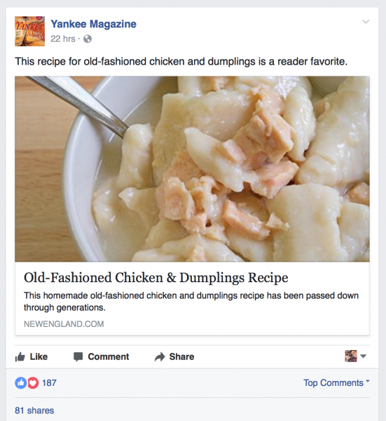
An example of using popular consensus to draw people in from Yankee Magazine.
Another example is in a list post of recipes, where you can say “our favorite is #9!” to tease people into clicking.

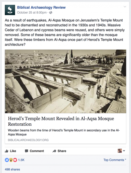
This example from the Biblical Archaeology Review uses an intriguing photo
paired with a short story that got around 500 shares in its first two days.
Storytelling is an excellent way to draw people in if you can make an
interesting point in few words.

Any thoughts on Facebook post design, or questions you might be running into when publishing to Facebook? Let me know in the comments.

