
AdSense guru Joel Comm explains where ads should go on your site
There are a few different types of text ads that Joel Comm mentions in his book The AdSense Code. He claims that the most popular is the leaderboard. At 728 x 90, it stretches across the screen and while it can be placed anywhere, it’s mostly used at the top of the page, above the main text.
It’s the first thing a reader sees and it offers a good selection of ads to choose from. This tends to be a good default to begin with. Putting a leaderboard between forum entries for example is also a noteworthy strategy. Give it a shot.
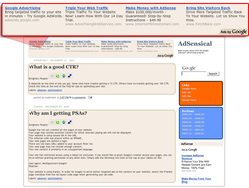

Banners (468 x 60) and half-banners (234 x 60) are much more flexible. Like leaderboards, you can certainly put these sorts of ads at the top of the page. When you’re looking for an ad to put in the middle of the page, a half banner can be just the ticket. Try and stay away from the 468 x 60 banners unless you want to try and incorporate them in the middle of your text or directly below an article link because they are likely to take up the width of your article or blog.
[text_ad]
Google also offers five different kinds of rectangular ads: Buttons (125 x 125), small rectangles (180 x 150), medium rectangles (300 x 250), large rectangles (336 x 280), and squares (250 x 250). It’s common to wrap the text around rectangular ads, forcing the reader to glance at them. Studies have shown that the large rectangle (336 x 280) gets the most clicks. Second best is the (300 x 250) rectangle.
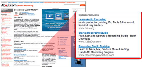

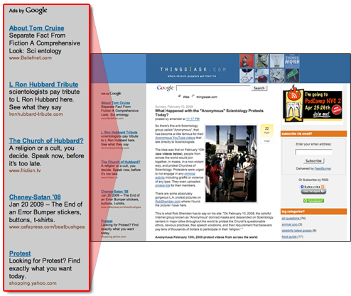
The final types of text ads are those that run vertically. These come in three sizes: skyscraper (120 x 600), wide skyscraper(160 X 600) and vertical banner(120 X 240). These are useful options for filling up your right or left sidebar.
By placing the ads on the right hand edge it’s psychologically ‘less distance’ between your right hand and the screen. This ‘closeness’ makes the user feel more comfortable and therefore more likely to click through a link.

Placing your vertical ad box on the side of the page where it is above the fold near the top is your best option for click through rates. Placing it below your navigation in either sidebar will give you a much lower click rate.

