Usability and design are two key factors in publishing great websites. You may have a clear strategy and great content, but if your site is unusable and unattractive, it will be difficult for users to find what they’re looking for, difficult for you to get users to do what you want them to do and difficult to get users to become loyal customers and revisit again and again.
Creating user-friendly websites begins by following the 14 Mequoda Website Design Guidelines for successful website design. By reviewing a site’s score for each of the 14 items, along with the overall average score, the areas of the site that operate well, and those that need work, become evident.
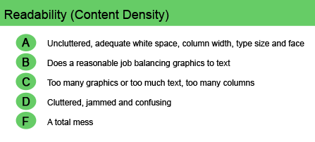
Readability (Content Density)
In print, the effective use of white space, the number of columns and the use of bolding, margin size, etc., increases reader pleasure. The same design principles apply on the Web.
Actually, employing the principles of continuity, similarity and proximity become even more important when formatting news content for the Web, because Web users tend not to read whole pages to determine if the content is relevant to their information search. Instead, they scan the page looking for specific information or clues to where they might find what they are seeking. Visitors who can’t comfortably read the content on a product site certainly aren’t going to stick around long enough to buy.
[text_ad]
Following are some graphic tips for improved website readability:
- Different font weights and styles break up the copy.
A sans serif font is easier to read online, while a serif font is easier to read in hard-copy print. Bold, italics, all caps, gray text and varying font sizes can be used effectively to break up blocks of text. Whole blocks of bold or italic text, however, are difficult to read. - Articles that contain headlines, subheads and visual enhancements (such as lists) afford greater readability.
Separate section heads graphically so everything flows well. Hypertext links in articles make it easy for the reader to locate information buried deep within the site. - A comfortable line length enhances readability.
Aim for no more than two-thirds of the width of the page, or 10 to 15 words per line. A line length that is too long, especially when coupled with small type, will discourage the reader and sometimes become hidden at the right side of the screen. - The judicious use of white space, even on the most content-rich pages, can keep text areas clean and contained.
On each content page, put boxes around sidebars, use bullets to emphasize text items and add graphics to avoid text-heavy pages. Beware of too many short paragraphs with numerous subheads, though, which can make a page too dense. - White or light backgrounds do not impair contrast.
Black text on a white background is the easiest to read. White text on a colored background or colored text on a colored background reduces contrast and, therefore, is difficult to read. Colored text should be limited to highlighting words within the text or for emphasis in headlines.
The ultimate goals of website readability are to make the site inviting, the format clean and well balanced, and the experience pleasant.
Website Examples
Best Practice Websites

BottomLineSecrets.com Website Design Review
This site is uncluttered. It uses adequate white space and employs good column widths, type sizes and typeface. Curiously, BottomLineSecrets.com is built on a narrow table measuring only 160 pixels wide. This makes it exceptionally easy to read, even though it creates an unusually wide right border.
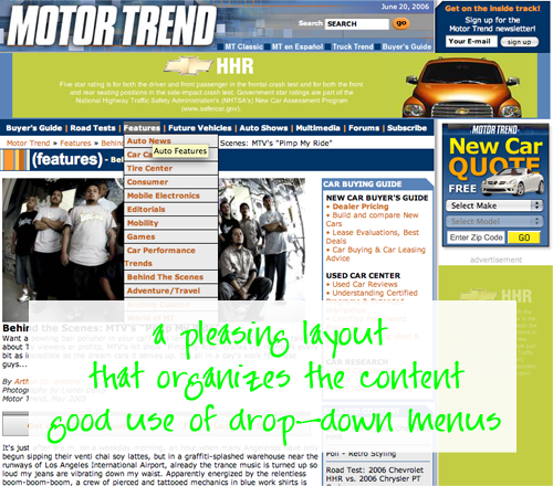
MotorTrend.com Website Design Review
Despite the sheer volume of information that’s offered here, the designers have found a pleasing layout that organizes the content appropriately and employs plenty of white space. Of course, part of the way they achieved this is through the use of drop-down menus.
Not-So-Good Example
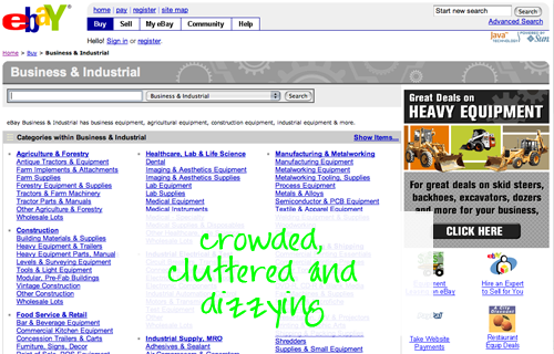
eBay.com Website Design Review
The site’s pages are simply too crowded. In an attempt to derive additional income for special “featured” auction items, the designers have crowded everything possible onto nearly every page. You might argue that clutter is unavoidable on a site presenting this much content, but I disagree. eBay is dizzying.


