Every landing page design is not for every audience
We’re all superficial people at heart because we like things that look fancy and expensive. An ugly Coach bag on the rack will sell for $300 because it’s got a bunch of giant C’s on it and you won’t even need to publicly brag about it because will already identify it as expensive just by looking at it.
This translates the same online, where you have only a moment to convince someone that your website is worth looking at for more than a couple seconds.
The way a landing page looks and feels is almost as important as what it says. A favorable decision to purchase your product or service is almost always the result of a sales effort that made the customer feel comfortable and safe.
When analyzing the look and feel of your landing page, take a stroll down this checklist to see if you’ve hit all the key points.
1. The graphic design is comforting and trustworthy to the target user.

This guideline is entirely dependent on who your target user is.
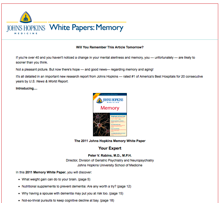
A 65-year old male may be more attracted to a white screen with a plain text sales letter and blue hyperlinks that bring him to the buy page.
This design will be familiar to the products he currently consumes and the typography will match his ability to read larger fonts with bolder headlines.
If your target audience values content over design, then stick to writing excellent copy for the page.

On the other hand, a 25 year-old female web designer may be more attracted to a clean but funky design by a talented graphic designer.
An intricate and fascinating design may actually lend credibility to the topic at hand.
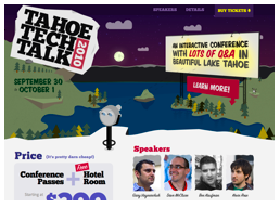
In the example here for Tahoe Tech Talk 2010, this landing page is likely to excite the target user, simply by demonstrating that they’re “with it” and worthy of holding a conference on this very topic. The more savvy your target users are, the more intricacies you may want to add.
[text_ad]
2. The graphic design is consistent with the target users’ mental model.
Like the previous examples, you want to make sure that you’re providing what the user expects. The 25 year-old web designer is used to buying from cleverly designed landing pages that feature video and multiple ways they can interact with the product before they buy.
Visitors instantly judge your credibility by the way your site looks. If it looks good and matches their mental model of what it’s supposed to look like, a visitor might take the next step, reading some copy or clicking a link. But the site design itself is the first hurdle.
There are innumerable options here. So many, in fact, that it’s easy to get overwhelmed and lose all direction. Before you settle on a design, take a good look around at other landing page designs in your niche. If they all have the same several elements on their sites, you may want to start figuring out how you can do it even better.
3. The look and feel reinforces the sales letter’s flow.
As important as your design is, do keep in mind that your sales letter is ultimately what will make the final sale.
This means that your design shouldn’t be so distracting that the user doesn’t know how to get from the beginning to the end of the sales process.
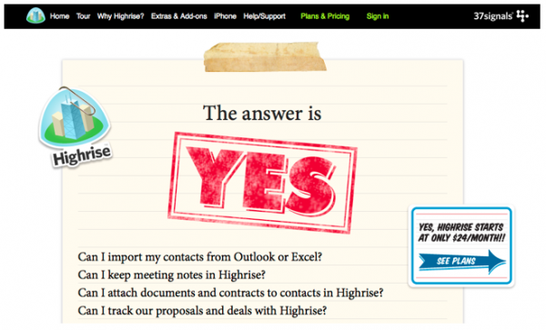
This example from 37Signals is an excellent case of a minimalistic landing page that is still good looking, while keeping all of its attention on the copy:
Example: http://highrisehq.com/yes
4. The look and feel supports and reinforces the product, service or brand.
Most designers will get this part right, but it’s still fair enough to note that your landing page shouldn’t stray far from your brand. When someone hits your landing page, they shouldn’t feel like they took the wrong direction if they came from your website homepage.
So take a step back and look at your landing page. You are probably not your target user. With this in mind, try to figure out your target user would respond to this landing page, not if you would respond.
Is the text large enough for 65 year-old to read? Would a 35 year-old mom respond to blue and grey graphics, or would she prefer a more lighthearted color scheme? Is your landing page too complicated? Too simple? Are you displaying everything you have to offer in the best way possible?


