Usability and design are two key factors in publishing great websites.
You may have a clear strategy and great content, but if your site is unusable and unattractive, it will be difficult for users to find what they’re looking for, difficult for you to get users to do what you want them to do and difficult to get users to become loyal customers and revisit again and again.
Creating user-friendly websites begins by following the 14 Mequoda Website Design Guidelines for successful website design. By reviewing a site’s score for each of the 14 items, along with the overall average score, the areas of the site that operate well, and those that need work, become evident.
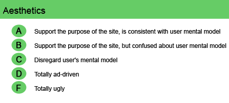
The average user expects professional websites to be clean in appearance, rich with information, and intuitive in terms of navigation. In Mequoda terms, the aesthetics of a site should support its purpose and match the user mental model—or be appropriate for the people that the website serves.
Site design doesn’t need to be pretty and perhaps not even serious, but it should certainly not be boring.
[text_ad]
A corporate-style B2B site might want to stick to the colors black and blue and gray, with some stock art and an occasional splash of bright color. A consumer-oriented site will need to be much more colorful, with lots of visual flair, or perhaps appear comfortable and homey.
Layout, typefaces, and colors give a site its personality and image. Remember, however, that the color red sends a contradictory subliminal message, meaning “stop” or “danger,” a message that is not something a site usually wants to project. Yellow or orange are more inviting and engaging colors for buttons and highlights.
A three-column approach has become common in site design—a narrow left-hand column of navigation links, a wide middle column for text (or text links and teaser copy on the home page), plus a narrow right-hand column with both graphic and text links—all clearly separated by an appropriate amount of white space.
Careful alignment and grouping of the different elements create nodes of interest that don’t compete with primary articles or graphics. Keep in mind, too, that persistent pop-ups and “coming soon” placeholders for future links are irritating and annoying distractions that project an uncaring design. If a site must have numerous banners and text links, they should appear as resources rather than clutter.
Users respond best when the site appears as a simple, reliable, secure, trustworthy, perhaps comforting, online source of information.
|
SI.com
Monster.com |