Like just about everyone else, I’d like to make more money, work less, and enjoy a higher level of financial security. That’s what Dave Lindahl, the Apartment King, is offering the public on his landing page.
There’s a fine line that must be walked when offering get-rich products on the Internet. Offer too much and you lose credibility. Offer too little and you lose the sale. Lindahl’s landing page is a good example of a get-rich-quick pitch done well. We’ve tested it against the very objective measuring stick called the Mequoda Scorecard and present the findings.
- In its soul, this is really just a good old-fashioned long-form direct mail-letter. It never loses track of its primary duty: to sell the product.
- Links to the order flow abound on this landing page. Like everything else on this landing page, the focus is to get the prospect sold early and make it easy to order.
- The benefits are clearly stated, the headlines are easy to understand, and just about anyone above a third-grade reading level can cruise through the page and figure out what’s going on.
- The only element of urgency is an implied, “How long do you want to be poor?” message that relies on the reader to supply the urgency. I’d like to see a bit more plainly articulated urgency.
- This is a convincing landing page. It really only needs a little tidying up design-wise and some good testimonials to make it an extremely convincing landing page.
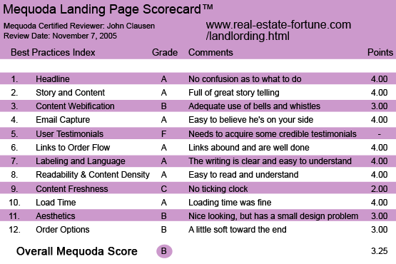
Real-Estate-Fortune.com’s Landing Page Scorecard
1. Headline (Strategic Intent) – A
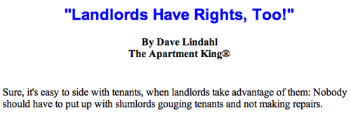
This landing page uses a classic and very well done riches-are-waiting-for-you approach. The idea of making a fat monthly income—five figures, no less—from your own apartment property… that’s a very tasty bit of bait. It’s obvious from the very first sentence that Mr. Lindahl is offering a way to prosper, work less and build security. He employs specific language regarding his “Six Secrets” and uses his own formerly difficult life as a way to curry favor with people who may be reading this pitch letter because they have had financial troubles. He goes to considerable lengths to establish that you don’t need to be a trust fund baby to use the system…but that it will also work for people who are already in the apartment renting business and want to do a better job. If you’re interested in the apartment business on just about any level, Mr. Lindahl has something to interest you. There is no pussyfooting around on this landing page… he is crystal clear on intent.
This landing page uses a classic and very well done riches-are-waiting-for-you approach. The idea of making a fat monthly income—five figures, no less—from your own apartment property… that’s a very tasty bit of bait.
[text_ad]
2. Story and Content – A
I particularly like Mr. Lindahl’s description of his first visit to a problem building he’d bought—one that was “infested by two heroin dealers, a crack dealer, and two apartments full of junkies.” Here’s some more of the story: “On my very first visit to the property, I’m in the hallway, and a woman stumbles out of one apartment, seriously stoned. She finally focuses on me, and in a confrontational tone, says mockingly, ‘Who are you…the new owner?’ I calmly and pleasantly unleashed my secret, unusual weapon by uttering four sentances [which he will reveal in the course]. Her eyes got wide, and she rushed into her unit and slammed the door.” He goes on to explain that the value of the building went from $58,000 to $475,000 with a monthly cash flow of $4,100. I don’t know about you, but I’d like to know what those four sentences are. This is a great example of using dramatic storytelling to amp up interest in the product.
3. Content Webification – B
In its soul, this is really just a good old-fashioned long-form direct mail-letter, which is something I personally love and respect. It never loses track of its primary duty: to sell the product. But Lindahl has also made fairly good use of the advantages of the Internet. There’s a nice little audio clip that’s easily accessed with a very clearly marked button. The clip isn’t particularly pushy as a sales tool, but it does match up a voice with the upfront picture of the very pleasant and friendly looking Lindahl. It might have been nice to see a streaming video of Lindahl working his magic, but even without that, the content seems very adequately webified. Nothing very arresting, but definitely adequate.
4. Relationship Building – A
The tone of this landing page is wonderfully designed to put the seller and the prospect in a friendly, mutually beneficial relationship. Lindahl hastens to point out that he’s no snob. He’s been broke and he’s been rich, and he definitely thinks rich is better. What’s more, he lays out three darned plausible reasons why he’s willing to spill his secrets for a relatively small amount of money. Even a seriously jaded copywriters like myself will come away from this site with a warm, fuzzy feeling about the seller and his product. It’s easy to believe that he really wants you to conquer the apartment world just as he has.
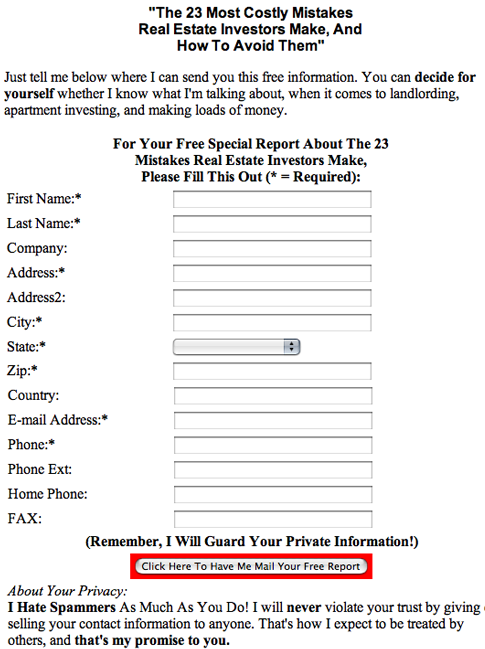
He also offers a free special report and captures the email address of the prospect.
5. User Testimonials – F
Maybe I missed them, but there appears to be a complete lack of testimonials on this site. He mentions how his students come up to him at various venues around the country and tell him how he’s changed their lives. But as far as I could see, they aren’t given a chance to tell the rest of the world. This kind of landing page product screams for testimonials. Mr. Lindahl needs to prevail upon those students to volunteer for streaming video, full name and city testimonials and put them up front in the site. It’s the least they can do for the guy who changed their lives and made them rich.
6. Links to Order Flow – A
Links to the order flow abound on this landing page. Like everything else on this page, the focus is to get the prospect sold early and make it easy to order.
7. Labeling and Language – A
This is “plain folks” writing at its best. The language is easy to understand for any reader, but it doesn’t talk down to anybody. The benefits are clearly stated, the headlines are easy to understand, and just about anyone above a third-grade reading level can cruise through the page and figure out what’s going on. There is no confusion regarding what the product and the offer are all about.
8. Readability & Content Density – A
The typefaces are easy to deal with and the letter is easy to read and understand. There is plenty of call to action copy. I see no problems at all in this regard.
9. Content Freshness & Urgency – C
There is definitely no run-for-your-lives urgency to this letter. In fact, the only element of urgency is an implied, “How long do you want to be poor?” message that relies on the reader to supply the urgency. I’d like to see a bit more plainly articulated urgency. He does supply a little intensity with the $24.50 look-it-over-for-30-days offer when he explains that he might pull the offer at any time…even tomorrow. But that’s buried in the copy. It would be more effective in the boxed headline.
10. Load Time – A
Loading time was well within the 15 seconds the Mequoda Scorecard recommends.
11. Aesthetics – B
I like the photo of Mr. Lindahl and for the most part the site is pleasant to look at and easy to read. Toward the end of the letter when he’s explaining the various deals he’s offering, I felt he could have used a bit of design help. It looked like the information was just typed in and hit with some highlighter color swatches. The copy seemed daunting to read and easy to skip over because of it.
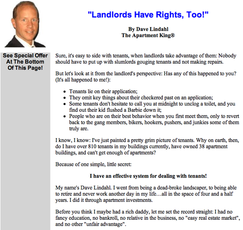
I like the photo of Mr. Lindahl and for the most part the site is pleasant to look at and easy to read.
12. Order Options – B
Basically, the order options are not difficult to understand, but the descriptions could be presented more clearly…possibly with bullet points. I particularly liked the $24.50 offer for prospects who want to dip their toes into less expensive waters before deciding. I also liked the guarantee, although it could come a little earlier in the letter.
Conclusion
This is a convincing landing page. It really only needs a little tidying up design-wise and some good testimonials to make it an extremely convincing landing page.


Comments are closed.