What does your color scheme say about your publication?
Branding comes into play when choosing colors for your website. Most brands stick with their main colors. However, some businesses also go through an entire rebranding when they launch or relaunch their websites, causing the “color” question to be taken into serious consideration.
If you’re redesigning your website, or simply enjoy the art of color, consider these popular website color schemes and the tools that helped develop them.
[text_ad]
Using Color Wheels Just Like a Pantone Swatch Book
Some color wheels offer you complete options visually, and when you hover over the colors of interest, you’re provided with the correlating HTML font color code. It’s sort of like a Pantone swatch book for the web.
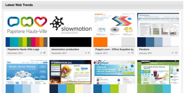
ColourLovers, a site dedicated to complementary color palettes, is one option for choosing website color schemes. Their website trends section can tell you all of the most popular color palettes on the web right now and offer endless inspiration.
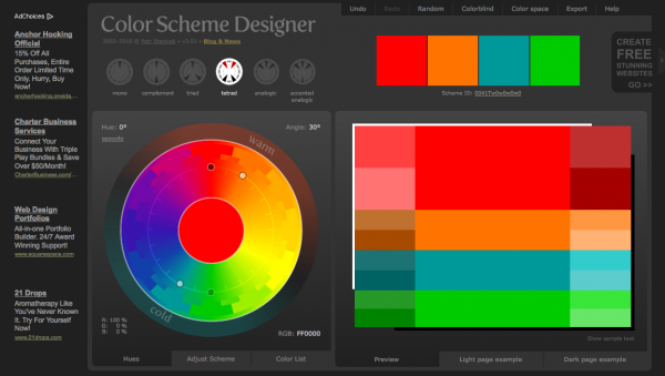
On ColourLovers you can create your own palettes, too. If you want to just start fresh, check out Color Scheme Designer 3.
[text_ad]
Choosing Colors for your Buttons
A large publisher we worked with a couple years ago was using a fire-engine red order button with white letters throughout his online store. The site had a very clean blue and gold color scheme with a white background and black type. Full color product shots were available for all products.
He had read that “response red” was the order button color that would draw the highest response rates. But being a guy who would test everything, conventional wisdom be damned, he decided to test alternate order button color combinations (red/white, green/white, yellow/black, orange/black).
The test was run for a full week with order button click-through for all versions in the thousands. Compared to the loser, the winner increased response and revenues by 27 percent.
The winner was the orange button with blue text. Our theory was that because blue is the coldest and orange is the warmest of all the colors, when combined they result in a unique combination of high contrast that is also highly balanced and comfortable to the human eye.
When designing your site, buttons and all, you can try the Color Blind Filter for looking at your site through the eyes of someone who is colorblind. This perspective can really help you identify where your site lacks contrast.
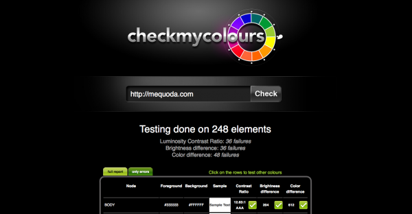
Try the Contrast Ratio Calculator too – The W3C, which designers and developers turn to for current web standards, states “a contrast ratio of 3:1 is the minimum level recommended by [ISO-9241-3] and [ANSI-HFES-100-1988] for standard text and vision.” CheckMyColours.com will do it for you automatically.
The moral of the story here is that when it comes to button color – test, test, test! An easy tool for testing is Google Content Experiments (found in your Google Analytics) and web software like Unbounce.
More Tools for Picking Website Color Schemes
A lot of times when it comes to choosing colors, it’s about finding a tool that you like. There are many to choose from. Feel free to choose from any of the others below:
- Color Blender
- Contrast-A
- Contrast (iPhone App)
- GrayBit
- Color Rotate (Web & iPad App)
- Vischeck
- Color Explorer
- Color Oracle
- Color Combos
There are tons of publisher palettes in the trending palettes section of ColourLovers. If you ever wanted to find out what colors your competitors are using, or just try to digest why you like their site so much, check them out.
Five years ago, if you took a close look at the most visited sites on the Internet, you’d see an interesting phenomenon. They all seemed to use the same four colors.
It’s true. Many websites used the same basic color scheme with slight variations. Usually those four colors include two shades of blue, a shade of gray, and a shade of yellow or ochre. White was (and still is) the predominant background color, with a pale blue coming in second. For a time, sites like Yahoo, Amazon, MSN, Walmart, PC Magazine, AOL and Wall Street Journal all looked fairly similar.
In fact, if you look at the two leading social networks right now, Twitter and Facebook, the two leading colors are still white and blue.
Louis Cheskin was founder of the Color Research Institute of America, and was the packaging genius who created the Gerber baby, designed the 7-Up label, and put the spoon on Betty Crocker packages.
Mr. Cheskin discovered that the four characteristics of colors—visibility, retention, preference, and association—are sometimes different for men and women.
For men, blue rates low in visibility and retention, but high in preference. Men generally associate blue with the words “reliable” and “intelligent.”
However, for women, blue also rates low in visibility and retention, as well as low in preference. Women generally associate blue with the words “depressing” and “professional.”
Nevertheless, when asked, more people of both genders cite blue as their favorite color.
Mr. Cheskin was fond of saying “perception is reality” and wasn’t interested in what customers thought about the packages he created. Instead, what was important to him was how colors and packaging made them feel about the product.
Food for thought: How do the colors of your website make your customers feel about your publication, websites and products?
