Want to know a secret? Of course, you do. Everyone loves secrets. As Homo sapiens we always want what we can’t have and that includes desiring an edge over our competitors or discovering some nugget of information that’ll add value to all facets of our lives; whether its business, financial, personal or dealing with our health.
And no company can present it to you better than “The Grand Poobah” of them all: Bottom Line Secrets—America’s Best Source of Inside information. This publishing company was founded in 1972 by the great Martin Edelston. Today, this branded behemoth has taken our insatiable appetite for information and brought it online with a main portal website and its satellite landing pages. Bottom Line also publishes offline books and today, we look at one book that targets the health industry, found in the Bottom Line Bookstore. Now, if you were looking for information on natural healing you wouldn’t just want “any” encyclopedia on healing, would you? No, you’re busy. You want all of your information in its entirety and you want it now. No ambiguity at Bottom Line. No sir. And that’s because they give you: The Complete Encyclopedia of Natural Healing.
- Their unique style of copywriting is called “fascinations,” and is used a lot in their eye-catching, mesmerizing magalogs.
- This landing page tells you immediately what’s in it for the reader. It’s a complete information source on natural healing and you get to read it for FREE for 30 days.
- Bottom Line—who as a traditional direct mail publisher tests all the time, probably determined that user testimonials didn’t increase sales, but I would’ve added some anyway.
- If there’s anything this publisher wants, it is for you to SIGN UP and test drive their book— then have you either pay for it now, or later.
- If you want to model your business off a multi-million dollar winner in the marketplace, then this landing page is the place to start.

BottomLineSecrets.com’s The Complete Encyclopedia of Natural Healing Landing Page Scorecard
1. Headline – A
Online and off, Bottom Line doesn’t use much long copy in their marketing. In fact, their unique style of copywriting, where they communicate with their readers and prospects, is called “fascinations,” and is used a lot in their eye-catching, mesmerizing magalogs. Using “fascinations,” they tease you with a strong benefit in their headline (and their bullets) that make you so “curious”, you must know more on how they accomplished it. You only have to look at their headline and subhead to see how they weave their magic. And like the title of my favorite James Bond film, “Nobody Does It Better” than Boardroom.
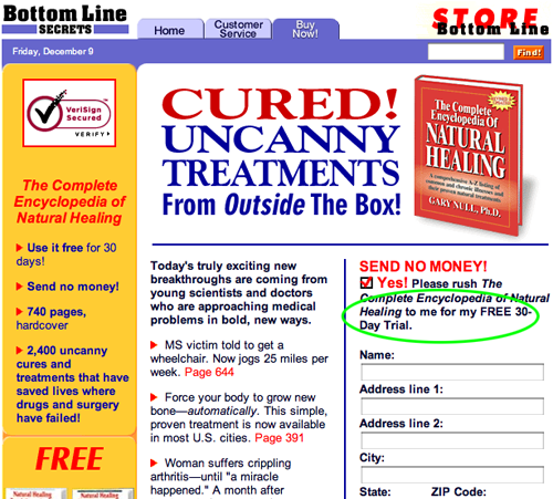
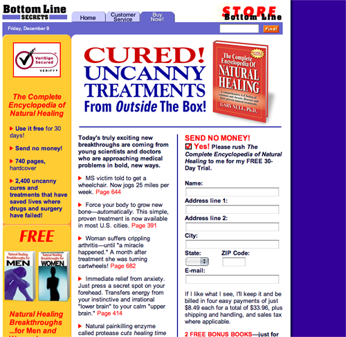
Headline: Cured! Uncanny Treatments from Outside the Box.
Subhead: Today’s truly exciting new breakthroughs are coming from young scientists and doctors who are approaching medical problems in bold, new ways.
Now, when reading this, you might think, “Hmmm, what are these young guns up to?” And if you’re a rebel of modern medicine and believe in either holistic or cutting edge medical discoveries, then you might want to see how it can apply to yourself.
2. Story and Content – B
Bottom Line publishers are minimalists when it comes to delivering online copy. What they do deliver is a tremendous, “I’d-be-foolish-to-turn-this-down-offer.” So much so, that I believe they were innovators of it in the direct response industry and since then they’ve been copied by their competitors.
Boardroom will send you their product/book/information for FREE and have you test drive it before purchasing it. They also give you the option of billing you later or paying for it up front. PLUS, you’ll get two free reports. This is true risk reversal.
If Mr. Prospect isn’t happy, he can of course, send back the book. Again, they effectively use “fascinations” along with strong offers to get you interested in their book and overwhelm you with their offer of sending it out to you for FREE. But wait, there’s more! You don’t have to fork over all the bucks right away. You also get the option of paying in three equal installments.
What I appreciated about this landing page is that you know immediately what’s in it for the reader. It’s a complete information source on natural healing and you get to read it for FREE for 30 days. There’s no ambiguity.
On the other hand, people take in information by feeling, reading, or hearing. As a marketer, you must capture the hearts and minds of your readers to keep them interested in your offer, always. This is why I would’ve preferred if they had some enticing graphics on this page besides the picture of the book. Examples: happy, healthy, invigorated looking couples, a group of determined looking doctors, or perhaps the author himself, Dr. Gary Null.
What I appreciated about this landing page is that you know immediately what’s in it for the reader. It’s a complete information source on natural healing and you get to read it for FREE for 30 days.
3. Content Webfication – A
It works for me. Again, not much use of graphics here except for the cover of the book. But the FREE offers are so overwhelming that you figure, “what the heck—let them send the book to me for free.” Bottom Line also offers you a FREE preview of the encyclopedia but, alas, you won’t get it until you give them your contact information.
4. Email Capture – B
Lots of FREEBIES are presented on this landing page (and of course, on the portal site), which I like. But to receive them you must “give it up.” The email address that is. Unfortunately, when you’re leaving the site, there’s no pop-up to grab your attention and say, “Hey, where are you going? You almost forgot to get your FREE…” Well, you get the idea.
5. User Testimonials – F
None whatsoever. Again, I believe Bottom Line—who as a traditional direct mail publisher tests all the time, probably determined that user testimonials didn’t increase sales, but I would’ve added some anyway. Perhaps I would have taken the trouble to use not only those but also the testimonials of some of their contributors to possibly increase sales.
6. Links to Order Flow – A
Links work and are used properly here.
7. Labeling and Language – B
Simple and effective. Again, every word of copy on the main portal and this landing page is used to get the reader to say, “Yes, send me your FREE book—now!” The buttons on this site are clearly labeled for easy “surfability” (a phrase I just made up). As a reminder, this is the Bottom Line Store. Most of the impressive benefits, free articles, community building, etc., are found on the main portal.
8. Readability and Content Design – B
Everything on this micro landing page is where it should be. It uses the common technique of a left column which gives you more FREEBIES. I would change and enlarge the font on the bottom of the page to show the other ezines they have.
9. Content Freshness and Urgency – C
Again, this is a landing page for the Bottom Line Store. Most of the urgency and content freshness is on the main portal page which includes LOTS of freebie articles, which I assume they change on occasion. There is no RSS feed or blog that bring fresh content. I believe this is a static page that doesn’t change much. It has a purpose: it wants your order and it wants it now. It is after all—a store!
10. Load Time – B
It ran at 17.23 using the Web Page Analyzer. On the main portal page, which was heavier with graphics, it was a lot slower.
11. Aesthetics – A
Simple in design. It attracts and doesn’t distract. Again, as I’ve said in previous reviews, people don’t care about your product or service; they care about what your “widget” will do for them. When one thinks of an encyclopedia, images of school work and research pop into the mind. School = work. And no one wants to equate a book with work. Yes, this is an encyclopedia of natural healing… but I would bring some graphics in of happy, healthy people. This would show the prospect how their life will be changed once they purchase this book. They, too, will have their problems solved.
Simple in design. It attracts and doesn’t distract.
12. Ordering Options – A
This is where Bottom Line excels. If there’s anything this publisher wants, it is for you to SIGN UP and test drive their book— then have you either pay for it now, or later. Strong online options consist of a right column on the side of the screen that asks for all pertinent information. There’s also a tab on the top of the page to have you call customer service.
There’s a tab on the top of the page to have you call customer service.
Conclusion
This landing page works mainly because it engages the reader, teasing you with their wonderful fascinations, while not overwhelming you with clutter. The copy does a strong job of building your trust and presenting its credibility on its main portal homepage (and subsequent landing pages). If this was a free standing micro site, you’d need more information. Bottom Line presents an overall strong communal feel to its readers on their overall site (not necessarily on this Store page).
If you want to model your business off a multi-million dollar winner in the marketplace, then this is the place to start.


would like to get more information about the book title The world,s greatest treasury of health secrets.
nice post.keep update friend.thank you.