See why Artist Daily received an A
This week’s Website Design Review is on Artist Daily, an emerging Interweave site. The site clearly tells me from the start that it’s the American Artist Magazine website. Interweave is known for websites that are Mequoda compliant and the Artist Daily site is no exception. The site does a great job of following the Mequoda Best Practices, which I will point out in the review below. These best practices are based off the Mequoda Website Design Scorecard.

Artist Daily Mequoda Scorecard
1. Strategic Intent: A – This site offers plenty to browse and search, including Blogs, Forums, Galleries, Videos and Topics.
It also offers a lot of opportunities to join the site and/or subscribe to the American Artist Magazine. It’s a new site design that’s well thought out and was obviously designed with strategic intent in mind.
The site does contain advertising zones but they too are well designed and integrated into the site. The leader board at the top does stand-alone and could be moved below the navigation in order to increase clicks.

Artist Daily Homepage
2. Content Webification: A/B – The Video Gallery is key for an artistic site like this. It’s useful in letting users “see” all kinds of artistic styles and step-by-step instructions. Additional web 2.0 items like Twitter inclusion would be a nice addition to the site.
3. Relationship Building: A – The “E-book Free Offer” for conversion is clear and even came up again when I was registered. With all the user content, there is plenty of reason to return to this site. The use of “add blog to favorites” makes it easy for a return visitor to follow a favored editor.
4. Community Building: A – The site promotes user-generated content via forums, videos and galleries. The comments and ratings allow subscribers to easily find popular and useful content.
5. Persistent Navigation: A – The navigation is clear and consistent throughout the site. I can see that this site is well thought out from the beginning. My only suggestion would be to include a topic list down the left navigation on the homepage for an easy overview of primary topics.

6. User Task Depth: A – The site has plenty of ways to browse, search, join and subscribe. These are the primary reasons to come to the site. The homepage shows what I believe are the latest editorial posts in the artists’ blogs. The use of “Related Posts” and tagging helps keep users moving deeper into the site.
[text_ad]
7. Affordance: A – The site is well designed and links are clear.
8. Labeling and Language: A – The site uses language specific to artists but also has a helpful Glossary.
9. Readability: A – The site is not cluttered and has a good mix of white space and column size. The only suggestion here is a list of new blog posts on the homepage that should include an image of the editor. When I visited the site, it was filled with the same editor’s posts so it looked a bit funny with the same picture repeated multiple times. They might want to set it so the editor’s picture only shows once.
10. Organization: B – The site is organized well and easy to find, but I had trouble finding products in the store and the online school that were referred to on the homepage. The store is the “Magazine” link from the main navigation but I expected to find a place for art products or books that I could easily browse. I did however also like the quick-links to “Join” and “Sign In”, located in the top right quadrant.
11. Content Freshness: C – I visited the site on different days. Sometimes it had new content, but other days the homepage only showed content that was a few days old. The editors should work on scheduling better to make sure new content is posted daily.
12. Load Time: C – The site took 13 seconds to load the homepage completely. There is room for improvement here.
13. Aesthetics: A – The site is designed by someone who understands information architecture well. It also incorporates a good balance with the paid advertisements. Everything seems well thought out.
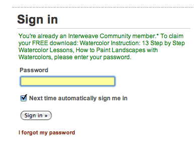
14. Brand Preference: A – As stated earlier, you immediately see ties to the American Artist Magazine. There are related magazines offered and I liked that when I downloaded the Free Report on Watercolor that I was given an ad for ordering the related American Artist Magazine on Watercolors. This is a great example of a Mequoda Best Practice.
Overall the Artist Daily site received a grade of a B+/A-. It is well designed and does most things right. The areas for improvement are load time, content freshness and organization of the store. These are things I believe they will naturally address as the site grows and expands. It was a pleasure to review this site and see many of the Mequoda Best Practices in use.

Artist Daily Upsell


As Adam said I haven’t heard any of these ever before.Thanks for the awesome post.
Great, tips. I been doing a lot of SEO/SEM in the past and I was pretty sure I know everything about this field but with your article I realized you can still teach new tricks to old dogs. I’ll be reading your other posts.
Thanks for the kind words Adam.
-Chris