There are a few glaring problems with the Cleveland Clinic Heart Advisor landing page. Mostly, they are not using effective copywriting techniques to sell this newsletter. Instead of promising readers a longer and healthier life, the Cleveland Clinic Heart Advisor landing page only manages to promise 2 free issues – something someone with a shelf already full of health information would not get overly excited about. Let’s see how else they do when run through the Mequoda Landing Page Scorecard.
ClevelandClinic.com’s Landing Page Scorecard
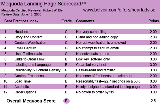
1. Headline (Strategic Intent) – C
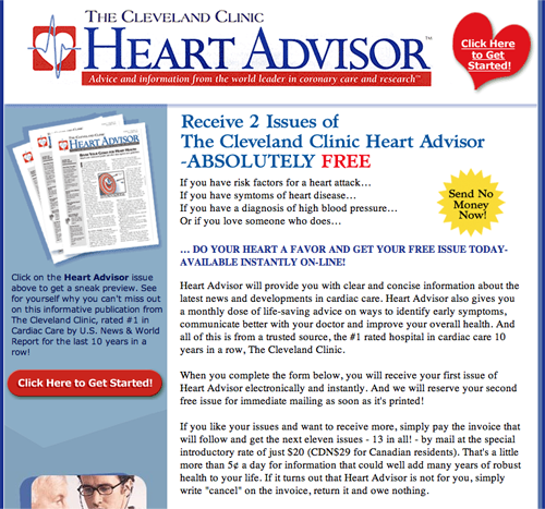
The large banner at the top of the landing page contains the publication title and tag line. The tag line is a solid, clear positioning statement: “Advice and information from the world leader in coronary care and research.”
But when you make a big claim, such as being “the world leader in coronary care and research,” you’d better prove it. The proof here is in a caption under the visual of the newsletter, which notes that the clinic was “rated #1 in cardiac care by U.S. News & World Report for the last 10 years in a row.”
That’s an extremely credible source, and it sets the Cleveland Clinic apart from everyone else in the cardiac health field. So I would set this copy in large, bold type. And I’d move it up to the headline or at least make it more prominent.
Also, in the tag line, “advice and information” is weak. No one needs more “information” about health, a ton of which is available for free on the Internet—without paying for a subscription to the Cleveland Clinic newsletter.
No, what the reader wants is not information but cures and solutions—medical technologies, remedies, treatments, nutrition tips, exercise routines and health breakthroughs to help us live longer, happier, healthier lives.
[text_ad]
Below the publication name and tag line is a headline offering two free issues of the newsletter.
Free offers work well online. But if the strongest thing Cleveland Clinic can say about its heart newsletter is that they give you two issues free, they’re in trouble. I want to know how this publication can help me live longer and healthier, and why it’s different and better than the mountains of cardiac health information already overflowing my bookshelves and files.
2. Story and Content – C
The Cleveland Clinic has opted for a bland, non-selling landing page free of hype.
Unfortunately, it’s also free of copy that makes anything but the most minimal attempt to sell us a subscription.
The Cleveland Clinic newsletter is, I am sure, full of fascinating news and recommendations on cardiac health. So why don’t we see a list of bullets teasing us with the promise of getting those healthy heart secrets if we subscribe?
Instead, the main copy on the landing page is a fairly generic description of a health newsletter along with the offer. There’s not much here to indicate that there is anything special, exciting, new, or unique about the content published in the newsletter.
The lead-in under the “ABSOLUTELY FREE” headline mentions heart attack, heart disease, and high blood pressure. To this list I would add high cholesterol and stroke.
3. Content Webification – C
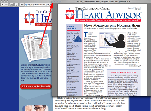
The content is fairly well adapted to the Web. For instance, you can click on a cover of the newsletter to read a sample issue online.
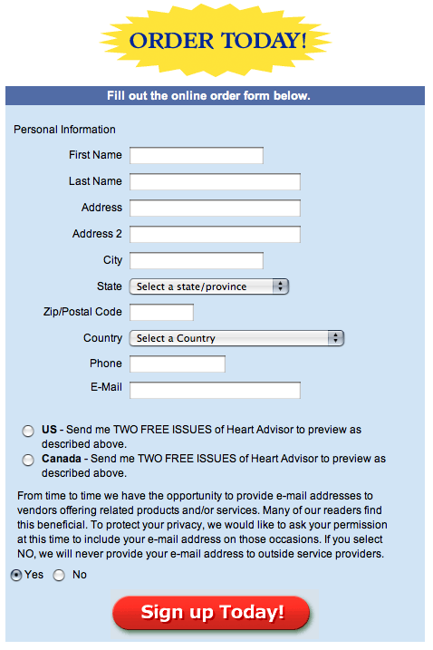
The landing page has multiple links to the order form, which also appears at the bottom of the page. A number of these lists are highlighted using bursts, making them easy to find. The order form is clean and simple.
4. Email Capture – C
When I clicked away, I was not served a pop-up window offering me a bribe (e.g., a free e-newsletter or special report) in exchange for my email address. This is a huge tactical error for any landing page.
Why? Because if you get the visitor’s email address before he leaves without ordering, you can serve him a series of follow-up emails via autoresponder attempting to convert him to a trial subscription. And, you’ve added another valuable name to your house e-list. Without his email address, you have lost the opportunity for follow up, significantly reducing your conversion rate.
[text_ad]
5. User Testimonials – C
I didn’t see any subscriber testimonials here. Nor does the copy say how long the newsletter has been published, how many subscribers it has or the name of the editor.
6. Links to Order Flow – B
The various links throughout the landing page encourage you to click to order. Clicking brings you to a simple, easy-to-follow order page with a soft offer: you can sign up for a subscription on a bill-me basis.
Traditional health newsletter publishers like Agora and Phillips promote their publications with hard offers (payment up front), while institutional health newsletter publishers like Mayo Clinic, Cleveland Clinic, and Johns Hopkins seem to use mainly soft offers (bill me). This makes me wonder what the pay-up rate is from orders placed on this landing page.
7. Labeling and Language – B
The landing page uses clear language: terms commonly understood by the target user. Terminology is consistent, and “power words” (e.g., “absolutely free,” “Request your FREE issues today!”) appear throughout to encourage ordering.
8. Readability and Content Design – B
The typeface and layout are familiar, common and easy to read. The copy is made readable with the use of subheads, links, bullets and dual columns—there’s a wide central column with the main message, and additional selling copy and graphics to the left. When you click on the graphic of the newsletter cover in the left column, you can download a PDF of the latest issue.
9. Content Freshness and Urgency – C
I could see having a section on this landing page where health items in the news (those featured in the newsletter) are prominently displayed. But there’s nothing here to make me believe that they haven’t been using this same copy for years. It doesn’t convey a sense of freshness, excitement, timeliness or discovery.
Alarming statistics about the incidence of cardiac illness in the U.S. are conspicuously absent. Not only does this result in a failure to create any sense of urgency about getting a cardiac health newsletter. But it also conveys the impression that the publisher hasn’t done his homework to find out the facts.
Also conspicuously absent is any mention of cardiac health breakthroughs, such as new supplements for lowering cholesterol or safer ways of performing heart surgery.
10. Load Time – B
This is a reasonably fast-loading page. When tested on with the Web Page Analyzer, the page downloaded in 22.7 seconds over a 56 Kb connection.
11. Aesthetics – B
This is a nicely designed, completely standard short-copy landing page. The design is clean and easy to read, and presents all copy and graphic elements clearly. The newsletter comes with a money-back guarantee of satisfaction, which could be made more prominent by placing it in a box with a certificate-style border.
12. Order Options – B
The primary order option is to click on a link and go to the order page where you can subscribe online. The publisher’s name, email address and toll-free phone number appear at the end of both the landing page and the order page. There is no option to order by fax.
The price for a one-year subscription (13 monthly issues) is $20, which, we are told, works out to around five cents a day. The publisher correctly recognizes that consumer health newsletters have a low price point, and is stating the daily cost to minimize price resistance.
Conclusion
The copy is concise and easy to read; the layout is clean and bright; the graphics are simple and eye-catching. However, I don’t learn anything about the importance of cardiac health, the existence of new life-saving developments, or how reading this newsletter can improve my cardiac health.
A few, simple, benefit-oriented copy tweaks would do a lot to improve the health of this landing page.


