WoodcraftMagazine.com is a Sturdy Site That Will Serve the Purposes of the Master Brand, but Won’t Warm the Hearts of the Audience.
Woodcraft Supply Corp. is a leading seller of woodworking tools. The company has been around for 75 years and sells via retail, online and in over 3 million catalogs globally. Expanding the woodcrafting empire, the company publishes a magazine, licenses franchises, offers classes with certified continuing education credits and acts as a trade organization for woodworking teachers. Running all of these businesses through a single website would be a recipe for disaster, and Woodcraft has rightly chosen to create a branded network of sites to fulfill the diverse business goals. This review details the website design of the magazine site, WoodcraftMagazine.com.
The Woodcraft Network:
- Commerce: Woodcraft, Woodcraft.com
- Editorial: Woodcraft Magazine
- Learning: Woodcraft University
- Gallery: Woodcraft Gallery
- Community: Woodworking Teachers Network
Variations in the URLs mirror Woodcraft’s strategy of a consistent look and feel for all of the sites, with visual cues and navigation changes to fulfill site-specific goals. A user will always know they are within the Woodcraft brand, and be able to find their way to the other sites in the network easily.
- WoodcraftMagazine.com’s links to the other sites in the network serves the parent company’s business goals by increasing traffic entry points.
- There isn’t much that is innovative here. Archives, Web-extras, event listings and search are pretty basic. Print readers are not given many reasons to go online.
- Skipping the community building devices that would encourage user involvement with each other places the site on a weak foundation.
- WoodcraftMagazine.com uses a left-hand navigation that remains consistent on every page. The only exception being order pages, which appropriately simplifies the navigation down to bare essentials (removing the temptation to click out of the process).
- While the affordance is clear, the ‘click here’s’ should be replaced to bring the site up to current standards.
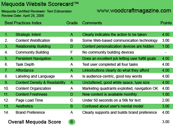
WoodcraftMagazine.com’s Mequoda Scorecard
1. Strategic Intent – A
The audience of Woodcraft Magazine is interested first in detailed information, and second in buying specialized products. The parent company and main business, Woodcraft the tool supplier, uses an editorial site to build an audience that they can sell to. The sale might be of a product from the Woodcraft store, or a class at the university, or a membership in the gallery. Or it might be the old fashioned editorial mission of simply increasing circulation (print and online audience) to sell to advertisers.
[text_ad]
In order to clearly indicate to the user the strategic intent of the site, the user must understand the business model at first glance. “I can get good free information here, and pay them only if I decide to subscribe or to buy something”—that is the unconscious understanding a new user should have at first glance.
WoodcraftMagazine.com succeeds in the above goal with these design items:
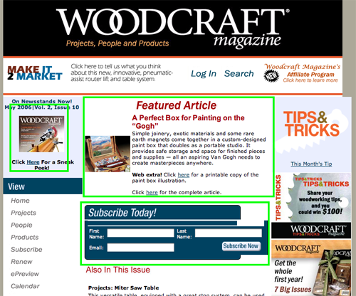
- Picture of the print magazine cover, clearly indicating that this is a real magazine “on newsstands now!”
- “Featured Article” in the center of the screen, clearly indicating free content
- “Subscribe Today” under the feature article, clearly indicating that the user can subscribe and get the site content in print form
In addition, WoodcraftMagazine.com‘s links to the other sites in the network serves the parent company’s business goals by increasing traffic entry points.
WoodcraftMagazine.com succeeds in the goal with these design items…
2. Content Webification – B
Craft magazines are all about the pictures. Pictures that you can scrutinize, study and have on the wall of your workbench. Websites can suffer in comparison to their print counterparts, since to keep page download times fast, pictures must be small. The best way to handle this is the thumbnail with an “Enlarge Picture” option. This is exactly what Woodcraft Magazine does.
In addition, Woodcraft brings the “Web Extra” to their subscribers with printable PDF illustrations including measurements and step-by-step instructions for projects described in the articles. All the information the enthusiast needs can be taken from the computer to the workbench.
WoodcraftMagazine.com has changed content format enough to take advantage of Web functionality and not simply reproduced the print media online. The content is readable and useable. However there isn’t much that is innovative here. Archives, Web-extras, event listings and search are pretty basic. Print readers are not given many reasons to go online.
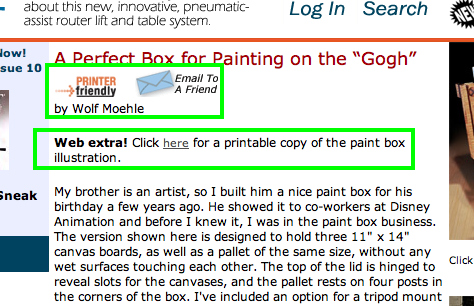
In addition, Woodcraft brings the “Web Extra” to their subscribers with printable PDF illustrations including measurements and step-by-step instructions for projects described in the articles.
3. Relationship Building – D
Users can manage their subscription accounts on WoodcraftMagazine.com, and subscribe to an ePreview for following month’s issue. Not much else. The user will not feel like the site is in any way personalized; a relationship between the user and the website is simply not being created.
4. Community Building – F
Editorial that is covering a topic where users will have questions and need advice and support from their fellow enthusiasts are a natural fit for community. Everyone has a common interest, and common experiences, that they can share with each other. Skipping the community building devices that would encourage user involvement with each other, increasing people’s personal connections and desire to come back frequently (don’t want to miss anything after all), places the site on a weak foundation.
5. Persistent Navigation – A
WoodcraftMagazine.com uses a left-hand navigation that remains consistent no matter what page the user is on. The only exception being order pages such as Subscribe, which appropriately simplifies the navigation down to bare essentials (removing the temptation to click out of the process). Common goals such as “Log In” and “Search” are always present at the top of the page. Getting around the site is easy, and doesn’t require a detailed blueprint.
6. Task Depth – A
User tasks on WoodcraftMagazine.com were a snap.
- Read new articles. These are found on the homepage, clearly identified.
- Find a previously read article and/or an article on a specific topic. Old articles can be found with an extensive search option, or by browsing by department.
- Subscribe/Renew/Cancel a subscription. These links to customer service tasks are very prominently displayed in the navigation.
- Advertise. An advertising link is in the navigation and as an affiliate link on the homepage. (Making it easy to find out how to advertise is particularly useful when the audience and pricing appeals to small advertisers.)
7. Affordance – A
WoodcraftMagazine.com has one of the best solutions to a typical problem in site networks. When there are several sites that all share the same audience, but serve different purposes (for example a store, an online learning center and an editorial site), many websites sprinkle links through their sites as if the different sites were the same site.
That is, to the user, it feels like they are being sent to a new site without warning. Everything they see on their screen changes, including logos, colors and navigation. People hate this and often react by simply clicking the “back” button. WoodcraftMagazine.com deals with the problem in two ways. First, it puts the word “visit” on top of the links that go to other sites in the network. Second, the logos of the other sites are displayed as the links. This visually differentiates the links from other links on the site that stay on the same URL.
While the affordance here is clear, the click here‘s should be replaced to bring the site up to current standards. The link should simply be the words (blue and underlined) that reflect the page the user will land on. For example, “Web extra! Click here for a printable copy of the cabinet illustration,” should be “Web extra! Printable Cabinet Illustration.”
While the affordance here is clear, the click here‘s should be replaced to bring the site up to current standards.
8. Labeling and Language – A
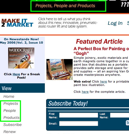
WoodcraftMagazine.com‘s labeling and language is not only simple, it’s alliterative:
- Tagline: “Projects, People and Products.”
- Editorial: Projects covers woodworking projects, People features woodworkers and their work and Products is woodworking product reviews.
- Navigation: Projects, People and Products are used in the left-hand navigation to link to an index of articles in those departments.
The only remotely woodworker jargon-like words are found in products. But if you don’t know what a “dual compound miter saw” is, then you probably shouldn’t be buying one.
WoodcraftMagazine.com’s labeling and language is not only simple, it’s alliterative:
9. Readability (Content Density) – A
The balance of images to text is perfect. A single column in the center of the page is used for articles, with a large font and a white background. This presents a very user-friendly online reading experience. Pictures are essential, and here they kindly replace unessential marketing spots in the right hand column. This allows the template to stay consistent while pictures can appear next to the text without smushing it.
An essential additional function here is that the images are enlargeable to a pop-up window. In a craft magazine, pictures are not mere window dressing, but an important part of the editorial. Also, the entire article can be seen in a printable PDF version. This is especially important for a craft site as many articles are going to find themselves sitting on the workbench, smudged by grubby working hands.
10. Organization – A
Every section of the homepage includes all the different types of links that create a well-balanced site. The user’s eye will flick from left to right and top to bottom and see marketing and navigational links in each quadrant.
11. Content Freshness – D
Content is updated monthly on WoodcraftMagazine.com. This is not enough to bring users back regularly—a month is too long for today’s media attention span. Assuming that only a portion of users would actually visit daily, even those users won’t come if there isn’t any new content to view. Reviews, user forums, an editor’s personal blog—there are many ways to keep something new coming every day, several times a day.
12. Load Time – C
WoodcraftMagazine.com earns a C with a page load time of 31.8 seconds on a 56K modem. That’s a long time to wait. The site doesn’t have large pictures or fancy animation, so the wait is really a mystery. Better check that code.
13. Aesthetics – B
WoodcraftMagazine.com partly matches the user mental model, in that it is clean and basic—a working person’s manual. But the colors are a little random and disjointed. Some of the other sites in the Woodcraft network present a much more pleasing palette. It would be worth the time for this site to bring their colors up to the level of the Woodcraft.com site, and to tighten up the layout (too many rough edges). The users are craftspeople, to whom aesthetics are an important part of their work. The visuals should avoid “eh” and go for “Ooooooh!”
14. Brand Preference – A
Pictures of the print magazine, repetition of the brand name and the logos for Woodcraft, Woodcraft University, Woodcraft Gallery and Woodworking Teachers Network all appear on the homepage. The sense of the Woodcraft brand is ambient and strong.
Conclusion
Woodcraft is first a supplier. Editorial publishing is part of the strategy, but as is clearly seen in this review, not a central focus of the management. This site is adequate, but missing many of the aspects that make a specialized niche publication site great. There are no community building or relationship building devices, content webification is minimal and even the aesthetics are kind of half-dashed. The site is like a basic, well-made table by a builder who is trying to get it over with so that he can get to the project that he really cares about —in some other place. There is no inspiration or creativity or craftsman’s pride in WoodcraftMagazine.com. A sturdy site that will serve the purposes of the master brand, but won’t warm the hearts of the audience.


