Great website design is only great when it performs the goals it sets out to do – what are your goals?
What are the actions you’d like a user to take when they arrive at your website? If you were conducting any kind of simple usability tests, you’d need to define these actions. In a heuristic usability test, where you’re watching a user engage with your website, you are required to come up with 5-10 major tasks, many of which require the one element that every website design requires: a very obvious call to action. Many publishers might include this list of tasks they wish their web visitor could complete easily, all requiring a button or call-out of some kind, telling the user how to do it:
- Download a free report (to subscribe to an email newsletter)
- Subscribe to a magazine
- Purchase a book
- Register for an event
[text_ad]
As you know, Mequoda considers the email newsletter call to action most important. We may not be able to convince every new website visitor to pay us money for our products or to subscribe to our magazine when they’ve only just met us. But we can entice them to take us up on a lower commitment, which is to subscribe to our daily email newsletter. We do this by providing them with freemiums. And when we’ve proven our content is great, we may persuade them to buy a product at some point down the line.
Is there a clear call to action on every page, for a free report, which requests an email address?
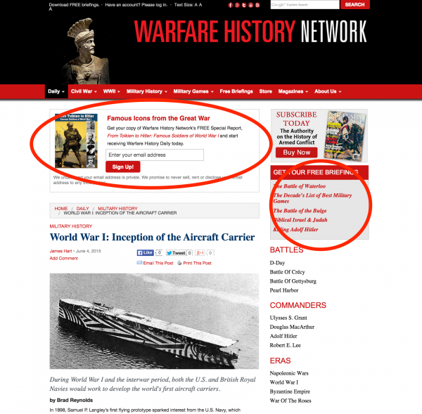
When new visitors come to Forester Network’s home page, they’re greeted with a Floater which contains a call to action for a free report. It’s very clear that the visitor is signing up for an email newsletter in exchange for the free Special Report. 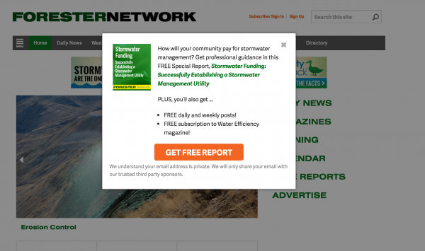
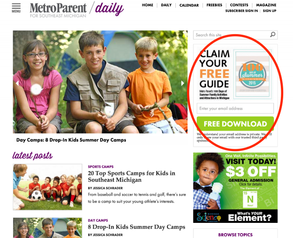
On MetroParent‘s free content portal, there’s no mistaking this call to action for a free guide.
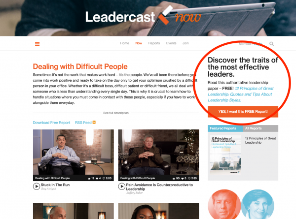
And on this Dealing with Difficult People video category page for Leadercast, there’s a call to action for their related free download.
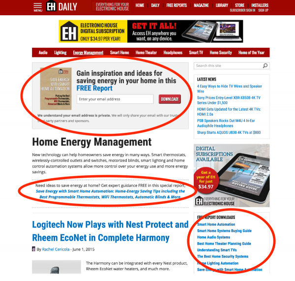
And on Electronic House, if a user lands on a category page like Home Energy Management, they’ll have no problem finding a call to action.
And since your articles are typically the pages on your site that will get found most, a call to action on these pages makes the most sense of all.
 Has this post inspired you yet, to add calls to action on your site? If you want to build up your email list, create freemiums and give them away in exchange for an email address. If you want to be successful at this, you need a call to action on every page of your site. Do all your pages have one?


I agree with you that meeting your goals for a website is the most important thing.
But “great” and “effective” are not the same in design.
I’d rather be effective than great. Many so called “great” designs look clean and pleasing to the eye, but don’t achieve the goal of converting a reader to a subscriber. Or rather, the site achieves a goal to look great. They might not want to “clutter up” their clean site with a subscription box, ad, or floater. Hey, that’s ok. It’s just a matter of whether you want to be effective.