See how Dark Daily holds up to the Mequoda Website Design Review Scorecard
This week we used the Mequoda Website Design Review Scorecard to review Dark Daily. Dark Daily is a news/e-briefing site whose audience includes clinical laboratories and pathology labs. Its is part of a family of sites from The Dark Intelligence Group, which also includes The Dark Report, a paid publication focusing on news reports and the latest facts and trends that affect medical laboratories of all kinds. The Editor-in-Chief is Robert Michel.
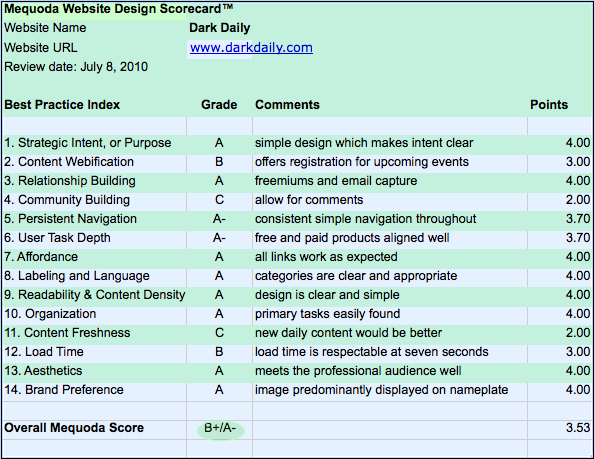
1. Strategic Intent: A
This site has a simple design that helps make the strategic intent clear. Users come to the site for free information (E-Briefings) and white papers, or to purchase an Audio Conference or Seminar. User purchases are easy to find and complete.
2. Content Webification: B
Webification is achieved by offering users registration for upcoming Audio Conferences and past conferences. However the pre-recorded conferences are only available for order on a digital CD. They could improve their content webification by offering the ability to purchase and play the audio conference on demand.
3. Relationship Building: A
Dark Daily is following many of the Mequoda best practices for relationship building by offering multiple points of conversion and email capture. Email capture is achieved by offering daily newsletter sign-ups or offering a free report (freemium with email capture), or from an order flow on a product purchase.

4. Community Building: C
The only community building device found on the site was a user rating for E-Briefing articles. The site could be improved by allowing user comments on these same briefing articles. Another device that could be added is a community forum. This would give registered users a reason to return to the site.
5. Persistent Navigation: A-

A simple navigation is used consistently throughout the site. Users can easily choose between the primary navigational items of E-Briefings, White Papers, Audio Conferences, Seminars, Services, Resources and Video. The navigation does not change on any page within the site. These items are clear and easy to understand. The last item is Video and it links to free webinars, so changing the title on this tab, or the title on the page to match, would create less confusion for the user.
[text_ad]
6. Task Depth: A-
The four primary tasks on the site are browse, search, join and purchase. There is a simple form to complete for registering that also “upsells” the user to The Dark Report, which is a premium service. This is an excellent example of a Mequoda Best Practice by aligning a related paid product with a free product.
The store link takes users to the shopping cart, but if no items are in the cart the link to “continue shopping” goes directly to the free white papers. This link should be fixed to go to the paid audio conferences or seminars.

7. Affordance: A
All links work as expected and the users can easily understand how the site should behave. No improvements are needed here.
8. Labeling and Language: A
Although the articles and seminars use titles that are specific to clinical and pathology laboratories the majority of the site uses simple menu labels. The taxonomy used for the vertical navigation is simple to understand with keywords of “Laboratory Management and Operations” and “Laboratory Hiring and Human Resources”. These categories are clear and appropriate to the audience.
9. Readability: A
The site’s design is simple and clear. It uses a three-column layout with left and right columns for navigational items and the middle column for article content. There is a good use of white space that makes the site easy to read and browse.
10. Organization: A
The marketing quadrants are correctly exploited for the primary tasks of searching, browsing, joining and purchasing. The Store icon is a quick-link and is easy to find since it’s included in the nameplate! The only suggestion here would be to move the newsletter sign-up higher up in the right navigation.
11. Content Freshness: C
The daily articles show publication dates of about every other day. They could improve their rating here by publishing new content daily.
12. Content Loading: B
The site’s homepage loads in about seven seconds. This is a respectable time, as keeping the site homepage simple is key for the load time remaining short.
13. Aesthetics: A
The overall design is clean looking and professional and is a perfect match for the clinical audience.
14. Brand Preference: A
Robert Michel is the face of this brand and his image is predominately displayed in the nameplate. Michel, having been part of the industry and strategic consulting for over 12 years, is used to drive brand awareness.
Overall this site scores high in the areas of simple navigation, clear keywords, and professional design. The site also scores high on the use of Mequoda best practices for relationship building and subscriber conversion. Improvements to increase frequency of daily content publication and community building by enabling user comments would be easy changes to help the site improve their overall rating on the Mequoda Website Design Review Scorecard.


Great write-up and some good points about the stores “Continue Shopping” link. We are correcting the way our Audio Conference registration tool functions and will be linking directly to the audio conferences page once we have completed adding all the past audio conference mp3 files into the DarkDaily store.
Thanks for the comment Justin. I’m sure the new functions will be a great addition to the site.
Best,
Chris