eDiets Doesn’t Feed You Enough Reasons to Join Their Program
I had mixed feelings when Don Nicholas asked me to take a look at eDiets.com as my first website review for the Mequoda Library.
The reason is my weight. You know those height/weight charts you see in the doctor’s office? Well, according to that chart, I am 7-feet, 8-inches!
So I knew visiting a diet site would be an unpleasant reminder of my ongoing battle to leave porker territory.
On the other hand, I’d be going to a site that offered me genuine benefits that I seek—mainly weight loss—a site where I would be a legitimate potential customer.
 |
|
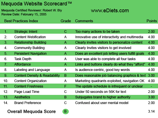
eDiets.com’s Mequoda Scorecard™
|
Before I detail how they scored on the Mequoda Website Scorecard™, I should mention that eDiets.com is a good example of a well-executed Mequoda Membership Website™. They are one of the Internet’s leading health and nutrition sites, with 13 million free users (subscribers to eDiet online newsletter) and 1.8 million paid members as of 9/30/04. The most recent revenue figures available were from fiscal year 2003, when the Company reported revenues of $38.3 million.
1. Strategic Intent or Purpose – C
There are way too many choices on this site. At first glance, you’d think that’s a good thing: lots of valuable content.
But unlike sites with a lot of free downloadable content, most of eDiets seems to cost money. So again, it’s not quite what you’d expect, as you get asked for a few dollars almost everywhere you go on the site.
If the lead product is the eDiets plan I was offered for $11.96 a month under the box “Lose 10 Pounds by March 25,” then I might suggest a split test of the current site vs. a product-specific, long-copy microsite. This dedicated microsite would center solely on getting people to sign up for the eDiets plan, and eliminate all other content and options.
Once people sign up for the eDiets plan, then they can be directed to the existing site—part of which could be password-protected for eDiets plan customers only—where they can explore the other resources such as fitness and recipes.
2. Content Webification – A
The eDiets site helps users choose which information program is best for them. Choices include diets, meal plans, exercise programs and support. The site then communicates with you daily (and automatically) with emails containing timely, personalized information and inspiration.
There’s a lot of interactivity that allows advice to be customized based on age, weight and body mass index, and other factors, which adds a sense of legitimacy and credibility. After all, how can you give me exercise advice if you don’t know how lean or heavy I am, or what kind of shape I’m in (oval, in my case)?
A lot of the advice is customized based on your answers to online questionnaires, but the questionnaires are often not designed well.
For instance, a Diet Needs Analysis asks me “What kinds of foods can you NOT live without?” The choices are fruits and vegetables; meat, poultry, fish, and eggs; and breads, grains, and cereals. But the system only allows you to choose one category. What if you are addicted to both meat and bread?
3. Relationship Building – A
Few sites I’ve seen are more personalized and interactive than eDiets. The content you receive is tailored based on your eating habits, exercise routines, weight, health and other relevant personal data.
eDiets.com is very personal
4. Community Building – A
At the top of the homepage are buttons that let you select different areas of the site—and community is prominent among them. You are invited to join a community of other health and diet-conscious eDiets users; the cost is $1.99 a week.
5. Persistent Navigation – A
Actually, I’d give it an A minus. Overall, the choices and pathways are clear. But sometimes the screens are slightly overloaded with offers, ads and links.
6. Task Depth – A
There is never a problem when completing questionnaires or going through the steps to get to the offer or content you seek. My primary complaint is that questionnaire design is not always logical.
7. Affordance – A
There are lots of links to a multitude of services and content on the eDiets website … and all links are clearly marked and easily accessible.
eDiets has great affordance, and when mousing over the links, helpfully pops up
short explanations for further information.
8. Labeling and Language – A
All terms are in the target prospect’s language: weight, exercise, diet, meal plans, recipes, fitness, personal trainer. There’s no nutrition or medical jargon of any kind. Everything is written in plain English aimed at a lay audience.
9. Content Density and Readability – B
The pages are relatively clean and easy to read. In some instances, however, too many options and items are jammed onto the screen, creating a slightly cluttered look. But it never gets confusing, and you can always figure out how to find what you want—and what to do next.
10. Content Organization (marketing quadrants) – A
The site is sensibly organized into sections which you can choose from, using either the buttons at the top of the screen or from boxes and sidebars within the screen.
11. Content Freshness – F
I can’t tell from looking at the site how often content is updated on the website or how much of it changes. But I’m not sure that’s a problem here, since the new content is delivered to users proactively via emails.
So if I follow the strict definitions of the Mequoda Scorecard™ we use at the Library, I have to pick F for content freshness. But I suspect it’s better than that, and probably more like a B.
12. Load time – C
The site isn’t overly graphics heavy, and I don’t really see flash or other rich media. On the broadband connection I use, pages downloaded instantly.
However, the Web Page Analyzer showed that it takes 31.62 seconds to download the eDiets homepage using a 56K dial-up connection… which gives the site a C for speed on our Mequoda Scorecard™.
13. Aesthetics – B
The homepage is what I call a tabloid-style homepage—offering a potpourri of offers, pathways and options. Many successful websites are designed in this manner.
However, when you first hit the eDiets homepage, it’s not clear what the site operator wants you to do next. If it’s to sign up for the eDiets program, which seems to be the primary product, the user is not clearly directed toward that action.
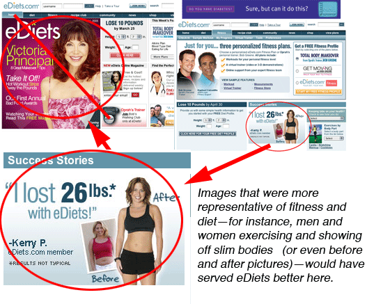
Do layout, colors and typefaces fit the site’s image and purpose? On the day I visited, the main graphic looked like the cover of a women’s magazine, featuring a big image of Victoria Principal. Images that were more representative of fitness and diet—for instance, men and women exercising and showing off slim bodies (or even before and after pictures)—would have served eDiets better here.
14. Brand Preference – C
On February 15, when I first clicked onto the eDiets home page, the main graphic featured a picture of Victoria Principal with some article titles, and it seemed to deliberately resemble the front cover of a women’s magazine—in particular, Ladies’ Home Journal.
So right away, as a male, I could not relate to the homepage. Maybe eDiets is mainly targeting women—but half of the 100 million or so males in America are overweight, too.
If, in fact, the site is targeted mostly to women, then they have done a great job marketing to their target audience.
As I mentioned earlier, the homepage is “tabloid style”—lots of interesting little items to choose from. Unfortunately, with a tabloid-style homepage, there’s no single point of focus, and no unifying positioning copy to tie it all together or define the brand of the site.
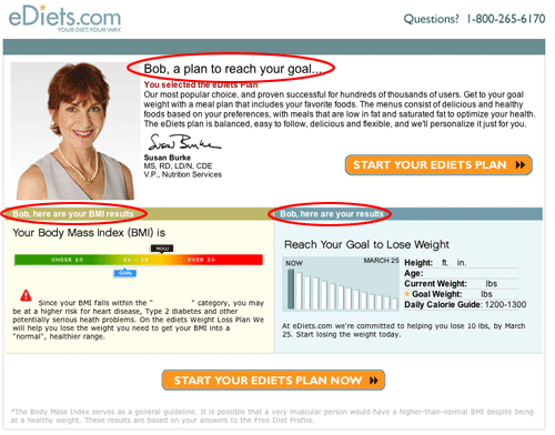
Although the large magazine cover graphic catches the eye, I was drawn to an interactive box which said “Lose 10 Pounds by March 25.”
You enter your height, weight and age, then click through a series of screens asking you more questions. eDiets can now design a customized weight loss plan for you, for which they charge $11.96 a month. Along the way, you are offered a number of free ezine subscriptions and information on advertised products, which makes it a little bit confusing and overwhelming.
The request for $11.96 a month at the end of the process came as a surprise to me; I somehow thought everything would be free. The reason it surprised me was that there is no “sell” copy preceding the questioning process.
So being asked for money came as a bit of a shock. And I didn’t buy. That’s just my personal reaction; I have no idea what the actual conversion rate is.
Interestingly, when I went to the diet plan questionnaire to run through it again, I was immediately served a page that said, “Welcome back, Bob. We’ve saved all your information. Click here to view it now. Click here for a special offer for return visitors!”
When I clicked on the special offer for return visitors, however, it was the same $11.96 a month I had been offered earlier. I didn’t see what was special or different about it.
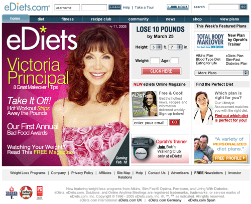
eDiets.com’s Homepage
Conclusion
Overall, eDiets received a B. It is an attractive site with a lot going for it: interactivity, customization, personalization, desirable content, contemporary graphics and the promise of some powerful benefits: lose weight, get healthy, look better and feel good.
If it were mine to do, I might test the current eDiets—which seems to offer access to all of eDiets services equally (as well as those of its sponsors)—against a dedicated microsite whose sole purpose was to get people to sign up for the $11.96 a month eDiets plan.
Those who sign up for the plan can then be directed to the current site. There they can explore and sign up for additional services, such as recipes and personal training. There should also be additional content for these paid subscribers, which they can access with their password.
Anyone who tries to leave the microsite without signing up for the eDiets program should be served a pop-under window offering a free subscription to one of eDiets many free ezines. This would allow eDiets to capture the email address and send a series of emails via autoresponder attempting to convert these free subscribers to paid eDiets plan buyers.
[text_ad]


