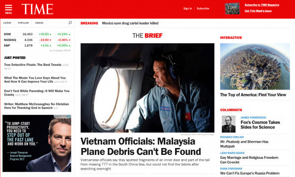
TIME debuted its new website last week and its design is so mobile friendly that even the non-mobile version has a three-line navigation menu up in the top left corner that you see so often now on responsive websites. Hat tip to responsive design, perhaps?

[text_ad]
TIME‘s new site design is clean and offers an abundance of white space with large headlines and font, which is becoming more common on blogs these days. Gone are the days of 10pt Verdana font. They said a serif font would never be a frontrunner for online reading, but every article page is written in Georgia. On the left of every article page you’ll find a list of popular articles, almost resembling a table of contents.

This redesign matches an even more drastic internal overhaul. According to Keith J. Kelly at NYP, “It recently unveiled plans to chop 500 [employees] from across Time Inc.” However, they’re also hiring, too. In fact, Time Managing Editor Nancy Gibbs boasted about their new structure, saying they “have new editors covering national affairs, international affairs, society.”
“Pretty much every area that we cover I have a new leadership team in place,” said Gibbs.
So far so good on all this effort. “The site had 22 million unique visitors in February, up more than 100 percent from a year earlier, according to comScore,” reports Kelly.
This multi-million dollar site redesign comes at a critical time in TIME history. The company is set to branch off from its parent company later this year.
To read more about this story visit The New York Post.


