eMedia Vitals pointed out last week that five major magazine and blog publishers redesigned their websites recently. After studying their before-and-after looks using the Wayback Machine, it’s obvious that all of these publishers paid special attention to graphics in their redesigns, usually opting for more. Social media was also an important factor. Across all of the new designs, we were able to identify five common fixes that almost all of the sites made big changes on.
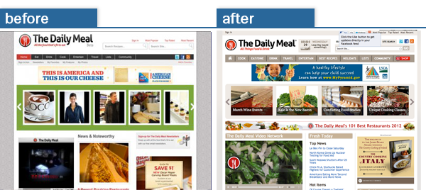
1. Video is prevalent in all of these redesigns. The Daily Meal, run by former Forbes.com CEO Jim Spanfeller launched on October 15th, 2010 and is only a year and a half old, but they didn’t waste any time updating the scenery. No huge changes, but intentional adjustments to the design, colors, and the size of their featured video that is part of a massive collection of videos they’re building and spending lots of money on.
As we all know, testing is the key, and in the case of The Daily Meal, their featured video is on autoplay so that when someone visits the homepage, they immediately start watching the video.
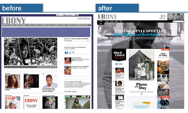
2. Rotating content, or content sliders seems to be the main interactive feature on many of the redesigns. Ebony.com is the hub for Ebony Magazine, who says “Ebony is more than a magazine, it’s a movement”. What’s interesting about the Ebony.com slider is that instead of focusing on rotating imagery, they’ve chosen to go with text. With each rotation, the background image changes on the website, but the text, which is usually the category, title, and subtitle, is what rotates.
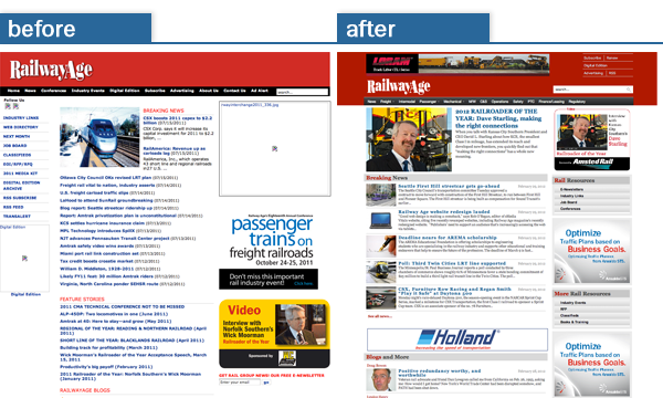
3. Featured graphics to go with articles isn’t just being popularized on consumer-driven sites, either anymore. Railway Age, a B2B magazine turned their text-heavy site into a more multi-media, visually-appealing hub. They also opted for adding (sponsored) video and slider images like the above publishers.
These featured images one-up their existing articles by not only adding interest to specific articles, but they’re now more visually appealing when shared on sites like Facebook, or if the opportunity lends itself, Pinterest. They also designed a better mobile site, added more social buttons and gave their commenting system a boost.
[text_ad]
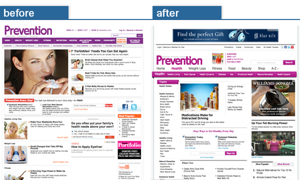
4. Social media integration was also popular (as seen above). In fact, Prevention.com implemented “Pin it” buttons for the wildly popular social network Pinterest and saw over 161,000 visitors in January alone, according to Audience Development.
Actually, “January 2012 kicked off the year with the site’s best month in its history, with more than 3.2 million unique visitors coming, a 44 percent increase. Prevention.com had its third best day ever on January 27, with 420,324 unique visitors,” noted T.J. Raphael from Audience Development.
As a bonus, he notes that “There has been a 20 percent increase in unique visitors through Facebook and an increase of over 790 percent in the number of unique visitors coming from Twitter.” Ad revenues have also picked up 13%.
5. Image-centric designs have also taken the stage. Each of these redesigns found ways to better use the graphics on their websites. Ebony used provocative images as their background, swapping it with each new headline. The Daily Meal found ways to better organize their images, reducing clutter and adding more white space. Railway Age took a text-heavy site and turned it into a multi-media hub, and while Prevention downplayed article images, you can see advertising images took up more space (hence the boosted ad revenues).
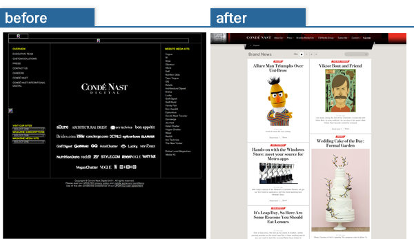
This is no difference for Conde Nast, who went with a Pinterest-esque design for their corporate site that exemplifies the content across their many different properties.
If you’ve been part of a website redesign recently, please do share what you’ve learned, and the major changes you implemented.


Excellent review of the 5 popular changes made on redesigning of the websites like The Daily Meal, Ebony, Railway Age, Prevention and
Conde Nast Etc. With the self explaining Pictures.It very useful to
the Webmasters to update their strategies.