There are a number of consumer health newsletters being published today, mainly in two categories: “guru” or doctor-driven (e.g., The Atkins Letter, Dr. Andrew Weil) and institution-driven, such as the Mayo Clinic Health Letter, a newsletter published by the prestigious Mayo Clinic in Rochester, MN.
One of the challenges of selling paid-subscription consumer health newsletters is that there is already an abundance of health information available on the Web for free. That’s why virtually all successful health letters have either a guru or institution behind them: the subscribers trust the editor; and they rely on him to provide wise, expert counsel in health matters.
The other challenge is price sensitivity. Consumer health newsletters always have low price points, and believe me, all the publishers have arrived at these low price points through testing, not charity. Therefore, you are always at risk of encountering consumer price resistance when asking for the order, and should use copywriting techniques to minimize that resistance.
MayoClinic.com’s Landing Page Scorecard
[text_ad]
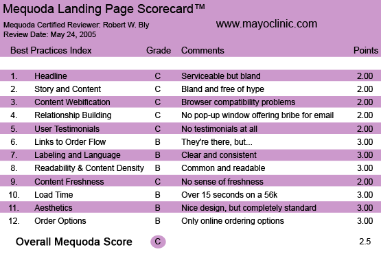
1. Headline (Strategic Intent) – C
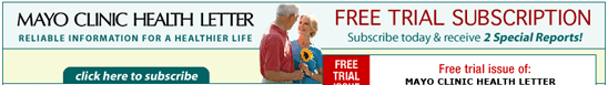
The banner at the top of the landing page contains the publication title and its serviceable, but bland slogan, “Reliable information for a healthy life.”
Placing the newsletter name at the top of the landing page makes sense, because it gets the familiar Mayo Clinic name right up front, where it should be.
To the right of the publication name and tag line is the offer of a free trial subscription with two free reports.
The headline under the banner reads, “Get the medical information you need from the experts you trust!”
Again, serviceable but bland. No one needs more “information” about health, a ton of which is available for free on the Internet—without paying Mayo Clinic $27 for its monthly newsletter.
No, what the reader wants is not information but cures and solutions—medical technologies, remedies, treatments, nutrition tips and health breakthroughs to help us live longer, happier, healthier lives.
2. Story and Content – C
The Mayo Clinic has opted for a bland, non-selling landing page free of hype.
Unfortunately, it’s also free of copy that makes anything but the most minimal attempt to sell us a subscription.
The Mayo Clinic newsletter and the free bonus reports are, I am sure, full of fascinating news and recommendations on health. So why don’t we see a list of bullets teasing us with the promise of getting these secrets if we subscribe?
The Mayo Clinic newsletter has, I believe, a spectacularly successful direct mail package that’s been a long-standing control—written, I think, by top copywriter Mark Johnson.
Why they didn’t adapt that copy for their landing page instead of using the bland pap that appears there? Probably because someone involved with their online marketing believes that “long copy doesn’t work on the Internet”—a myth we know to be patently false.
3. Content Webification – C
The content is fairly well adapted to the Web. For instance, you can click on a cover of the newsletter to read a sample issue online. There are also covers and titles of premiums with hyperlinks, but when I clicked on these links, I was served pop-up windows that were empty; perhaps there was a problem with my browser.
The landing page has multiple links to the order form, which also appears at the bottom of the page. The order form is clean and simple.
4. Email Capture – C
When I clicked away, I was not served a pop-up window offering me a bribe (e.g., a free e-newsletter or special report) in exchange for my email address. This is a huge tactical error for any landing page.
Why? Because if you get the visitor’s email address before he leaves without ordering, you can serve him a series of follow-up emails via auto-responder attempting to convert him to a trial subscription. And, you’ve added another valuable name to your house e-list. Without his email address, you have lost the opportunity for follow up, significantly reducing your conversion rate.
5. User Testimonials – C
I didn’t see any testimonials here. True, the Mayo Clinic name is such a strong brand that the need for credibility building is not as strong as it would be with most other health advisors.
But even though I know the Mayo Clinic name, I may not have heard of their newsletter. And so I need to see testimonials from subscribers, the media, and experts saying that this service is worthwhile and makes money for its readers. And I don’t.
6. Links to Order Flow – B
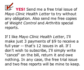
The various links throughout the landing page encourage you to click to order. Clicking brings you to a simple, easy-to-follow order page with a soft offer: you can sign up for a subscription on a bill-me basis.
Traditional health newsletter publishers like Agora and Phillips promote their publications with hard offers; institutional health newsletter publishers like Mayo Clinic and Johns Hopkins seem to use mainly soft offers. This makes me wonder what the pay-up rate is from orders placed on this landing page.
7. Labeling and Language – B
The landing page uses clear language and avoids terms not commonly understood by the target user. Terminology is consistent, and “power words” (e.g., “free trial issue, subscribe now”) are used throughout to encourage ordering.
8. Readability and Content Design – B
The typeface and layout are familiar, common and easy to read. The copy is made readable with the use of subheads, links, bullets and dual columns: there’s a wide central column with the main message, and additional selling copy and graphics to the right.
9. Content Freshness and Urgency – C
I could see having a section on this landing page where health items in the news (those featured in the newsletter) are prominently displayed. But there’s nothing here to make me believe that they haven’t been using this same copy for years. It doesn’t convey a sense of freshness, excitement, timeliness, or discovery.
10. Load Time – B
This is a fast-loading page. When tested on the Web Page Analyzer, the page downloaded in 15.06 seconds over a 56K connection.
11. Aesthetics – B
This is a nicely designed, completely standard short-copy landing page. The design is clean and easy to read, and presents all copy and graphic elements clearly. I particularly like the way the no-risk guarantee is made prominent by placing it in a box with the Mayo Clinic logo.
12. Order Options – B
The primary order option is to click on a link and go to the order page where you can subscribe online. The publisher’s name and address appear at the end of both the landing page and the order page. There is no option to order by phone, fax or email.
You get two free special reports when you sign up for one year, and this is clearly indicated on the landing page and the order page.
The price for a one-year subscription (12 monthly issues) is $27, but that number never appears on the landing page or the order form. Instead, we are told to make “just 3 payments of $9.”
The publisher correctly recognizes that consumer health newsletters have a low price point, and is presenting the price in a manner calculated to minimize price resistance.
Conclusion
There’s very little to dislike about the Mayo Clinic Health Letter landing page. The copy is concise and easy to read; the layout is clean and bright; the graphics are simple and eye-catching.
On the other hand, there’s very little to like—or at least to get excited about—on this landing page, either.
If you divide products into two categories—must-have and nice-to-have—newsletters fall decisively in the latter. No one needs newsletters. As Bill Bonner, founder of Agora Publishing, a large consumer newsletter publisher likes to point out, “Nobody wakes up, taps their significant other on the shoulder, and says, ‘Honey, we need to get some more newsletters today.”
Newsletters do not sell themselves. They need to be sold. And this landing page just doesn’t live up to the copy standards that Agora, Phillips, SoundView, and other successful publishers use to sell their health newsletters.


If you are looking for the robux free online games so here you can visit and can play games in the best quality. While playing these games you can have great entertainment.
Hi Henryk,
We’re not affiliated with the Mayo Clinic, so you’d have to contact them. Sorry!
I am a subscriber to Mayo Clinic Newsletter. Stopped getting it at my current address in Europe. What’s the problem ? Pls. let me know’
HMU
I am a subscriber to Mayo Clinic Newsletter. Stopped getting it at my current address in Europe. Please check and let me know what’s the problem.
Henryk M. Uznanski