How to Make Money Selling Other People’s Books
Many of the best affiliates of Amazon.com are losing opportunities to make money. Poor navigation on their web sites and lack of attention to crucial details is preventing them from reaching their potential as moneymakers. Of the sites we reviewed, there are those that are doing outstandingly well, some who are gliding along, and others who are falling way behind. With a few critical changes, these sites could begin earning top dollar as affiliates.
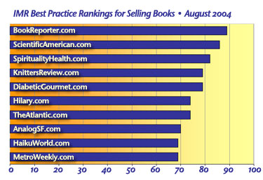
Bookreporter.com was deemed Best in Class by the Mequoda Library’s research team. Bookreporter’s traffic ranking at Amazon.com shows that even though they fall into a “niche” category, they are receiving higher traffic sales than other sites whose names are more recognizable. Also note, the sites that received the lowest grades from us, had some of the worst traffic rankings. (For Amazon.com, the smaller the traffic ranking number, the higher the ranking.)
| Sites | Amazon Traffic Rankings | ML Points |
| Bookreporter.com | 91,825 | 89 |
| ScientificAmerican.com | 15,814 | 86 |
| SpiritualityHealth.com | 30,275 | 82 |
| DiabeticGourmet.com | 131,316 | 79 |
| MetroWeekly.com | 220,711 | 69 |
The Association of American Publishers reports that book sales in 2003 are up by 6 percent, coinciding with the U.S. Census Bureau report that total bookstore sales in 2003 topped $16 billion. Amazon.com is reported as having a $2.3 billion share of that figure. It isn’t that hard to make money as an Amazon affiliate, particularly if you already have a large customer base.
We selected ten sites that were highly ranked on Amazon.com, and researched their sites. According to our 10 success factors, four were doing quite well, four were doing OK, and two needed work. The bottom line is that we found making money as an Amazon affiliate is relatively easy, however, most sites are not living up to their full potential. With a few exceptions, these sites made it difficult to find their bookstores. A pity because a user-friendly site tends to be a profitable site.
[text_ad]
Online estimates suggest that in 2005 affiliate programs and networks will represent 20 percent, or $53 billion, of e-commerce sales. However, in most of those programs, only 5 percent of the affiliates are making the most money. It shouldn’t be hard getting into the top 5 percent.
Bookreporter.com and ScientificAmerican.com are charging ahead of the pack by demonstrating a consistent use of best practices.
Exploding the Myths
Myth #1: It’s unethical to provide a link for buying the product next to the review.
Even the biggest bookstore on the web recognizes that people need more than dust jacket quotes to make a purchase decision. They need the opinions of informed others to help them decide if this book is for them. Amazon.com spent millions developing a system that would allow their customers to review the books they sell, attaching those reviews to the product page. They even went so far as to allow purchasers to rank the reviews in terms of their helpfulness in making the purchase decision. If we’re talking value propositions here, then providing helpful, knowledgeable, perceptive reviews is a valuable service to the book reader/purchaser.
In order to write a credible review, the reviewer has to have read the book. The one is the logical extension of the other. And that much was evidently grasped by the owners of the websites we reviewed. What shocked us was that so few of those sites with a clear “book review” function, i.e., The New York Times book review provided the reader with a link to actually purchase the book! Instead of reasoning that after reading a review, a reader might feel compelled to purchase it, so let’s give them a BUY link, the owners/editors of these sites reverted to the print world position that providing an opportunity to buy on a product review page was tantamount to mixing editorial with advertising. Not so. Providing a link on a review page to someplace the reader may want to go is 100 percent consistent with the nature of the web and in no way violates the editorial and advertising separation of “church and state.” There is nothing unethical about providing the consumer with a link to buying something they want to buy. If anything, it is an extension of the service provided by the review article itself. After all, the reviewer is as much entitled to blast the book, or grant it faint praise, as he or she is in granting it a glowing review. As long as the reviewer is consistent, the reader is benefiting from the information, links and all.
Myth #2: The best merchants all belong to Linkshare and Commission Junction
There are hundreds of affiliate merchant networks out there and many merchants run their own program. Amazon, for example, runs their own affiliate network. They do so because they don’t want to share affiliates with other merchants in an open network and, for now, because direct links to their site helps their organic search rankings. CJ and Linkshare both currently use a link redirect system that neither helps nor hurts the merchants search engine rankings. ClickBank is an alternative merchant network which offers website publishers more than 10,000 products from smaller merchants. ClickBank is very popular with ebook publishers—an excellent product for web publishers to review and sell that offer better than average margins—50 percent is relatively common—and immediate gratification for the customer. Last word: Be creative in selecting the products you’ll review and don’t get stuck with any one merchant. You gotta shop around!
Myth #3: The more you have the more you sell.
Some of the sites we looked at in preparation for this report featured pages and pages of product with little information other than what would be found in an ISBN listing. That might work in some industries but when it comes to books your readers want to know what YOU think. Long lists of products won’t get you the same kind of buyer loyalty and customer satisfaction that a consistently frank and useful series of reviews will.
Best Practices
Mequoda analysts tested several websites that were affiliates of Amazon.com. While Amazon is not the only book affiliate merchant on the web, we wanted to ensure that our research involved the least number of merchant variables. Of the many sites we reviewed, we selected 10 to further study and evaluate. We were then able to determine 10 best practices as the success factors for the sites that deserve “Best in Class” standing. From what we found, there are two particular factors that increase a site’s success above all others.
- Providing a link to book reviews in a dominant marketing quadrant on the home page.
- Providing a link to purchase the book next to the review.
These and eight other success factors that will improve your site and your revenue are defined in detail below.
1. Having a link to book reviews in a dominant marketing quadrant
A link in a dominant marketing quadrant on your homepage to areas that generate revenue has a huge bearing on how much money will come your way. The consumer should not have to hunt for where to find the information you are providing. It should be upfront and in their face.
2. Quality and functionality of browse
It is important that a website be easy to understand and use. The quality and functionality of browsing a site is an important facet for selling products. The customer coming to your site wants to be able to find what they want immediately, and at the same time, you want to entice them to spend more money.
3. Quality and functionality of search
One of the most important functions to have on a site is a search field, particularly larger sites with hundreds of pages of information. This should be in a prominent location and should allow for direct input… not simply a button that goes to another page. The other aspect is that the search produces results that the customer wants. A good search engine is key to a successful site.
4. Book reviews should be in the persistent navigation bar
A persistent navigation bar is a must for any site that wants to be taken seriously. It provides a map, and a consistency, that the user will associate with your site. Further, a link to the book reviews should standout in the navigation bar.
5. Helpfulness of Reviews
Good reviews are crucial when selling a book—that’s why back covers carry quotes from others supporting the book. Informative, lengthy reviews increase a customer’s belief that the reviewer is serious. Other reader ratings are also recommended, because they are not only helpful, they suggest that your site is considered knowledgeable.
6. Credibility of reviewer
Helpful reviews are only useful if they come from a credible source. Give the name of the reviewer, link the name of the review author to other reviews that they have written, reinforcing why they should be trusted—all of these are key to ensuring the credibility of the reviewer, and thereby the credibility of your site.
7. Consistency of the site
Don’t irritate your customer. One of the most annoying flaws on a website is the lack of consistency. A consistent site is pleasing to the consumer, and also helps “brand” the site—it helps it stand out in contrast to other less user-friendly sites. Colors shouldn’t vary too much, and there should be persistent, and consistent, navigation. A consistent site is easy to accomplish—a style guide helps.
8. Links to books should be embedded in the text
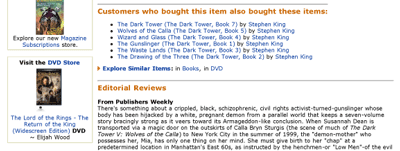
Search engine optimization is key for getting traffic to your site. The more links that you have, the higher SEO rating you receive. An easy way to do that is to embed links to Amazon.com in the text of the review. Every time the name is mentioned, hyperlink it to Amazon. Customers shouldn’t need to search to find out how to buy the book—they want instant gratification. Also, mentioning other books that are similar, or by the same author, increases the credibility of the review and your SEO, not to mention the ultimate value of the purchase. Embed links to those as well. Every link is a potential moneymaker.
9. Let them know from whom they are buying the book
People like to know where they are sending their money, and they don’t want to be confused about it. A site that doesn’t mention their partnership with Amazon.com doesn’t take advantage of the good will of Amazon’s brand and confuses the customer, particularly when a new window is opened and they find themselves at Amazon’s order window.
10. Buy links open a new window
By opening a new window, the customer can look around at Amazon, while still keeping your site in the toolbar. Once customers are directed to a new site, they need to be cajoled back to where they were. A new window solves this problem by ensuring that the old window is still available without hitting the back button.
How 10 Affiliate Websites Ranked
At first glance nearly every site on this list is a relative unknown to the casual web surfer. The only two sites with any significant brand recognition are Scientific American and The Atlantic, publications that have long been associated with quality print information. The rest of the list falls into rapidly growing number of “niche” markets available and profitable because of the web. And that’s the core message of this report. Even a small player in a niche market can achieve an impressive bottom line, precisely because they can focus on a very particular need or interest. It is also important to note that Bookreporter.com, which received the highest ranking, is a little-known website. So having a venerable brand doesn’t necessarily mean instant success on the Web.
| Mequoda Library Affiliate Marketing for Bookstores—August 2004 | ||||||||||
| Sites | BR | SA | SH | KR | DG | H | TA | ASF | HW | MW |
| Link in Marketing Quadrant | 10 | 10 | 10 | 10 | 8 | 10 | 7 | 10 | 10 | 3 |
| Quality/Function of Browse | 10 | 9 | 9 | 10 | 7 | 8 | 8 | 10 | 8 | 8 |
| Quality/Function of Search | 7 | 10 | 10 | 8 | 10 | 3 | 10 | 0 | 8 | 10 |
| Link in Persistent Navigation Bar | 10 | 10 | 10 | 10 | 10 | 10 | 9 | 10 | 10 | 3 |
| Helpfulness of Review | 7 | 7 | 5 | 6 | 7 | 5 | 6 | 6 | 6 | 7 |
| Credibility of Reviewer | 7 | 9 | 5 | 5 | 5 | 7 | 9 | 7 | 5 | 5 |
| Consistency | 9 | 9 | 10 | 10 | 10 | 8 | 9 | 10 | 10 | 10 |
| Embedded Links | 9 | 7 | 3 | 5 | 3 | 3 | 1 | 7 | 3 | 3 |
| Buy From Information | 10 | 5 | 10 | 10 | 9 | 10 | 5 | 0 | 9 | 10 |
| New Window | 10 | 10 | 10 | 5 | 10 | 10 | 10 | 10 | 0 | 10 |
| Score | 89 | 86 | 82 | 79 | 79 | 74 | 74 | 70 | 69 | 69 |
Having A Link to Book Reviews in a Dominant Marketing Quadrant
The Library divides the typical homepage into four marketing quadrants, all of which are “above the fold,” or in the first screen the viewer sees. The quadrants run in a “Z” pattern and are crucial for getting your marketing/selling message across. Of the sites we reviewed, those with a book link in one of the top two quadrants receives a “10,” those with a link in any other quadrant receives a “7,” those with it somewhere on the home page get a “5,” and those with no link get a “zero.”
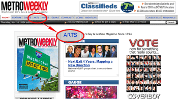 While only one site did not feature a link on the homepage to a bookstore, a few of the other sites made it difficult to find the link on the page, causing the kind of confusion that normally drives customers from the site. MetroWeekly.com did not feature a link to a store on their homepage. Instead, they had an “Arts” link, a label which is ambiguous at best. TheAtlantic.com received a “7” because the link to their book reviews was low in the persistent navigation bar, in quadrant three, along the left-hand side of the page.
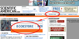
Most of the sites, however, featured the labels “Book,” “Book Review” or “Bookstore” prominently in the persistent navigation bar, generally in quadrant one or two of the homepage. Scientificamerican.com received a Best In Class rating. The “Bookstore” link was front-and-center in the navigation bar, which was in quadrant one on the page. It was obvious and eye-catching, which encourages the customer to follow where the link leads.
Quality and Functionality of Browse
 A typical customer gets on a site to browse, to research a product, or to contemplate a purchase. However, without logical order flow throughout the site, customers will leave. Internet users are goal-driven, they want what they want and they want it now. Each of the sites we rated received relatively high marks in this area. A “10” indicates our test users found what they wanted simply by looking around. The lowest grade we gave was a “7,” due to the confusion of the site.
While DiabeticGourmet.com is an excellent site, it can be quite confusing at times. The site is excessively “busy,” and can often send the customer in circles.
Three sites received “10”s in this category. Bookreporter.com, however, is the standout. With a logical order flow and a simple persistent navigation bar, this site is easy to understand and browse.
Quality and Functionality of Search
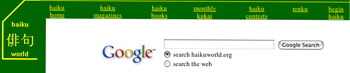 Having a search function is crucial to an information rich website, especially on the homepage. Only one site failed to provide a search engine, analogsf.com. This is NOT recommended. Google.com provides a search button for any site, and it is incredibly easy to use. You simple copy and paste, and voila! Your site has a search engine. Both haikuworld.com and knittersreview.com utilize this service on their site. For the same reason that quality and functionality of browsing is important, having a search field is important. No one wants to hunt around on your site trying to find a specific word or phrase—it wastes time and it is unnecessary.
 |
Can you find the Search box? |
In order to receive a “10” in this category, a site had to provide a search “field” in the persistent navigation bar. As opposed to a search “button” or specific search page, this allowed the user to search from each page, without being linked to another page. Virtually every other site received high marks. A “10” was given to the sites that displayed the search field in the persistent navigation bar. A “7” was given to those with a search button located somewhere on the homepage.
Analogsf.com received a “0,” because their site has NO search function. There isn’t a button, field or attached page. Considering that there are several (this researcher found 10) sites that offer to place a search button on your site, neglecting to do this is ridiculous and ignorant of your user’s needs.
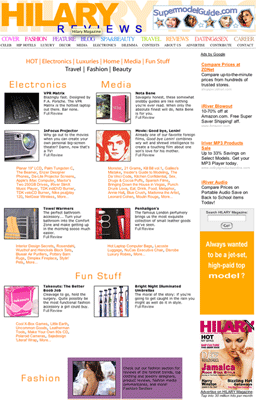
Hilary.com received a “3.” Although their site did feature a search field, it was almost impossible to find… because it was in a column with several ads and looked like an ad! Ads typically run along the outer edges of a webpage, and placing a search field in that area renders it useless.
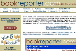
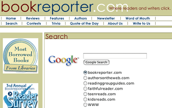
Bookreporter.com has a search button, two in fact, but they go to a blank page (messing up their site consistency ranking), with a Google search field. They do allow the user to search other sites, and as useful as that is, the search page completely distances the user from the original site. UPDATE: Bookreporter.com has changed their search page to better reflect their site. (see Site Consistency below)
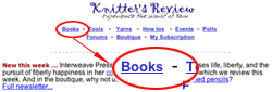
 Knittersreview.com received an “8,” because their search field did not appear on their homepage, but did on their book review page. Their homepage did not even feature a search button, and having to “search” a site to find their search engine is quite annoying.
Scientificamerican.com and DiabeticGourmet.com tied for best in class in this category. Scientificamerican.com’s search field is prominently located in the first quadrant, and offers “recommended search terms” and “advanced search.”
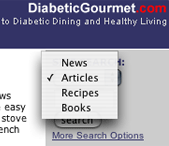
DiabeticGourmet.com provided a search function in a persistent navigation bar, which allowed the user to search news, articles, books, and recipes. No matter where the user was on the site, that search bar was there, unobtrusive, but obvious.
 Book Reviews Should Be in the Persistent Navigation
Persistent navigation is a set of links that direct users where to go on their site and is consistent throughout the site. It can be simple, with only a few links, like KnittersReview.com and Haikuworld.com, or it can be complex, like theatlantic.com. Consistency is key, as is placement of the link in the navigation bar. A persistent navigation bar also aids and directs the user to other, relevant information on the site.
 For our purposes, we rated the sites regarding who had a book review, bookstore link in their persistent navigation bar. Each site that did this received a “10.” Lower scores were given if: a) the link was low on the page and b) the link was named differently, i.e., “arts.”
MetroWeekly.com did not provide a “bookstore,” but an “arts” links. This link was in the persistent navigation bar, and did receive a “3” for this effort. The only other site that did not receive a “10” was theatlantic.com, which received a “9” for being too low on the navigation bar, which was located on the left-hand side of the page.
Scientificamerican.com received best in class for this category. The persistent navigation bar is easy to see and read, and announces “Bookstore” in the first quadrant.
Links to the book reviews are key to being a good affiliate marketer. A persistent navigation bar is a basic service that you should provide to your user. Getting lost on a site is annoying, and a link that goes to a page that does not have a bar, or a way back, quickly drives users from your site.
Helpfulness of Reviews
 |
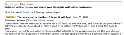 |
A thorough, helpful review sells a book better than any banner ad. To receive a “10” in this category, a review needed to be thoughtful and longer than two paragraphs. We looked for reviews that provided a “star” or reader rating, that directed us to other similar books, and to other books by the same author. In this category, the highest we rated a site was a “7.” The reviews tended to be short and blasé, and did not guide the user to similar books.
Only one site provided a rating system for the books that were reviewed, DiabeticGourmet.com, and it was sporadic at best. Amazon.com has a rating system of 5 stars, where actual readers provide recommendations and rates the books, in addition to their own. This system is highly effective and should be copied.
The three top-ranking sites were bookreporter.com, scientificamerican.com, and diabeticgourmet.com. Each site provided a thorough review of the book in question, but failed at other aspects. They did not recommend similar books, and they did not allow the readers to write in with their take on the book.
When a user is on Amazon.com, they can instantly find information on a book that they want, including several reviews, a list of 5 or so similar books, and ratings by the customers. A good review sells a good book.
Credibility of Reviewer
 As helpful as a review might be, it can seem disingenuous if the reviewer is not cited. Or worse, might be taken from the editor or dust jacket. To receive a “10” in this category, the site needed to provide the name of the reviewer, a brief reason why they were qualified, and links to other reviews that they have done.
The average for most of the sites was a “5,” wherein they provided only the name of the reviewer and not much else. This undermines the credibility of the site and the review. A reviewer should be required to read the book and write a thoughtful review – and sign their name!
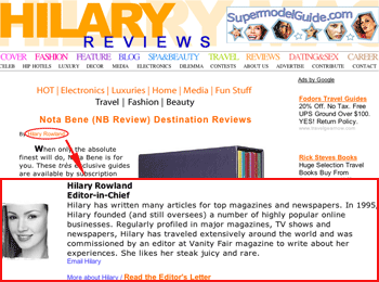
Hilary.com took an interesting approach. The reviewer was not only cited, the name was linked to a short bio on the about page. This is an excellent idea and should be copied.
Scientificamerican.com and theatlantic.com received the highest scores, “9”s. While the reviewer was cited under each review, and a small blurb was written about him, there were no links to other reviews that he had done.
Users are more inclined to buy from a review wherein the reviewer seems knowledgeable. So provide the reviewer’s name, what they do, and what else they have written or reviewed. It makes a difference. Amazon.com is a success for numerous reasons, but this is definitely an area where they shine.
 Consistency of the Site
It is rare that a user buys on their first visit to a site—normally it is the third. If your site is not interesting, encouraging, and memorable enough for the user to come back, they won’t—and you lose money. To earn a “10” in this category, a site had to be consistent along several lines: color scheme, font and font size, navigation bars, and acknowledgment of links, i.e., blue and underlined.
There were really no losers in this category. Most sites were consistent and while their color schemes were somewhat questionable (spiritualityhealth.com), that was not enough to lower the rating. However, colors are very important when selling products. Blue and red both signify power, but blue gives the underlying impression of calm strength. Political figures pay close attention to the colors of their ties for this reason. Colors are important, and if they clash, yikes! So pay attention to what your site is saying to those who visit it.
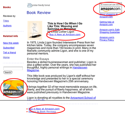
Bookreporter.com was initially rated best in class, but when their search button directed us to a colorless page with only the search field, their rating dropped. However, their color scheme and basic layout design is still an excellent example of consistency.
— UPDATE: Bookreporter.com has changed their search page to reflect their site. Bravo! — (see image)
Scientificamerican.com was deemed Best In Class for being consistent and thorough. The color scheme is simple and carried throughout the site, as is the navigation bar. This site did everything right in this regard.
Are There Embedded Links to Books
Links mean money and a higher spot on the search engine totem pole, the more links you have, the greater the potential to make money. In the same way, embedding links to related books also increases the money kicked back from Amazon.com. A reviewer can recommend one book, and link the review to four others, and the site will receive money for all five books. KnittersReview.com did this well, linking older books to newer reviews. Over half of the sites didn’t provide this service at all, and are missing out on a great opportunity.
TheAtlantic.com received a “1” in this category. They did not embed any links into the review, although they mentioned several books by name (all of which they could have quickly linked to Amazon.com). They finally linked the book (in a small aside), for which they received the “1.”
 DiabeticGourmet.com and MetroWeekly.com both received a “3” in this category for one reason: they named the book in the review, but did not link the name. This is a major missed opportunity! The price at the bottom of the review was linked, as was the image of the book along the right-hand side of the review, but the title IN THE TEXT was not linked. Ridiculous. It’s there, LINK IT.
Bookreporter.com received the highest ranking here, a “9.” It embedded links to the book it was reviewing, but not to other books.
This is not a difficult chore. It is incredibly easy to add links to a site, and by doing so, the site not only receives money, but a high SEO rating. Why is this difficult to understand?
 From Whom Are You Buying the Book
Amazon.com provides affiliates with “buy buttons” to link their sites back to Amazon. This is a useful service that all of their affiliates should use to their advantage. Being an affiliate of Amazon is a good thing; it increases the credibility of your site. Letting your users know that you are in business with Amazon is a boost, do it. It isn’t that hard, Amazon provides the buttons!
Analogsf.com was confusing. They didn’t acknowledge the partnership anywhere on their site, but surprised the customer with a new window when they went to purchase.
Scientificamerican.com had a button on the bottom of each review, noting their partnership with Amazon.com, which gave them a rating of “5.”
Bookreporter.com did very well with this, noting their partnership three times on each review page.
Knittersreview.com received Best In Class. They indicated four times the merchant with whom they were affiliated, as buttons and links.
Do the Buy Links Open a New Window
All that was needed to receive a “10” in this category was a new window being opened. Eight of the sites created a new window when the user clicked the “buy now” button. This is a very simple process to do, and it allows your site to stay on the screen. You don’t want your customers to leave, do you?
One site received a “5.” Knittersreview.com lost points for inconsistency, by only opening a new window occasionally. Haikuworld.org received a “0” for never opening one.
There was no best in class for this category, as 8 of the 10 sites did the task perfectly.
The benefits of a new window are twofold. One, the user never leaves your site. This is important if you want the user to continue purchasing from you. Two, the user understands the correlation between your site and Amazon.com. This is especially important for those sites that didn’t provide this information on their site.
Just Fix It
Provide a link to buy the book. There is nothing wrong with selling on your site. Consumers are more encouraged to buy knowing you reviewed the book and are helping them purchase it. This gives credibility to the site and to the book. As a matter of fact, let readers know that they’re purchasing a book from your site, underwrites the service you provide, namely thoughtful, helpful book reviews.
Give credit to the reviewers. Put their names on it, link the review to other reviews they have done, identify what makes them expert enough to review it. This gives credibility to the reviewer and to the site. It might encourage the consumer to purchase other books from the site. It builds a background for the reviewer that makes the consumer trust the reviewer and return when they want to read about something else.
Add links to similar books. Name books that are similar, in the same genre, or that have been reviewed by the same reviewer, then link them to Amazon for purchasing. This brings money to you, as the affiliate, and it boosts the search engine optimization on your site. More to the point, it makes readers believe you know what you are doing, and that you, too, have read similar books on the subject. Anything that boosts the credibility of the reviewer and your site increases the revenue and returning customers. If you cannot think of any, go to Amazon and see what they are linking.
Collect the email address of visitors when they visit your site. Offer the occasional newsletter or update, this allows you to collect their email addresses when they visit the site. This is an essential part of 1to1 marketing when they visit the site. Quick and simple, this allows you to send them emails when the reviews change, or when you are having a sale. This collects your users, it files them away, and you don’t lose them.
By the Way
There are several other affiliate programs. If your brand is strong enough to stand on it’s own, and you find a better deal, good. Go do that. Amazon.com is a great affiliate, but it isn’t the only one.
Some things to remember when choosing an affiliate to work with:
- A legitimate program should explain exactly what you will receive—you want a clear pay structure. If the merchant beats-around-the-bush, avoid them.
- Look into two-tier programs, which gives you money for referring another affiliate to a merchant. A good way to make extra money is by being paid for your affiliate referrals.
- Look for technologies that help you sell—”iframes” are automated scripts that keep track of price changes or product changes for you. All you do is paste the script into your HTML and the iframe takes care of everything else.


Gentlemen:
My Colleague, John Deighton, HBS, published a case called “BRITA.” I analyzed the data and suggested to John that a BRITA II would be inorder using Conjoint Analysis to identify the optimal combination between in-store promotion and trade advertising.
Dr. Deighton said, “I understand exactly what you want to do, and you have my blessings!” My plan is to incorporate an case using the output of Conjoint, and then encourage the class discussion on interpreting and implementing the results.
Conjoint is a widely used program in Marketing and it would help the students look at the results and work it out in the class room.
May I work with someone??
The first article on Conjoint appeared in HBR, “New way to Measure Consumer Judgments” by Green and Wind.
Please respond. Thank you very much.
Sincerely,
Dr. Ehrman