When Editor Don Nicholas asked me to review BlueDolphin.com, I was a bit hesitant. After all, he served as the Company’s CEO from its inception until 2003, when he ventured off with other business plans… plans that led to our successful “parent” company, Mequoda Group, LLC
For anyone unfamiliar with BlueDolphin.com, it is a huge online magazine retailer offering over 1,500 magazine titles, from bestsellers to hard-to-find periodicals and leading interest publications.
BlueDolphin offers the lowest authorized prices on magazines and a 100 percent risk-free guarantee. If you’re not 100 percent satisfied with any magazine for any reason at all, you may cancel within 90 days and get a full refund.
[text_ad]
Additionally, BlueDolphin offers a free gift with every purchase, the chance to win prizes and exclusive special offers and bonuses. They also have a proprietary free system called MagTracker™ that allows you to manage your subscriptions 24/7 online, with the options of canceling, renewing, changing your address or simply viewing account activity.
Having said all that, let’s see how they do executing all that they promise.
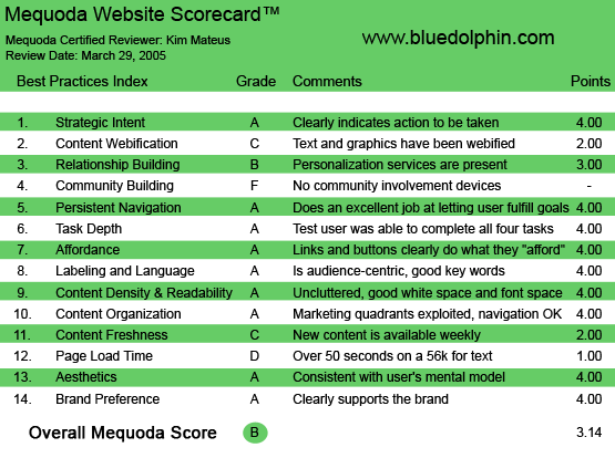
BlueDolphin.com’s Mequoda Scorecard
1. Strategic Intent – A
As soon as I hit the homepage, my eyes are drawn to an inviting, yet subtle, yellow search box. It asks me to search for my favorite magazines. Just below the search box is Browse Magazines, where a list of various genres falls way below the fold. Feeling the need for an afternoon snack and tempted to click on Cooking, I resist and browse instead on the homepage. New arrivals, special offers, this week’s special and this week’s bestsellers—all topics that push the strategic intent of the home page—to get people to search for magazines.
2. Content Webification – C
The text and graphics on the site are webified. Images are the perfect size, the text is very easy to read. The problem is that they claim to offer a product review for each magazine, yet when you click on the product review link, you are brought to a “textbook” explanation of what the magazine is about. It’s more of a product description written by BlueDolphin than it is a product review written by genuine readers of the magazine. Thanks to our friends at Amazon, we now associate the words “product review” to actual product reviews—written by real people—about their real feelings concerning the book or magazine you are about to buy.
As a first time visitor, I would have been much more impressed with real, genuine product reviews of each magazine that were written by actual readers of the magazine. Especially for the special interest magazines and the hard-to-find titles they claim to have. It would help a potential subscriber read what other people have said about the product.
If BlueDolphin really wanted to be on par with the best information retailers online, they would also offer the option to glimpse inside the magazine and allow the user to sample some content before buying.
3. Relationship Building – B
At the top of the homepage, just right of the search box and below the BlueDolphin logo, is a sentence that reads: “Welcome Guest! Would you like to log yourself in? Or would you prefer to create an account?” 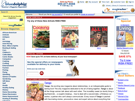
As a first time visitor, I can understand their intent: they want to know who I am. And this is good practice. But I ignore it entirely—after all, I’ve been given no incentive or reason to create an account. Instead I continue browsing.
I find a magazine I like and I click to buy. I’m taken to a shopping cart page. On this page, I am drawn to a yellow button that says “Proceed to Checkout.”
I click to proceed, and I get the same page, this time with tiny text that is highlighted in pink across the top of the page that reads: “One or more items in your shopping cart are missing information. Make sure you’ve entered shipment information for each item.”
Confused, I look down at my shopping cart. Ahh… there in red letters is the problem: You must specify a delivery address for this item.
OK… they don’t know my name, but they want my address?
So I click on a link that says Change my Delivery Address, because it is my only call to action, and I’m taken to a “blocker” page that looks like this:
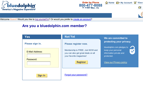
Only now do I realize that I have to create an account in order to buy something. Perhaps I should’ve received the blocker page the second I clicked to buy a magazine. This way, I would’ve understood the necessity to create an account. This was a little bit frustrating.
Anyhow, I proceed to creating an account. As I’m filling in my name, address, etc., I see at the bottom of the page that I’ve been given the option to receive different newsletters.
- This Week’s Special
- Editor’s Notebook
- America Today
- Women’s Living
- Just for Me
This is why they get a B—the newsletters are a way for me to personalize my content. Especially the Just for Me newsletter, which are personal customized magazine recommendations based on previous purchases. You get preferred-member-only exclusives on magazines of particular interest to you.
Another place that I noticed they had some personalization features is when I tried to change my address and cancel my order. To complete those two tasks, I went to MagTracker™. This is where I was able to complete all my customer services inquiries, and this is where I found a link to “Find Similar.” When I hit “Find Similar” I was brought to a page that listed all the magazines they felt I might be interested in based on what I had just purchased. So here, hidden in MagTracker™ is another place BlueDolphin personalizes your content.
4. Community Building – F
I had to give them an F in this category. Nowhere on the site am I prompted to contribute anything. Some may argue that on a retail site such as BlueDolphin, a community device isn’t needed. But I’d have to argue back by pointing to one of the most successful retail sites out there: Amazon. How do you think they were able to build such a strong, loyal customer base?
Part of the reason is because Amazon customers don’t just feel like customers, rather, they feel like they’re part of the Amazon equation. They contribute something. Their opinion matters. It’s human nature to feel the need to belong, and without giving users the option to participate, BlueDolphin is leaving that potential connection on the table.
They could certainly model Amazon when it comes to community building.
5. Persistent Navigation – A
BlueDolphin’s navigation is very clear and easy to follow. If the main goal is to search their archive of magazines, then they have made this very easy to do.
No matter where you are in the site (except for the order flow) the left hand navigation does not move.
So if you clicked on a magazine to learn more, but lost your interest in buying, you could easily continue searching for other magazine titles.
6. User Task Depth – A
In order to determine their grade on task depth, I assigned myself four typical tasks:
- Search for a particular magazine
- Order a magazine
- Cancel a subscription
- Change my address
Before I even begin my attempt to complete the four tasks, I am drawn to a toll free phone number that is right there on the top of the page. Order by phone, 9-5 EST Mon-Fri. A website that immediately provides me with a number to call? It’s almost revolutionary! I’m guessing I can pretty much do it all by phone—order, cancel and change address. Bonus! 
Searching for magazines was a breeze. As I mentioned earlier, they have a nice, inviting yellow box right at the top of the screen asking me to search for a particular magazine. If I wasn’t sure of the name, I could search instead by topic, which is also extremely easy to do. Additionally, when you search by topic, they give you a pull-down menu asking if you want the results by bestseller, alphabetical order (A to Z or Z to A), or by price point (Low to High or High to Low). Very nifty!
Ordering was just as easy (OK, well, almost as easy). With the exception of the trouble I experienced with attempting to buy without being logged in, the process was pretty simple. Once you are logged in, all you have to do is click on a magazine for more information. They provide you with a “buy now” link or an “add to shopping cart” button. They also offer the option to give a gift. Once you add to cart, you are brought to a page showing your shopping cart. Here you may update your cart by removing unwanted items, etc., or you can continue shopping. You are then prompted to “Proceed to Checkout,” or “Order Now with QuickShop.” QuickShop is a program that will recognize all your information if you let it, and allows you to shop without having to re-enter your credit card information.
BlueDolphin’s MagTracker™ makes both canceling and changing addresses a very painless process. You simply click on the MagTracker™ link, and it brings you directly to a page listing all the magazine’s you’ve purchased and you are given the option to click on “questions,” “cancel subscription,” “change address,” “add magazine” and “find similar.”
In addition to MagTracker, they have a Customer Care section. So they’re covering all their bases in more ways than one.
7. Affordance – A
The affordance on this site is great. Because the left hand navigation is just a long list of magazine topics, they decided not to use blue underlined links. Instead, they chose to use mouseovers in order to see that it is underlined. While this practice may be frowned upon in other circumstances, it is perfectly acceptable here. If each of the 56 topics were underlined, it would make the list hard to read.
All the buttons on the site work well. What looks like a button is a button, and they bring you exactly where you expect to be going.
In the top navigation, you will find links to Home, My Account, View Cart, Customer Care and Sign Out. Each of these links change color as you mouseover. Nice and clean.
8. Labeling and Language – A
The labeling and language on this site is great. Very easy to understand, no use of technical jargon at all. Search, manage your account, new arrivals, special offer, all terms that not only speak my language, but that cover everything that I may possibly want to do on the site.
9. Readability (Content Density) – A
Their use of white space is perfect and their use of color is great. The balance of graphic to text works very well and the design of the individual pages avoids confusion at all costs.
The one very tiny bit of criticism I might have is that they’ve chosen to use a color that is too close to red as their Submit Order button. I’m sure that their intention was to make the color orange, but on my screen (Macintosh) it appears almost red, and our western culture tells us that we associate the color red with stop. “Stop” being the last thing they should want going through someone’s head as they are about to submit an order.
I’d recommend lightening up the orange a bit more, again, more closely resembling the orange that Amazon uses as their order button. Other than that, BlueDolphin is a very pleasing site to read and navigate. 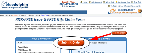
10. Organization (Marketing Quadrants) – A
Perhaps the inventors of the Marketing Quadrants came from BlueDolphin? Right there in the first quadrant is the option to search, and the option to order by phone. So what are they telling you right from the start? They’re saying, “Please stay awhile, search for your favorite magazines, and if you have any qualms or questions about buying online—no worries! You can order by phone!”
Their second quadrant is also perfectly exploited. Here is where you can manage your account with their great MagTracker. You can also contact Customer Care, view your cart, or log into your account. They have given you multiple entries to accomplish the same task. Some could consider that annoying, in this case, I’d consider it downright usable.
In their fourth quadrant, they have placed their “This Week’s Best Sellers.” This, they probably did intentionally. They wanted to communicate to the user that the site is updated as least weekly, which reinforces to the user that this is a live, functioning and active site, which leads to our next criteria.
11. Content Freshness – C
The only inclination I’ve been given concerning content freshness is the “This Week’s Special” and the “This Week’s Best Sellers” feature.
While I’d have to check back in a week to see if it is actually being updated, I’m pleased that they’ve at least made this attempt. I know of many retail sites that don’t find it necessary to indicate when their content is updated. Arguably, this may not be so bad on a retail site, but on the other hand, any type of e-commerce needs a time ticker. Users need to be reminded of how often they should be checking back for new information or products. Otherwise, you may lose them for months on the thought that they have no idea if you’ve added anything new. 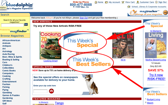
12. Load Time – D
OK, so it may take a while to load on 56K. I felt no frustration on my broadband connection.
Are people even still using dial-up? Yes! The answer is a resounding yes. For those of us in metropolitan areas or on either coast, that may seem unbelievable. All we hear about broadband usage is that it’s growing—and it is, but according to studies done by Website Optimization.com, in February 2005, 43.71 percent of home users in the US were still connected to the Internet at 56Kbps or less.
If you’re running a website, you must not forget this! And, it would behoove you to stay current on the stats. Website Optimization releases a monthly Bandwidth report. It’s compiled using data from the Nielsen/Net Ratings.
13. Aesthetics – A
The aesthetics of site couldn’t be better. The user visits the site because they are looking for magazines. And what do they find immediately upon hitting the homepage? They find the option to search for magazines. Also, as I mentioned earlier, their use of color, white space, typeface and graphics are all perfectly appropriate with the site’s intended personality and image.
They want to make buying magazines easy and painless, and they’ve designed their site to look just like that: easy and painless.
14. Brand Preference – A
BlueDolphin certainly supports and builds its own brand. Their offer is great. I buy magazines from them for the lowest price available, I have 90 days to cancel, and I get to keep all the issues and any free gift I may have received. Additionally, I have the option of canceling my subscription online, with no hassle whatsoever. No questions asked, nobody to call, just a simple click and my subscription is cancelled. And, if it’s within 90 days, I get a 100 percent refund and I get to keep any issues or free gifts I have received. What magazine company can beat that? Plus I can order and manage all my magazines this way? It’s perfect!
Additionally, they send out five newsletters that keep me updated on BlueDolphin and politely remind me to revisit them for special “members-only” discounts and specials.
Conclusion
BlueDolphin’s final score was a B. The F they received in Community Building really hurt their score.
My first suggestion would be to include adding a real product review feature, simply because this is what annoyed me most about the site. I’d love to know how readers feel about the magazines. As an avid Amazon shopper, I guess I’ve been spoiled with real reviews. I understand this may be a difficult feature to add to an already successful website, but it certainly wouldn’t hurt to survey their members and test it out.
Another suggestion I have, which may in fact be more important, is that they put their newsletter sign-up on the homepage.
Think about it: I’m a first time visitor to BlueDolphin. All I can tell from the homepage is that they want me to search for magazines. I’ve been given a hint that they want to know who I am, based on their statement… “Welcome Guest! Would you like to log yourself in? Or would you prefer to create an account?” But I have no idea they want me to become a member! If that is in fact the first thing they want you to do, perhaps the Welcome statement should instead say something like…. “Welcome Guest! Would you like to become a member of BlueDolphin? Membership is free and grants you special offers and discounts on all your favorite magazines. Plus you can be kept up-to-date on BlueDolphin’s offers by signing up for our free newsletters.”
Other than those two items, BlueDolphin was a very pleasant site to review. They have a lot going for them: a great offer, a huge selection, skilled website designers and stellar customer service options. Once I’m done “testing” the magazine I had to purchase to research this review, I will undoubtedly be back to join the rest of America in making BlueDolphin my magazine superstore.


