Top Chef, Iron Chef, Rachel Ray, Bobby Flay – seems like America’s new favorite hobby is cooking. Publisher Cook’s Illustrated, one of the grand dames of the industry, is also in the mix. In addition to their TV show on PBS they have a Website and free email newsletter, which we’ll put to the test today in this email newsletter review.
e-Notes is a free monthly email newsletter published by Cook’s Illustrated under their “America’s Test Kitchen” brand. It is marketed as providing:
“…cooking advice, test results, buying tips and recipes about a single topic
each month—from chocolate to fruit desserts or onions…”
Subscribers are also told they will receive news or articles being prepared for future issues of Cook’s Illustrated and exclusive offers on cookbooks and publications. Another plus: Cook’s offers an incentive—a free trial issue of Cook’s Illustrated, a print magazine—to encourage sign-ups.
In writing this review, I relied on five recent issues of the email newsletter, September 2006 through January 2007.
So did Cook’s Illustrated win the challenge? Or should they pack their knives and go? There are some tasty things about e-Notes:
- It’s well positioned to support the business goal, which is to sell subscriptions and books.
- The content was superb; one of the most interesting, varied and successful mixes I’ve seen.
- The opening paragraph is very personable and makes you want to stop what you’re doing and read.
And some things that aren’t so appealing:
- The subject line doesn’t do the content justice.
- The look of the preview pane is bland and not engaging.
- There’s no attempt to use e-Notes as tool for growing the email list via word-of-mouth marketing.
Bottom line: There’s a lot of potential here, but e-Notes has a way to go to earn the equivalent of the culinary industry’s highest award, three Michelin stars.
[text_ad]
1. Delivery – C
A colleague forwarded me all five of the issues of this newsletter that I reviewed. I did sign-up to receive the newsletter in December, but I did not receive the January or February issues (although my colleague did). Was my copy filtered as spam? Or was there a delay or problem adding my email address to the email list? Unknown. But it’s something I would recommend Cook’s look into.
Another suggestion for Cook’s: add a white list request to the email newsletter. Having readers “white list” you (by adding the address you send from to their address books) is the only effective way to ensure deliverability through desktop spam filters. Best practice is to do this in a prominent location within your email newsletter; I’d also recommend that this be included during the email newsletter sign-up process, on the thank you page.
On a positive note, Cook’s does a great job of sending the email out on a regular basis. It usually arrives on the first Friday of each month, in the afternoon (east coast time). This is an appropriate delivery schedule for a consumer audience who will probably read it over the weekend.
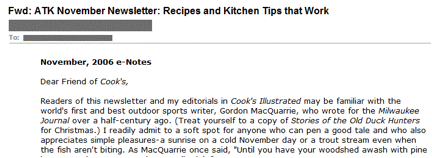
2. From Line – B+
As soon as this email newsletter arrives in your inbox you know who it’s from, which is good (Figure 1). It’s instantly recognizable to readers. Cook’s just needs to decide which of its two brands to lead with here.
The Cook’s display from address was inconsistent over these five issues – four times it read “CooksIllustrated.com” but once (in the December issue) the email came from “America’s Test Kitchen.” Switching display from address from issue-to-issue risks that your readers won’t recognize you; Cook’s should standardize on using one of these brands for their display from address and stick to that.
On a positive note, the actual from address (cooksillustrated@americastestkitchen.com) was consistent through the issues, which is critical for deliverability (since many filters will white list based on this address).
Figure 1: From and Subject Lines
![]()
3. Subject Line – D
The subject line (Figure 1) could be more engaging and benefit-oriented; it’s the same each issue except for the month. I’d like to see Cook’s entice us with something unique that we’ll get if we read this particular issue. For instance, “[ATK] Top 10 Gift Suggestions” for the December subject line or “[ATK] Easy Fall Breakfasts, Keeping Food Warm and Tea Infusers” for the October issue. This type of subject line would also push the benefit to the left – right now the only possible benefit (“that work”) is at the end of the subject line and may be missed.
They should keep the “ATK” moniker, short for America’s Test Kitchen in the subject line (I’d put it in brackets to set it apart). When present at the front of the subject line it’s a nice companion to the “CooksIllustrated.com” display from address and gets both brands in there.
On a high note: the current subject line doesn’t sound particularly “spammy.”
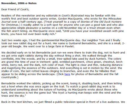
4. Preview Pane – D
Cook’s should be making better use of the preview pane (Figure 2), the top 2 to 4 inches of the email, to engage readers. There’s no logo here, no benefit-oriented headline or title, no link to view the email online. The one positive: since there are no images the preview pane looks the same whether or not images are blocked.
Figure 2: Preview Pane
[text_ad]
5. First Screen – C
This email newsletter pulls you in right away. Christopher Kimball (Founder and Editor, Cook’s Illustrated and Cook’s Country magazines) writes a conversational opening note to readers full of his personal experiences and folksy-but-relevant stories. It’s like a note from a friend, guaranteed to bring a smile and something of interest, in each issue.
My only “beef” (pardon the pun) with the first screen (Figure 3) is the lack of a table of contents. Letting readers know, at a glance, what’s in each issue would allow them to dive into what’s really of interest to them. Including links so they can go directly to an item of interest is even better. Expecting readers to scroll or read through the entire newsletter each month is unrealistic.
Figure 3: First Screen
6. Look and Feel – D+
While I usually applaud minimal use of HTML, I believe Cook’s has taken it a little too far. The newsletter initially appears to be text-only—until you notice the bold headlines and embedded links. Doing just a bit more with the HTML, for instance a Cook’s Illustrated or America’s Test Kitchen logo in the preview pane, would aid in recognition, reinforce the brand and create a common design element between the newsletter and the website/landing pages.
Cook’s should also consider using an additional image or two to break up the copy of the email newsletter. We’re talking about food here and presentation is a big part of the appeal. Why not include a small picture of each month’s feature recipe to further encourage readers to try it at home?
The text itself is formatted very well—lots of white space and short paragraphs (once you get past Christopher’s opening remarks) make it easy to skim.
7. Content and Tools of Engagement – B
The Cook’s newsletter has excellent content—some of the best I’ve ever seen in a free email publication. It’s written in an engaging voice, it’s interesting and it’s reader-focused. The variety (7 to 11 items a month) assures that something in each issue will be of interest to each reader. By mixing together guides (“Everything You Need to Know about Gravy”), menus (“An Intimate Thanksgiving Menu”), product reviews (“Equipment Corner: Pie Servers”), recipes (“Cranberry-Pear Butter”) and more they keep the readers’ interest.
Involving subscribers with the newsletter is another best practice. Cook’s does offer a link to send thoughts to an editor and a free bulletin board to communicate with other Cook’s readers. Still, it would be nice to see some surveys, polls or other items to further encourage a two-way relationship with the publication.
Even with the large group of ads at the end, the newsletter is well positioned with regard to the 60/40 rule; in an email newsletter, it’s a best practice to make at least 60% of your copy editorial and no more than 40% promotional. An analysis of these five issues, based on column inches, showed an average of 62%/33%/5% editorial/promotional/housekeeping (things like contact us, unsubscribe links and forward-to-a-friend information).
But each issue of this email newsletter is very long, too long to comfortably read online for most people (4-1/2 printed pages, on average). There’s so much here that they could easily split it into two and go to a twice-a-month delivery. This would accomplish two things: it would make each issue more manageable for readers (right now there’s a lot to sift through) and might allow them to engage more readers each month, since someone who missed the first issue each month might catch the second.
8. Business Goals – A
The strategic intent of the Cook’s newsletter is clear: to generate leads for the paid products, which include print and online subscriptions as well as books. Each issue includes at least three calls-to-action (Figure 4) for Cook’s products. They are strategically positioned in the midst of the editorial content so that they won’t be missed by readers. And they are tastefully done. The editorial content supports the business goal by giving readers a “taste” of what Cook’s has to offer.
It appears they also have a secondary goal—to generate advertising revenue by including ads from the sponsors of their PBS television show. These five to seven ads run at the end of the newsletter. Each month features the same companies and all but one run the same copy each month—kudos to Woodbridge Wines by Robert Mondavi for changing up their copy each month and targeting it to the season. While these probably do bring in ad revenue, the value to the reader is questionable (except for the Mondavi ad). I expect that most readers just ignore this section, since the information is mostly the same from issue to issue.
Figure 4: Call to Action for Paid Product
9. Footer – B
Cook’s does a pretty good job with their footer. There are links to unsubscribe and change your email address and Cook’s U.S. Postal Service address appears prominently. The one thing missing: a copyright notice to protect their intellectual property.
10. Other – D
There is a disconnect between what readers are told at sign-up and reality. With the exception of the December issue, which was all about the holidays, I didn’t see the “single topic each month” focus that was highlighted on the opt-in page. But the email newsletter is so good, I’d recommend updating that marketing copy rather than messing with the content strategy. Cook’s does meet expectations set at sign-up with regard to frequency.
Also, Cook’s is missing a word-of-mouth marketing opportunity by not encouraging readers to share this very interesting email newsletter with their friends and giving anyone who receives a forwarded copy the ability to sign-up themselves.
Conclusion
Cook’s Illustrated ATK e-Notes is a good email newsletter. Its strength lies in the content, which is excellent. But there are other elements, especially the subject line, preview pane and look of the email newsletter, which could be improved upon to better engage readers. These changes wouldn’t be expensive or time consuming, but they should provide a lift in clicks (which should domino into a lift in revenue) as they are implemented.


PLEASE UNSUBSCRIBE ME FROM AMERICA’S TEST KICHEN. TOO MANY EMAILS COMING IN AND NOT PLEASED WITH WEBSITE. THANK YOU
HI Barbara,
We are not in charge of America’s Test Kitchen’s email list. I recommend contacting them directly if you want to be unsubscribed from their list.
Donna, please contact ATK directly to unsubscribe from their list. http://www.americastestkitchen.com/
Laura, CP and Gayaura — we can’t unsubscribe you. Please contact ATK or CI directly to unsubscribe from their list.