Roll Call Website Remains True to its Founding Principles By Using Simple, Effective Website Design, Yet Misses the Boat on a Few Small Details.
This website design review proves that RollCall.com, the flagship site for Roll Call newspaper, gets it right. This publication is widely read by those people on Capitol Hill that have a need to know what is happening on the Hill. Roll Call has a well-established reputation as the source for inside information on politics and government in Washington. In establishing a Web presence, Roll Call could have, as so many publications before it, focused on the technology of the Web and lost that which makes it unique. Spending some time with this site doing this website design review provides convincing evidence that Roll Call has remained true to its founding principles. “The Newspaper of Capitol Hill Since 1955.”
- The publishers of this site have created a user experience that is well aligned with, and meets, visitor expectations
- This site does a very good job of following recommended online marketing precepts—visitors are not required to scroll to see important content or equally important marketing messages
- The publishers of Roll Call have done an excellent job transferring the quality and value of the print edition to the Web—the site is to-the-point, easy to use and full of value
- Roll Call subscribers are offered a number of email notifications; a better strategy would have been to offer non-subscribers the same options as a way to build relationships
- Embedded linking would enhance the usability of this site, and would facilitate the ability of visitors to create their own paths
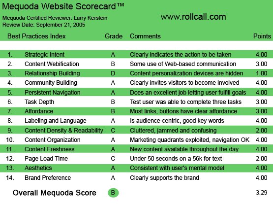
RollCall.com’s Mequoda Scorecard
[text_ad]
1. Strategic Intent, or Purpose – A
Visitors to the RollCall.com website know exactly what they want. The Roll Call newspaper has been published on Capitol Hill since 1955. It is the premier source for congressional news and information. When visitors come to RollCall.com, they are looking for the inside scoop from the Beltway. Fortunately, this website is designed for the visitor. Its design is clean and clear, making navigation obvious and access intuitive. The publishers of this site have created a user experience that is well aligned with, and meets, visitor expectations. Visitors know exactly what actions to take in order to meet their objectives. And the design of the site encourages visitors to engage in actions that the publishers want visitors to take. The functionality of this site directly supports the monetization model. One must subscribe in order to view full articles. No ifs, ands or buts. No subscription, no content. In addition, the site displays banner ads on all pages, both preview and complete article pages. As a well established site, with a leading reputation for unbiased reporting of political news, RollCall.com can credibly require visitors to pay for a subscription in order to view content. Unfortunately, the subscription model is decidedly less than user friendly. But more on that later…
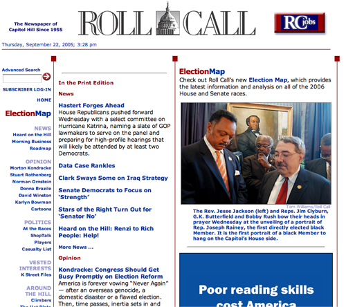
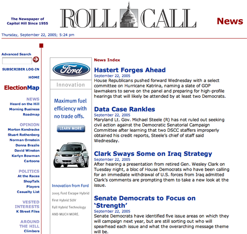
RollCall.com’s Homepage
2. Content Webification – B
This site does nothing fancy. That is at once its strength and its weakness. To the extent that this site leverages the unique characteristics of the Web, it does so in a limited fashion. Subscribers can download an electronic version of the daily Roll Call print edition, increasing convenience and providing timely access to the print edition. In addition, the site is updated throughout the day, and as such, provides up-to-the-minute news about the happenings on the Hill. The “Election Map” functionality offers an interactive approach to various congressional races on a state-by-state basis. The site also offers what it calls “advanced search,” providing easy and direct access to the content available on the site. It even provides the daily menu for the House and Senate cafeterias. The site does not, however, deliver any multimedia content, nor does it facilitate creation of an online community, two typical features of online financial publications, for example. It creates a “community” on the strength of the value and currency of the information it publishes.
It creates a “community” on the strength of the value and currency of the information it publishes. It even provides the daily menu for the House and Senate cafeterias.
3. Relationship Building – D
The RollCall.com website has much to offer to potential subscribers. This site is one of very few sources of credible information about Washington politics and government policy available on the Web. In fact, once you become a subscriber, you can choose to receive email notification of late breaking news, you can be notified of the posting of the latest print edition to the website, you can be notified of special events, special news features or special offers, and you can be notified of offers from related companies or companies of interest. Clearly, these email notifications represent multiple opportunities to engage with potential subscribers. The content of these emails is compelling and gives the recipient a tangible sense of the quality and substance available from RollCall.com. In short, these email alerts could easily increase subscription rates on the site. However, visitors must subscribe to the Roll Call publication in order to receive them.
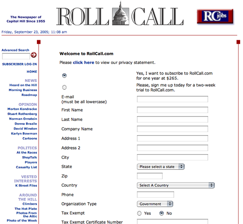
The subscribe page, which offers a two-week trial.
4. Community Building – A
As is the case generally with the Roll Call website, there is an implicit presumption that compelling content is sufficient. This philosophy applies to community building. There is no explicit content or design element that is focused specifically on community building. However, the site does provide just the right variety of content to entice an existing community of interest and to keep members of that community coming back to the site. In some sense, the subject matter explored, reported on and commented on, is sufficiently compelling to maintain a community of visitors to this site.
5. Persistent Navigation – A
The Roll Call website presents a clear and consistent navigation scheme that is anchored by the global navigation menu in the left hand column. This menu is persistent, remaining unchanged from page to page. When you click on one of the menu items, the page that is served includes articles and stories that are typically the target content sought by the visitor. There are few instances of multiple levels of navigation on this site, and so the left hand navigation is sufficient for navigating most of the site.
The site does send visitors off-site fairly frequently to other, relevant sites that present political and government content. This is a double edged strategy, in that visitors who leave the site are not likely to return. This may not be particularly attractive to current and potential advertisers.
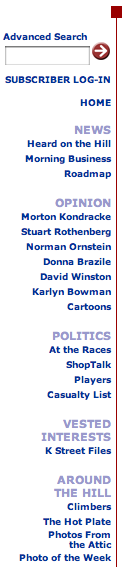
Note: A clear and consistent navigation scheme that is anchored by the global navigation menu in the left hand column.
6. User Task Depth – B
RollCall.com is single minded in its desire to create new subscriptions. If you are not a subscriber, you cannot obtain access to any of the content on the site. On less well-known and well-established sites, you might find some content that is generally available to give visitors a taste of the goods, and convince them to sign up. Not so here. This site never gives away anything. And so, there is plenty of motivation and opportunity to complete the tasks necessary to obtain access to desired content. All you have to do is subscribe. And, in fact, if you aren’t convinced you want to become a subscriber, you can sign up for a two-week trial subscription. The steps necessary to complete both the trial subscription and the real subscription are simple and straightforward. However, this site makes, in this reviewer’s opinion, the cardinal mistake in the online subscription game. In order to sign up for a trial subscription, the visitor must provide credit card information. In many instances, this requirement will present a significant enough barrier so as to prevent subscription. Requiring a credit card may well exceed the risk threshold for many visitors.
In addition, the subscription flow can be confusing. There are two pages in the subscription flow, the first of which is an information collection form, and the second of which is the payment method page. Although the form page does inform the visitor that a credit card will be required, this information is easily overlooked. When I went through the subscription process, I decided that I didn’t want to provide my credit card information simply to participate in a trial subscription. However, I did submit the form before being confronted with the credit card page. Feedback from the site suggested that I had created an account, but I could not log in, nor could I view any content. In addition, when I returned to the site, having decided to go through with the full subscription process, I was told that I had to select a different username and password combination, as my chosen username was already in use. So, I seem to have been partially registered. This caused unnecessary confusion and complication, and further increases the likelihood of dissatisfied visitors.
7. Affordance – B
While RollCall.com is packed with content, the user is never confused about navigating the site. All links are text links. In addition, the links presented on this site are presented in a wholly consistent fashion. Each link looks like all the rest. Links are presented in text format and are colored blue, however, the identity of these links would be even more obvious if they were underlined. For the most part, this site avoids making it “the user’s problem.” The visitor is never put in the position of having to guess where to go next, or how to get there.
Embedded linking would enhance the usability of this site, and would facilitate the ability of visitors to create their own paths.
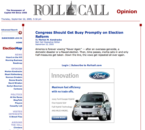
8. Labeling and Language – A
If you are “in the know,” there is a compelling temptation to communicate with language that is familiar only to the initiated. Reporting on Capitol Hill insiders could easily include terminology and language familiar only to those on Capitol Hill. This is not the case with this site. All of its articles and reports are presented in an understandable and well explained fashion. However, none of the compelling and interesting elements of the site content is lost as a result. In fact, the use of colloquial language actually increases the impact of stories reported.
9. Content Density and Readability – C
As noted, the content presented on this site is engaging and resonant. The site operators have chosen a range of topics that is immediately relevant and interesting to a wide variety of audiences interested in how, and why, our government operates the way it does. The site uses a three column grid design, which is typical of most successful websites. However, the right hand column, in which banner ads are presented, is given more page geography than it might. Because so much of the page is devoted to advertising, the page content often gets squeezed. This is especially true of the summary pages, in which site articles are summarized. It is often harder to read the copy than it should be. Limited page space in the center column, where page content is presented, produces short lines of text. This condition increases the difficulty in maintaining continuity in eye scanning, and reduces the overall readability of the content presented on the site. Too often readability on this site is sacrificed for the need to cram as much advertising per page as possible. To its credit, the site does employ bolding to highlight some words and phrases throughout the copy. This technique recognizes the fact that visitors will tend to scan a page to determine relevance before reading in detail.
10. Organization – A
As noted earlier, this site uses the typical three column grid for its page layout. The top banner includes a navigation link to RCJobs.com, their sister job site. This is the navigation or content element in the top banner and, as a result, gets plenty of visibility. The main menu is displayed in the right hand column and presents two levels of navigation in an effective and efficient fashion. The right hand column is used to promote highlighted content and to present banner ads. The main, active (center) window presents relevant content in the form of articles, commentaries and other resources. The active window also displays banner ads and other promotions, sometimes to the detriment of site readability.
This site does a very good job of following recommended online marketing precepts. Visitors are not required to scroll to see important content or equally important marketing messages. Consistently, from page to page, this site follows the concept of eye scanning, placing high priority content and promotional material on the page in a visible and easily identifiable fashion.
11. Content Freshness – A
This site updates its content on a regular basis by definition. News reports and articles are cycled on a daily basis, while breaking news is updated continuously. Other features are updated on a less frequent basis, but there is no question in the visitor’s mind that the news they are reading is up-to-date, if not up-to-the-minute. It is reasonable to presume that subscribers visit RollCall.com on a daily basis. As a publishing site, the content and its freshness is an inherent aspect of the business model upon which the site is based. Ads change, offers change and content is updated regularly. The world of politics is nothing if not dynamic, and Roll Call keeps up with the changes, and when it is at its best, it’s ahead of the curve.
This site updates its content on a regular basis by definition. News reports and articles are cycled on a daily basis, while breaking news is updated continuously.
12. Load Time – C
The load time for the homepage is 45.92 seconds over a 56K connection. While the total number of HTML requests is limited, there are 17 images that are loaded with the page, including banners and navigation menu rollovers, and this is increasing the download time for the homepage, as well as interior pages. The total size of the homepage is over 229Kbytes, while the optimum size for rapid download is below 100Kbytes. Layering content by loading the most relevant content for users first will help reduce the perceived delay in download time.
13. Aesthetics – A
The Roll Call website is clean looking, information rich and intuitive. As such, the design of the site will meet most people’s expectation for professionalism. The site is about information and communication, and its clean, no nonsense design support those objectives very effectively. The look and feel and overall design of the Roll Call website is utilitarian. There are few if any extraneous content or design elements. No large and cumbersome images, other than banner ads, to get in the way of the main function of the site, which is information presentation. Roll Call is a publisher and the design reflects the information oriented nature of the site. It is clear to the casual observer how the information presented on the page is categorized. As noted above, banner ads are displayed prominently in the active window and the right hand column.
14. Brand Preference – A
On the Web, brand preference is established and reinforced by providing visitors with successful user experiences. Ease of use, relevance, visual consonance, credibility and confidence all contribute to a successful user experience. Unlike traditional media, indirect branding is seldom effective in the online environment. The Roll Call site does an excellent job of reinforcing brand by providing visitors with an easy-to-use, intuitive website. The ability to download a PDF version of the print edition further reinforces the Roll Call brand by closely associating the familiar print version with the website. The site clearly leverages the visibility and fame of writers like Morton Kondrake and Stuart Rothenberg to further establish brand strength and recognition. The site does an excellent job of online branding by providing valuable and highly relevant content to visitors in search of political intelligence and the “inside scoop.”
Conclusion
Read universally by everyone connected to the U.S. Congress, Roll Call is an essential source for those who want to keep their hand on the pulse of Washington, DC. Unlike other news publications, Roll Call covers the mechanics of politics, like who is running for what, as well as news about the political races. Published since 1955, the print edition is an institution in Washington. The publishers of Roll Call have done an excellent job transferring the quality and value of the print edition to the Web. The site is to-the-point, easy to use and full of value. Until 2003, the site was freely available, and didn’t require visitors to subscribe. Now, visitors must subscribe in order to view site content. This type of strategy is a risky one, as the dominant publishing strategy on the Web is free content. Selected news publications, with WSJ.com being the primary example, offer sufficiently unique value to require that customers pay to see the goods. Roll Call is another one of those publications. Its articles, commentaries and special features provide visitors with information they won’t find elsewhere. These guys know Washington and visitors to the website know that the Roll Call is the only place to get the inside story.


