Daily Dish email newsletter review
The Daily Dish is a free email newsletter companion to The South Beach Diet Online. Both are published by Waterfront Media (formerly Agora Media), parent of a number of other health email newsletters, including Morning Stretch with Denise Austin, Emotional Health and Managing Diabetes.
The Daily Dish promises to help readers “stay on track with daily tips and recipes from The South Beach Diet.” The acquisition strategy, or how readers come to learn about and sign-up for the free email newsletter, is somewhat unusual. The free email newsletter isn’t mentioned on the home page of the Website at all; you only learn about it after you’ve entered a half dozen pieces of personal information, including your height, weight and email address, to request a free diet profile.
I reviewed seven issues of The Daily Dish, sent the week of March 11, 2007, in order to write this review. So how did the weigh-in go? There are some healthy things about this free email newsletter:
- The from line is consistent from send to send and easily recognizable to recipients
- Everything that should be there is included in the footer
- It’s no small task to avoid making the subject line of a diet email sound spammy – here they succeed.
And a few things that should not be part of a well-balanced email program:
- The first screen isn’t as engaging as it could (and should) be
- Fatty sales copy, rather than good-for-you editorial, makes up the bulk of the content
- A big chunk of the preview pane is taken up by a third-party advertisement—not the best use of prime real estate
[text_ad]
1. Delivery—B
I’ve been receiving this email newsletter for months now and it is consistently delivered to my inbox. There’s a prominent request to add their from address to my address book and white list them (which I had done). While they do send the email out more or less on a regular schedule, it’s not what I’ve found to be the best schedule to reach consumers. They send in the middle of the night, usually between 2:00 AM and 6:00 AM eastern standard time.
The problem here is that it’s always mixed in with a lot of spam (since there’s also an abundance of spam activity during this time period). If they asked me, I’d recommend they shift to a late afternoon send time, which I’ve found to be good to reach consumers. Of course, the best answer would be for them to test and see which time provides the best response.
2. From Line—A
The Daily Dish received a perfect score for their from lines (Figure 1). Both the display and actual from addresses featured their brand prominently, were instantly recognizable to the recipients and were consistent from send to send.
Figure 1: From and Subject Lines
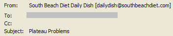
3. Subject Line—B
The subject lines (Figure 1) used by the email newsletter didn’t sound spammy, which is difficult when so much spam is focused on weight loss. The most important information was first and the subject lines changed to reflect the content of each issue.
One thing the publisher should test is making the subject lines benefit-oriented. They tend to be either (a) the name of the featured recipe (“Rigatoni with Turkey Sausage and Mozzarella” on March 12th), (b) the title of a promotional article (“Taste Victory on the South Beach Diet!” on March 13th) or (c) holiday related (“Have a Happy, Healthy St. Patrick’s Day” on March 17). What about highlighting the benefit of the recipe (“Low Cal, Low Carb, Delicious Rigatoni”) or something else that’s more about what the reader will get out of this issue?
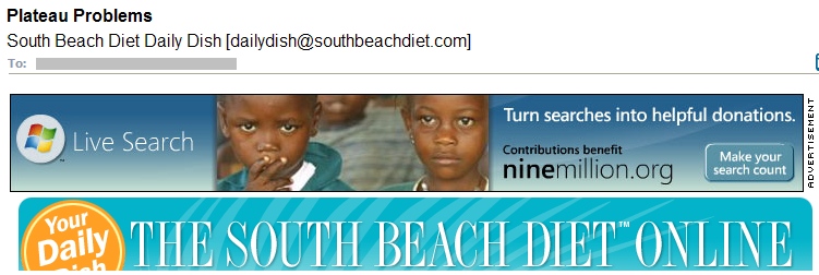
4. Preview Pane—D
The preview pane (Figure 2) contains a third-party advertisement and the newsletter masthead. Nothing more. The former does change from issue to issue, but it’s not related to the content of the issue. The latter doesn’t change – and doesn’t give the reader a clue about what’s in this particular issue that might be of interest.
The Daily Dish scored points for its recognizable logo/masthead. But it failed to provide a strong, benefit-oriented headline unique to the issue in this area. Another point of failure – if images are blocked, the preview pane is just a couple of boxes with red Xs in them, not the best way to pull readers in. Although there is a link to view an online version, it does not appear in the preview pane; it’s unlikely someone would scroll through the red Xs to get to it.
Figure 2: Preview Pane
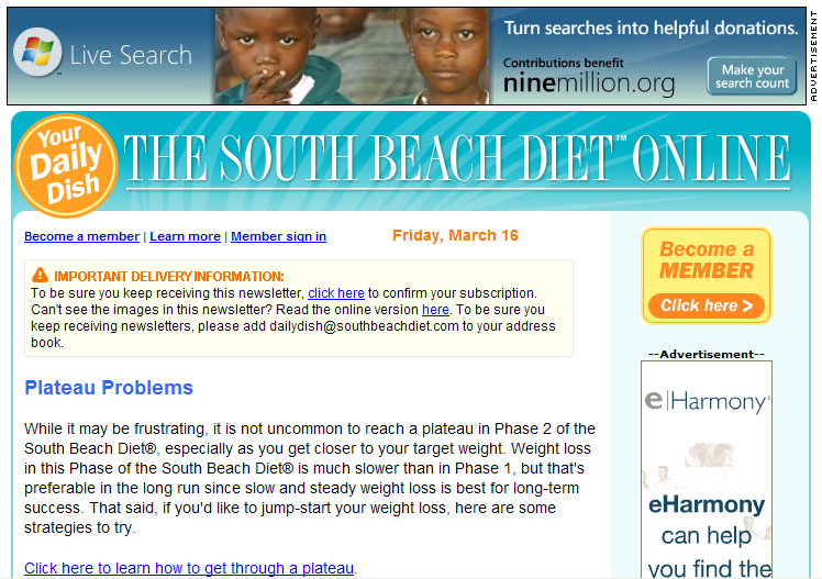
5. First Screen—F
This (Figure 3) was the weakest area of The Daily Dish. This email newsletter was lacking in every element of this section. There was no opening paragraph, the newsletter didn’t come from a person or a group, it didn’t include a table of contents (TOC) to help readers quickly find items of interest and, since there was no TOC, there were no links to help readers jump to what they wanted to read.
As I look more closely at the content of the email newsletter, I think I understand why there’s no TOC; it wouldn’t be terribly engaging to readers:
- Plateau Problems
- What Members Get
- Phase 1 Forever?
- Sign-up for the Diet Online
- Buy the Book
In this case (from the March 16 issue) everything has to do with following the diet, subscribing to the online version of the diet or buying the diet book. If you aren’t currently on the diet or planning to join today, there’s really nothing here for you.
[text_ad]
Figure 3: First Screen
6. Look and Feel—D
The newsletter follows the look and feel of its companion Website, as it should. It’s clear the two are related and there’s no disconnect when you click from one to the other. The paragraphs were short, which usually makes them easy to skim, but here they weren’t, due to the layout and use of images.
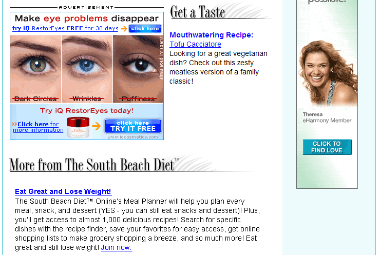
One key piece of content in most issues was a recipe – why aren’t we shown an image of the dish in the email (Figure 4)? This would be a way to pull images in to support and highlight the editorial content – although it would probably require South Beach to decrease the current space given to image ads, to avoid image overload (which we’re just about at as is).
The only images used in the email newsletter, besides the masthead, were in ads. And since many were third-party ads, they weren’t necessarily complementary to each other. They made the email appear busy; it was hard to know where to look. As a result, no credit was given for ease of skimming or use of images. Since the email wasn’t engaging to the eye and didn’t immediately draw readers in, no points were given in this area either.
7. Content and Tools of Engagement—D
The only points earned here are for length – the newsletter comes in at 2 printed pages or less for each issue, which is the perfect length to be read online. But while the content is short, it’s not really very sweet.
There are no engagement tools for readers – no polls, no surveys, no discussion board, no way to provide feedback to the editors (whoever they may be, since they aren’t identified).
Also, the editorial/promotional ratio strays very far away from the 60% editorial / 40% promotional rule I’ve found successful for email newsletters. On average, each issue consisted of only 4% editorial content; the vast majority of the information presented was promotional, coming in at 68%. Housekeeping made up 28% of the issue. Even on their best days, only 8% of the content was editorial; some days the promotional material topped 70%. In my book, this makes The Daily Dish a promotional email, not an email newsletter.
On a positive note, the editorial usually consisted of a link to a recipe. While this is useful, there isn’t enough of this type of information in the email newsletter to balance the heavy focus on advertising and advertorial (editorial which is actually an ad) content. To make matters worse, much of the advertorial/promotional content is the same from issue-to-issue, which gives the reader no reason to read it, once they’ve read it once.
8. Business Goals—C
The Daily Dish’s business goals are clear: (1) to sell the online diet, (2) to sell ancillary products related to the diet and (3) to make money from third-party advertising.
They hit you over the head with all three of these issue-after-issue, which earns them a point for multiple calls to action but no points for being “effective but not pushy.” The content is so promotional that it works against itself; a newsletter should provide value first and then have promotional messages secondary. This one is promotional first and foremost; the editorial appears to be an afterthought.
And the third party ads – yikes. There’s a huge ad above the masthead (Figure 3), in what was a popular ad space back in the mid-1990’s. Most email newsletters have moved away from this placement because it subjugates their masthead and brand; The Daily Dish should consider doing this as well.
Then there’s a tall vertical ad in the right column (Figures 3 and 4), along with a rectangular ad that cuts into the body copy from the left side of the screen, leaving just a 2-inch column between them to hold text (Figure 4). The copy here is sometimes editorial (a link to a recipe) and other times promotional. But that’s not all for ads. Either another banner like the one above the masthead (Figure 5) or a trio of third-party text ads appear above the footer. And these third-party ads are in addition to the promotions for South Beach Diet products which appear throughout. It’s a lot to squeeze into two printed pages or less.
Figure 4: Advertising
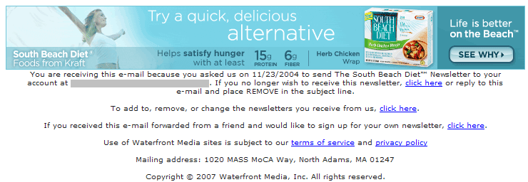
9. Footer—A
The Daily Dish earned another perfect score here (Figure 5). In addition to multiple unsubscribe options there is a link to a subscription management page where readers can unsubscribe from or opt-in to a wide variety of email newsletters. Also here – a U.S. Postal Service address (as required by CAN-SPAM) and a copyright notice, to protect the content.
Figure 5: Footer
10. Other
The Daily Dish promises daily delivery and they live up to that. The high volume of promotional content wasn’t mentioned at sign-up, and while they do deliver a link to a recipe in almost every issue, it isn’t the email newsletter that was promised at sign-up; no credit there. I was delighted to see them offer a link to subscribe for people who have “received this email forwarded from a friend,” but there was no language suggesting that readers share the email newsletter. They really should consider including this, especially since the Website sign-up is hidden, rather than front and center.
Conclusion
It’s not that The Daily Dish isn’t an effective email, it’s just that it isn’t really an email newsletter – it’s a promotional email with a link to a recipe. The average grade it received in this review is based on everything but content – which is what makes an email newsletter great. If they want to publish an email newsletter to promote the diet they should beef up editorial content and cut back on the advertising. If this is purely a promotional / third-party advertising vehicle, they should be more honest about that at sign-up (and they might consider cutting back the frequency).


Good tips.