Harvard has opted not to use a traditional landing page to sell the Harvard Health Letter.
Instead, the main sales page for the Harvard Health Letter is a minimal transaction page with the barest of copy and graphics, and is devoid of the selling effort one would normally expect when promoting a paid subscription publication online.
Knowing the smart marketers at Harvard, we have to believe that this is a deliberate choice. As we recall, they don’t use this “bare minimum” approach in print promotions: their paper direct mail that we’ve seen consists of strong, long-copy sales letters that sell the publication and its benefits, and sell it hard. Why then would they opt for this “bare bones” approach online? This review really addresses a broader, more important question: are online and offline copy fundamentally the same or fundamentally different?
- When Internet marketing was in its infancy, many so-called Web gurus pushed the belief that the primary virtue required in online copywriting was brevity: if it’s short, it’s good
- Using short copy online contrasts with the practice that direct marketers have of using long copy to sell publications
- Direct marketers embrace long copy. Not because they like it but because, through tested experience, they know it works best for certain products and offers, such as newsletters and health care, and Harvard’s product is both
- Primary analysis of the Harvard Health Letter page is that the short, minimalist presentation is inadequate to do the selling job
- The page should be tested against a standard, longer-copy landing page following direct response fundamentals and the established Mequoda principles
Introduction
In this review we will look at the main sales page for the Harvard Health Letter, which appears to be a simple transaction page.
There is also a catalog-type site that gives brief descriptions of each of Harvard’s health newsletters. You can click on any newsletter to go to a brief landing/transaction page specific to that publication.
[text_ad]
You will notice that Harvard has opted not to use a traditional landing page for the Harvard Health Letter. I define a “traditional landing page” as a sales letter adapted for online marketing and posted as a webpage or stand-alone site (microsite) for a single product, following the Mequoda guidelines for landing page construction.
Instead, they have used a minimal transaction page with the barest of copy and graphics, devoid of the selling effort one would normally expect when promoting a paid subscription publication online, especially in a product category as competitive as health care information.
Knowing the smart marketers at Harvard, we have to believe that this is a deliberate choice: they must feel that this approach is better suited to either the Web or their audience, or both.
As we recall, they don’t use this “bare minimum” approach in print promotions: their paper direct mail that we’ve seen consists of strong, long-copy sales letters that sell the publication and its benefits, and sell it hard.
Why then would they not post a version of their direct mail controls on the website and instead opt for this “bare bones” approach? Does Harvard truly believe that a consumer acts differently online than offline? Or is the current online page for Harvard Health Letter an oversight—or perhaps a placeholder—until a stronger conversion promotion can be devised?
This review of the Harvard Health Letter landing page, therefore, really addresses a broader, more fundamental question: are online and offline copy fundamentally the same or fundamentally different?
When Internet marketing was in its infancy, many so-called Web gurus—usually from the usability, content or technical side—pushed the belief that the primary virtue required in online copywriting was brevity: if it’s short, it’s good. Period.
An email, these pundits insisted, should be one or two paragraphs max. A webpage should be at most one screen—the shorter, the better.
This contrasts with the practice that direct marketers have of using long copy to sell publications, as well as a variety of other products and services ranging from software and insurance to gifts and nutritional supplements.
Direct marketers embrace long copy not because they like it (though many of us do), but because, through tested experience, we know it works best for certain products and offers. Primary among the products known to work best with long copy are both newsletters and health care, and Harvard’s product is both.
Therefore, my primary analysis of the Harvard Health Letter page is that the short, minimalist presentation is inadequate to do the selling job and should be tested against a standard, longer-copy landing page following direct response fundamentals and the established Mequoda principles. As you can see below, the Harvard landing page fulfills neither very well.
HarvardHealthLetter.com’s Landing Page Scorecard
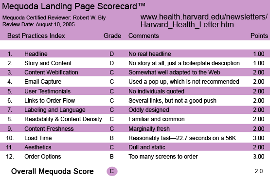
1. Headline (Strategic Intent) – D
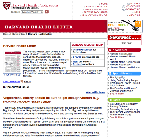
The banner at the top of the landing page lists the publisher as Harvard Health Publications, with the name Harvard Medical School directly underneath. Obviously, the trump card of this newsletter is the Harvard connection, and the Harvard crest is appropriately displayed next to the publisher’s name.
Underneath is a brief, simple transaction page, lacking any sort of a headline, save for the name of the publication.
This seems to me to be an error. A publication’s name alone seldom provokes sufficient interest or provides motivation to subscribe. Harvard could have added interest to the heading of this page with any of a number of standard headline techniques, such as putting an offer in the headline (e.g., “FREE sample issue!”) or incorporating a benefit or promise (e.g., “When doctors at Harvard Medical School get sick, this is what they do…”).
2. Story and Content – D
There is no story and content, just a one-paragraph boilerplate description of the newsletter. And this description sounds generic, and does nothing to differentiate the publication from its competitors.
A much more interesting and compelling argument could have been made along these lines: Harvard Medical School is the leading edge of medicine, and a subscription to this newsletter brings you the latest developments and breakthroughs direct from this leading edge, before your doctor even knows about them.
The copy could also be made more intriguing with bullets that tease the fascinating health breakthroughs in the pages of the newsletter. This is the prevalent technique in writing copy to sell health newsletters. Here are two examples from a recent promotion for Boardroom’s Bottom Line Health: “How to tell if your body is filled with nasty toxins. Simple test you can do at home using a glass of water” and “The finger and thumb trick that relieves headaches in 90 seconds.”
3. Content Webification – C
The content is somewhat well adapted to the Web, though not perfectly. For instance, you can click on a thumbnail cover of the newsletter to read the first page. But, at least on my PC, the enlarged version that pops up in a window is still not big enough to read easily.
The landing page has a couple of links to the order form. These consist of the words “SUBSCRIBE NOW” underlined and in all caps. These links could have been highlighted with bursts, arrows or another graphic devices to make them pop out more. The order form is clean and simple: a basic shopping cart.
4. Email Capture – C
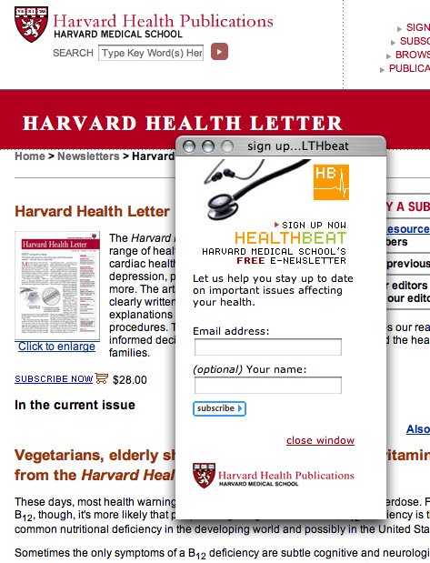
When I clicked onto the catalog page, I was immediately served a pop-up window, blocking my view of the page—not a tactic I’d recommend.
The pop-up offered a free subscription to Harvard’s e-newsletter Health Beat. Harvard is smart enough to know that you should attempt to capture the email address of every visitor to your site, and that offering a free e-newsletter is an effective way to do that.
Why work so hard to get that email address? Because if your visitor leaves without ordering, you can serve him a series of follow-up emails via autoresponder attempting to convert him to a trial subscription. And, you’ve added another valuable name to your house e-list. Without his email address, you have lost the opportunity for follow up, significantly reducing your conversion rate.
A better strategy than a pop-up, however, is to use a pop-under which appears only after you attempt to click away from the site without purchasing one of the paid subscription newsletters. But Harvard opted for the pop up instead of the less obtrusive, and annoying, pop under.
5. User Testimonials – C
I didn’t see any subscriber testimonials here. Nor does the copy say how long the newsletter has been published, how many subscribers it has or the name of the editor.
6. Links to Order Flow – C
The various links throughout the landing page encourage you to click to order. Clicking brings you to an order page.
The newsletter price is listed as $28. There are no creative tactics used to minimize price resistance. There’s no readily visible money-back guarantee. They don’t offer valuable reports as premiums; nor is there an offer of installment payments, i.e., “three easy monthly payments of $9.37 each.”
Copy doesn’t bother to state the price “creatively” to make it less daunting, such as noting that a subscription is less than eight cents a day for a full year of service. It doesn’t talk about return on investment or money savings—for instance, the fact that avoiding just one costly prescription can pay back the entire subscription fee.
Traditional health newsletter publishers like Agora and Phillips promote their publications with hard offers (payment up front); institutional health newsletter publishers like the Mayo Clinic, Cleveland Clinic and Johns Hopkins seem to use mainly soft offers (bill me). Harvard, although an institutional publisher, uses the same hard offer as Agora and other traditional publishers.
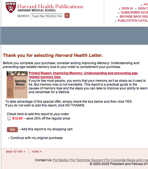
During the order process, you are asked whether you also want to purchase a special report on memory loss for an additional $12. It’s difficult enough to sell health newsletter subscriptions, why complicate it with a second step and a second product offer? Instead, Harvard should offer this or other reports on major health topics—heart health, cancer, arthritis, memory—as free bonus gifts to increase the landing page’s conversion rate.
Also, promotions selling consumer letters traditionally require a strong money-back guarantee, which should be made prominent on both the landing page and transaction page.
If there is a money-back guarantee, Harvard is keeping it quiet and well concealed—it certainly does not pop out at you on any screen. It should be highlighted in a box with a border on the landing page, and in copy on the shopping cart.
7. Labeling and Language – C
The design of the landing page is odd. The top half is weak boilerplate copy promoting the newsletter, and underneath is an excerpt of an article from the newsletter. But it doesn’t specifically say “article excerpt,” nor is it given some other meaningful label, e.g., “Health News from Harvard Medical School.”
8. Readability and Content Density – C
The typeface and layout are familiar, common, and easy to read. The page is made readable with the use of subheads, links and bullets in the right-hand column. However, those bullets are for other reports, newsletters and books, which may cause visitors to wander off to those pages and never get around to subscribing to the newsletter.
9. Content Freshness and Urgency – C
By featuring text from a recent article on the landing page, the content is kept fairly fresh and updated.
Unfortunately, the boilerplate paragraph of sales copy for the newsletter itself doesn’t convey a sense of freshness, excitement, timeliness or discovery. This could be solved either by listing the titles of recent articles, or continually updating a list of Boardroom-style bullets based on recent content.
10. Load Time – B
This is a reasonably fast-loading page. When tested using the Web Page Analyzer, the page downloaded in 22.7 seconds over a 56 Kb connection.
11. Aesthetics – C
On the plus side, this is a competently designed, short-copy landing page. The text is clean and easy to read, and presents all copy and graphic elements clearly.
On the negative side, the page is dull and static. Not much thought seems to have gone into attracting the user’s attention with graphics, color, or visuals.
12. Order Options – B
The primary order option is to click on a link and go to the order page where you can subscribe online using your credit card. The shopping cart is a sequence of screens with multiple steps, which is standard practice on sites like Amazon that sell multiple products. But it’s unnecessary when selling a single product like a newsletter.
The entire transaction for the one product could be reduced to one screen. Doing so might increase conversion rates, since experience shows a percentage of shoppers abandon the transaction each time you make them jump to a new screen to continue.
Conclusion
The lack of compelling, benefit-oriented selling copy and bold Web design on this landing page has me wondering whether Harvard has already tested this plain Jane, rather ho-hum effort against something much stronger, and found that the plainer, more conservative, laid-back promotion shown here worked best—a result that would surprise me, but is not impossible.
If they haven’t, I would urge Harvard to hire a top copywriter and Web designer (they know plenty) to create a much stronger, more engaging, longer and more detailed landing page and test against this control. We’d be more than pleased to report the results of such a test in these pages.


