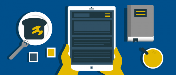
Technology lets digital magazine layout designers get back to basics when enticing readers with a vertical reflow
Isn’t it fascinating to consider how the old journalism phrase “above the fold” has evolved? Once, it literally meant “above the fold” of a traditional broadsheet newspaper. Editors, writers, and designers battled over what, and who, would win a coveted spot above that fold, where the most reader eyeballs would land.
Now, even as those broadsheets themselves are in decline, heading for dinosaur status, the phrase still lives – in tablet publishing.
[text_ad]

Of course, tablets have no fold. But they do have a single screen, and for magazines employing the Mequoda Best Practice of vertical reflow, “above the fold” – that is, the first screen – has become once again a layout consideration.
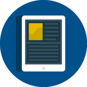
Vertical reflow, also known as vertical swipe to describe how the user accesses the content, means a layout where instead of squeezing a magazine page into the smaller tablet screen, the content is resized and reflowed on a bottomless tablet page. Users swipe up to bring up this long page as they read. The reader can swipe horizontally at any point on this page to go to the next article.
Mequoda prefers this layout because it’s reader-friendly; even young folks can have trouble reading content that’s squeezed down from magazine size to tablet size if you don’t reflow your content.
And the growing popularity of this digital magazine layout has led to new design considerations – what should you put on that first screen, above the “fold?”
[text_ad]
Designing above the fold for the iPad
 With 58% of the tablet market owning a full-sized iPad, I’m focusing today on designing for that specific device. When you employ vertical reflow, you don’t have to worry about responsive design, because the content’s already laid out to be easily viewed on that iPad screen.
And just as in the newspaper days when editors chose content to go above the fold that would keep their readers engaged and coming back every day, iPad content designers have to consider how to do the same. You don’t want your subscribers or single-issue buyers yawning and scrolling straight through your magazine.
Those readers won’t be renewing, or buying a subscription, if they’re not captivated by your content in the first few seconds on each page. And it’s certainly a waste of resources if you’re spending time and money to reflow your content without taking reader engagement into consideration.
So, how to get readers’ attention and keep it? At the moment, there are several different design options popping up out there.
1. Use a big, provocative headline
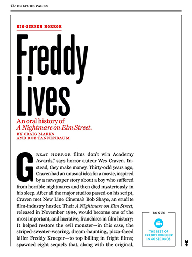
This is less common at the moment than it has been in previous years. For example, New York magazine, one of our tablet favorites, did it for almost every feature it published, back in 2013. Now it’s a bit harder to find, but apparently the designers thought that screaming “FREDDY LIVES!” as the title to an article on horror movies would be even more provocative than a graphic image from said movie.
2. Feature a compelling image.
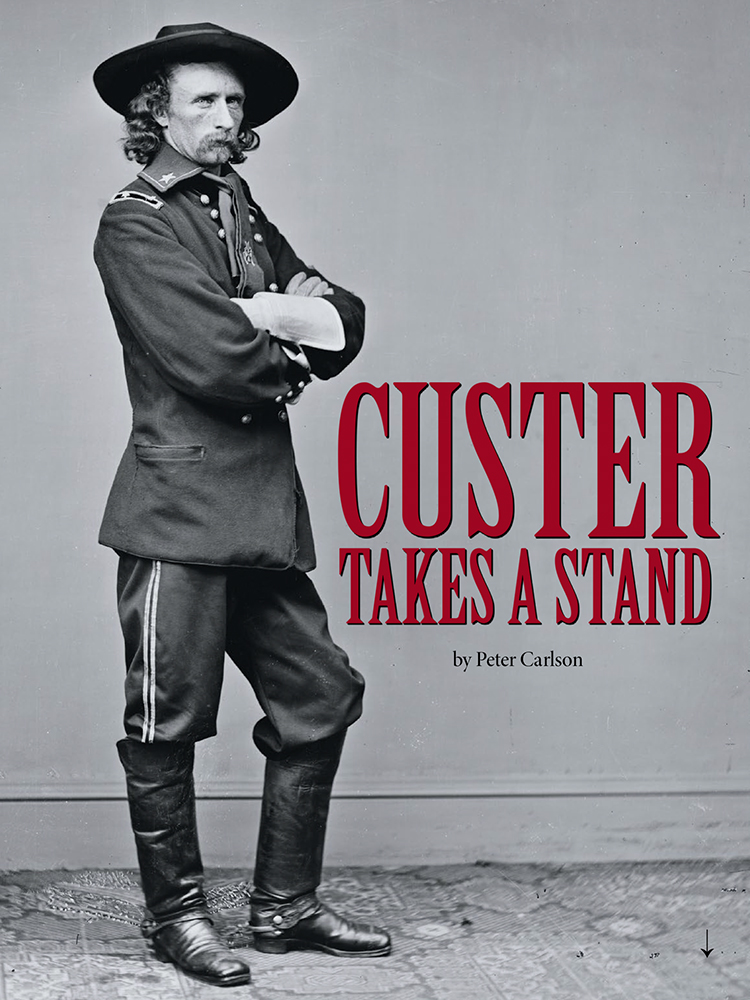
Again, fairly common. The right image can really have an impact on a reader casually scrolling through a digital magazine layout. In practice, an image completely alone looks like an ad, so all of the designs with prominent images I found have at least a small headline included to indicate that it’s editorial content. American History‘s art director knows that having someone looking directly out of the page at the reader is absolutely arresting.
(In an interesting enhancement, Popular Science lets you double-tap the screen to make the headline and any text disappear, and enjoy the lead image all by itself.)
3. Start with an engaging video.
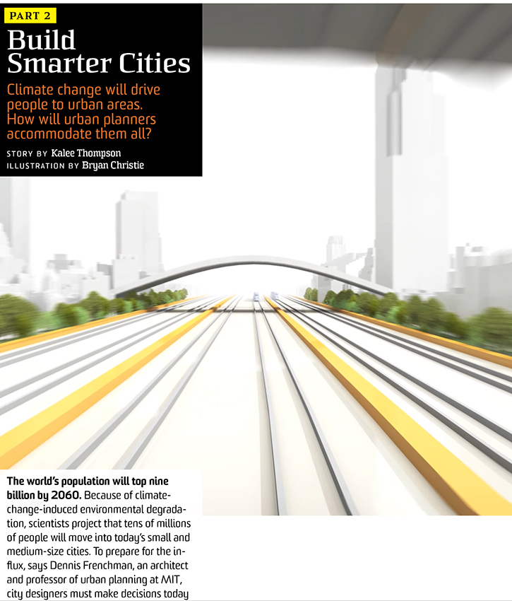
And speaking of our friends at Popular Science, here they are opening an article with a rather breathtaking view from the back of a high-speed train in an artist’s rendering video. See the motion at the top of the screen, as the train passes under a bridge?
4. Combine a compelling image with moveable text.
This is a technological offering that our partner, Mag+, was excited about long before most publishers had adopted it. Now, however, it’s becoming almost common. “Layering” allows the designer to feature a stationary image and have the corresponding text be scrollable. Mequoda client I Like Crochet offers the directions for each project as moveable text that allows the reader to keep the all-important image of the finished product in front of her all the time.

5. Combine some or all of these techniques.
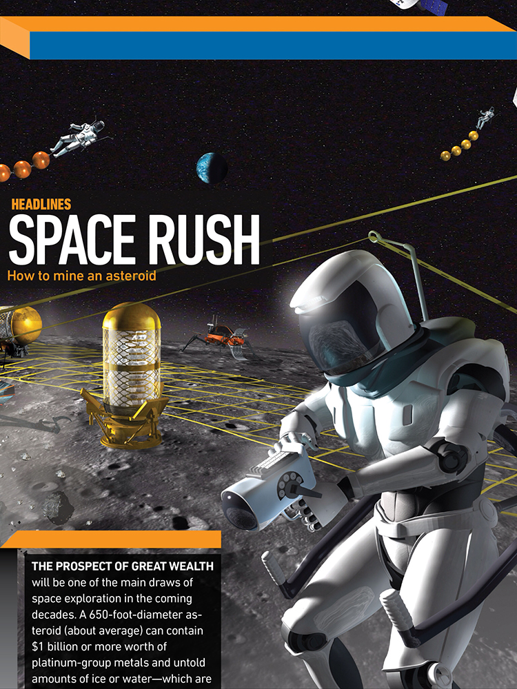
Here Popular Science combines a compelling image, startling headline (How to mine an asteroid!!!) and scrollable text. (We shouldn’t have to refer to PopSci so often in a post like this, but they are pioneering many of the emerging best practices in the tablet app magazine space.)
Of course, designers being designers, we may soon see other “above the fold” offerings that haven’t yet been thought of. That’s the beautiful thing about tablet app magazine publishing! Have I missed any prominent layout strategies for “above the fold?” Share in the comments!
This post was originally published in 2013 and is updated frequently.


