Computerworld.com has overcome the hurdle of letting their print roots go
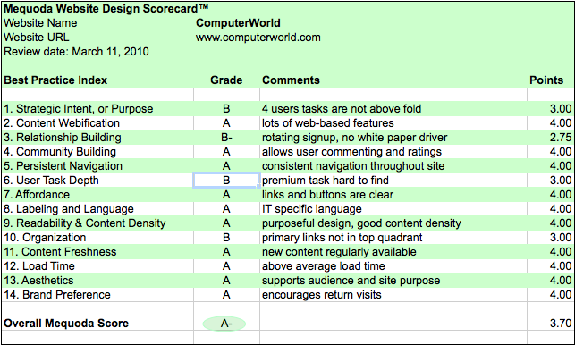
The Mequoda Website Design Scorecard has been used to critique hundreds of websites over the last five years, 76 of which we’ve documented. We decided recently to dust off the ol’ scorecard and use it to reevaluate Computerworld.com, a site we originally gave an overall score of a B in May of 2005.
Nearly 5 years later, how has their site improved? According to our review, this B2B site catering to IT professionals has changed significantly, earning a score today of A-.

Computerworld Website Design Scorecard
Computerworld.com’s Mequoda Scorecard
[text_ad]
1. Strategic Intent – B
Computerworld, (CW) is one of the oldest and most respected publications from IDG, with a target audience of Senior IT management at mid-to-large size companies.
What is the strategic goal of a free content B2B website such as Computerworld? There are several answers, here are just a few:
- Content. Readers expect the same content online as off, and to find everything on a given subject, quickly and easily. They want consistency with the brand they have known to rely on. If you fail in any of these areas you’re going to lose brand loyalty.
- Conversions/Data Acquisition. Advertising rates are not just a simple volume calculation, they depend on the quality of the publication’s readership. The more information the publisher has, the better they can maximize their pricing strategy. The more users who subscribe to Computerworld newsletters, the more attractive they are to potential advertisers.
- Advertising Inventory. Deeper content and wider distribution means more readers and more inventory. Advertisements are key to bringing in revenue.
- Premium Content. Content that is offered on a subscription basis.
Computerworld manages all the above goals pretty well except for the last one, Premium Content. The strategy toward print subscriptions has changed as expected yet it’s still on the site in an almost hidden place. The goal here is not clear and cannot be achieved because of its lack of clarity.
We would have expected to see Floaters and OFIE’s consistently marketing toward an unknown user. A rotating Ad for newsletter signup appears periodically above the nameplate but should be consistently displayed.
Furthermore, additional conversion architecture is needed above the fold. This includes:

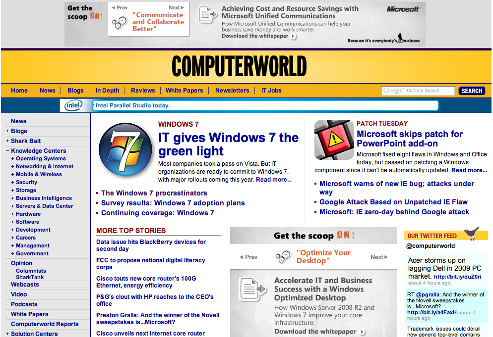
ComputerWorld Homepage
2. Content Webification – A
Since our last review of Computerworld, the website has clearly moved beyond its old print media roots and embraced webification. Here’s the quick list of the web tools available.
- Podcast. Free bimonthly podcasts
- IT Job. A job search site that allows searching by title, skills, location, and company
- Search. This can be done in multiple ways: Topic or Sponsor or Industry
- Webcasts. Upcoming and on-demand are viewable by registering on the site
In general, webification of the site is in-line with established standards. There’s nothing risky here, but they do display a good solid implementation of expected web features.
3. Relationship Building – C
Here is an area that could use some improvement. The main goals of the site should be a conversion to signup and an increase in email newsletter registrations. The site lacks in offering free products while soliciting signups. On the positive side, selectivity is offered on multiple newsletters types.
4. Community Building – A
Blogs and Shark Bait. Shark Bait is the place to post your experiences about all things IT. It uses cutesy Sharks symbols to rate others’ experiences, and really promotes the interactive user experience.
Recent comments are prominently displayed in the right navigation to entice the reader to follow the happenings of the site.
Article pages show the number of comments and ratings on posts to help users while browsing and searching articles.
Blogs support feeds to follow favorite bloggers.
These sections are well designed so it’s easy to give them an A.
5. Persistent Navigation – A
The main navigation stays consistent throughout the site and the left navigation stays consistent across pages as well. There do not appear to be any issues here. This navigation allows for easy expansion to view topics, subtopics and industries.
6. Task Depth -B
Our tasks to undertake were to:
- Browse Headline. The homepage is chock full of easy to read clickable headlines.
- Search for a specific keyword. Google custom search is used throughout the site.
-

ComputerWorld Newsletter signup
Signup. The newsletter signup is found below the left hand navigation. It needs to be moved up higher on page. Once it’s found, the user’s experience is adequate with only a few required fields to gather necessary data for advertisers.
- Subscribe. So where is the premium content? Oh, there it is at the end of a long list in the left navigation “Print Subscriptions”. Are they trying to hide it? Maybe since they are moving to a digital format, the prominence of the print newsletter link is less important, but it’s unclear.
Because of the confusion on the premium task (subscribe to magazine), they can only be given a “B” on task depth.
7. Affordance – A
The content navigation used underlined titles and bulleted items, which are good standards. Additional navigation was also clear. The grade is easily an “A” here.
8. Labeling and Language – A
There is some use of labels specific to Computerworld, such as “Tricks of the Trade” or “SharkBait,” which build the brand to keep the reader returning. The IT audience uses a large volume of specific labels for their constantly changing industry. These are represented on the site, which is audience appropriate. The audience will appreciate a publication that speaks their language.
9. Readability (Content Density) – A
The column width changes as your eyes move down the page due to a centered ad block. This is not recommended but it works for this ad driven site. Hopefully they have tested this and know it works.
The only other drawback is that the font is small and they don’t seem to have a text resizing option. Fixing this would appeal to the aging IT population since this publication has been around for 40 years and the audience is not all youngsters.
10. Organization – B
The upper quadrant of the website should have all four primary tasks. These need to draw attention to the “Subscribe” or “Print Subscriptions” sections. The premium content section is in transition but that’s not reason to delegate it to the bottom of the navigation list. They should remove it or make the intent more clear.
Another area that lost them points is the “Free signup”. A better use of this section would include an upsell.
11. Content Freshness – A
Knowing what’s going on as soon as it happens is important to industry execs. Updating the latest headlines several times a day, five days a week is essential, and for doing this Computerworld gets an A.
12. Load Time – A
Testing on a variety of analyzers shows the site’s load time to be between 1 and 1.5 seconds. No complaints with those statistics here.
Additionally, there is not an overuse of graphics or flash weighing down the site.
13. Aesthetics – A
Computerworld gets an A. It matches the audience perfectly.
This site is clean, clear and professional. It makes a good use of the colors gold and navy. The newsletters however might use some redesign. I assume the purpose of all text is to display on mobile devices, but the content is just a long text list.
14. Brand Preference – A
The site supports the print brand well. There is extensive editorial content available, and the strategic tasks we listed in the first section are attended to.
Conclusion
Computerworld has done an excellent job of improving the site since our last review. They address areas such as Navigation, Content Density, Relationship Building and Organization. However they lose key points on Task Depth for premium content as their print subscription link just causes confusion. It seems like an afterthought to them and if that is no longer their direction they should remove it.
Overall, a 3.7 score leaves them some room for improvement but overall, they are doing a great job.


Attractive section of content. I just stumbled upon your website and in accession capital to assert that I get actually enjoyed account your blog posts.
Anyway I will be subscribing to your augment and even I achievement you access consistently fast.