Seth Godin, Father of Permission Marketing and Internet Pioneer, Delivers a Dysfunctional Website
Why is it that some of the best, most commonsensical and trusted marketers don’t practice what they preach? Or put more politely, why do they sometimes act counter-intuitively to what are generally agreed to be “best marketing practices”? Why don’t they walk their talk? Why are they so incongruent?
I loved Seth Godin’s book, All Marketers are Liars, The Power of Telling Authentic Stories in a Low-Trust World. Loved it, I repeat! In it he lays out a simple premise: “Successful marketers don’t tell the truth. They don’t talk about features or even benefits. Instead, they tell a story. A story we want to believe.” Of course, that’s what great marketers do! The power of storytelling is as ancient as the heavens. If cave men were developed sufficiently to communicate with each other, you can bet they told stories around the campfire (after they discovered fire). Storytelling is the basis for all of our modern culture—books, TV, ballads, movies, religion, politics, etc.
“Marketers succeed when they tell us a story that fits our worldview, a story that we intuitively embrace and then share with our friends,” says Mr. Godin. Right on! We’ve even embraced “telling a story” as a major component of a successful Mequoda Sales Letter Landing Page.
- There appear to be several intents here, although not necessarily what I would call strategic.
- It’s ironic that the father of permission marketing has asked for permission to send me email, but has made it very difficult to find his offer.
- I really like the wide-open layout and typography of this simple, elegant website. If only it performed as nicely as it looks!
- The website design is clean, crisp and very attractive, but as we learned in Design 101, form follows function, and this site is seriously dysfunctional.
- I can only hope that on a return visit to SethGodin.com, I’ll discover a greater congruency between Seth Godin, the marketing genius, and his online marketing practices.
Introduction
And what about Permission Marketing: Turning Strangers into Friends and Friends into Customers, Mr. Godin’s tome in which he argues “businesses can no longer rely solely on traditional forms of interruption advertising? … that if you want to grab someone’s attention, you first need to get his or her permission with some kind of bait—a free sample, a big discount, a contest, an 800 number or even just an opinion survey?
Right on, brother! That’s the Mequoda System website practice of relationship building.
And then there are Mr. Godin’s five other books of equal stature:
- Free Prize Inside describes how every single person in your organization is in the marketing department… and shows you how to make something happen.
- Purple Cow was a The New York Times and The Wall Street Journal bestseller. It’s all about how companies can transform themselves by becoming remarkable.
- Survival Is Not Enough redefines what change means to anyone who works for a living. Tom Peters called it a “landmark.”
- Unleashing the Ideavirus is the most popular eBook ever written. More than one million people downloaded the digital version of this book about how ideas spread.
- The Big Red Fez, Mr. Godin’s take on Web design, was the #1 eBook (worldwide) on Amazon.com for almost a year before it was published in paperback.
Mr. Godin is no Internet-marketer-come-lately like so many other online gurus. He credentials are solid. He was CEO of Yoyodyne, a leading interactive direct marketing company, which Yahoo! acquired in 1998. Plus, he holds an MBA from Stanford, and was called “the Ultimate Entrepreneur for the Information Age” by Business Week magazine.
Best of all, Mr. Godin seems to have mastered the secret of taking what he says and does seriously, without succumbing to the trap of taking himself seriously. He’s got a great sense of whimsy and humor that come across in his writing and is charmingly reflected in the graphics of his books’ covers and the design of his website.
So here’s my problem. If I admire him so much, why is it that Mr. Godin’s website disappoints me so deeply? Why don’t we find him exemplifying all the best practices of online marketing that I want to believe he knows and espouses?
Let’s look at Mr. Godin’s website against the the 14 Mequoda Website Design Guidelines and see how it measures up.
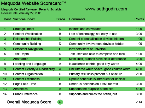
SethGodin.com’s Mequoda Scorecard
[text_ad]
1. Strategic Intent – D
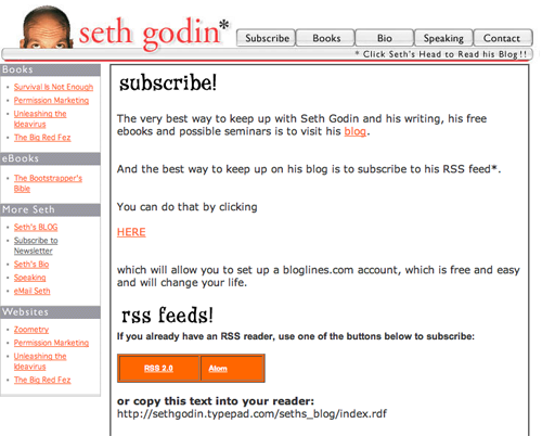
Well, there appear to be several intents here, although not necessarily what I would call strategic. The first is to induce you to leave SethGodin.com for another website, Seth Godin – Liar’s Blog, in order to get a sneak peek at All Marketers are Liars on the Liar’s Blog. That site is a painfully long download (445.11 seconds—more than seven minutes!—at 56K), and it still doesn’t enable you to see excerpts from the book. That requires yet another click to a one-page PDF (Portable Document Format) file, which is a simple review of the book itself.
The second intent of the SethGodin.com homepage is to get you to sign up for Mr. Godin’s email updates and blog alerts. But this, too, is a four-click procedure that takes you off SethGodin.com and onto a third-party site, Bloglines, a free online service for searching, subscribing, creating and sharing news feeds and blogs.
The whole process is indirect and convoluted, with plenty of opportunities for the user to quit and click away in frustration.
2. Content Webification – B
OK, so with enough persistence you can signup for Mr. Godin’s on-again, off-again email newsletter. If you’re technical (a word that has recently gained popularity as an adverb), you can subscribe to Mr. Godin’s RSS (Really Simple Syndication) feeds.
If you don’t know how to install an RSS feed, there are no instructions provided. However, you’re offered a hypertext link to an article on RSS at the Wikipedia, for all that’s worth.
3. Relationship Building (Personalization) – D
I want to be good buddies with Mr. Godin, even if it’s only online. But when I finally get an invitation to read his blog—in exchange for giving up my email address—I get caught up in another quagmire. This time it’s trying to confirm my email address and password with Bloglines—yet another broken process.
Meanwhile, Mr. Godin hasn’t sent me an email or any kind of a welcome to his mailing list.
Eventually, well into my second hour of exploring his site and writing this review, I found another link (not on the homepage) that offers four free chapters of Permission Marketing in exchange for my email address. Guess what? They never arrived via email, as promised.
Ironic, isn’t it? The father of permission marketing has asked for permission to send me email, but has made it very difficult to find his offer. When I do find his offer, and respond, a broken process results and I don’t receive the free information that was promised.
4. Community Building – D
OK, so now I’m subscribed to the Godin blog. But participating is not encouraged. Some subscribers are asking Mr. Godin questions, via email, and he is responding online, both on his blog and on his website. But there is no give and take. I can’t post to his site. I feel unwelcome and disenfranchised. Some community!
5. Persistent Navigation – F
Would you believe it? Once you click off the homepage at SethGodin.com, there is no way to get back, save for the back button on your browser. There are no links to the homepage on any of the site’s other pages! Urrrgh!
6. User Task Depth – D
OK, so I signed up for the blog—eventually—but it wasn’t fun and if I weren’t reviewing this site, I would have quit a long time ago. Yeah, I’m getting grumpy. Can you imagine why?
7. Affordance – B
I resent having to scroll all over a page looking for the mouse pointer to change from an “arrow” to a “hand” indicating a clickable link. Making all your text links underscored (underlined) should be standard operating procedure. Here, sadly, it’s not.
And then there’s the note on the homepage that explains, “Click Seth’s Head to Read his Blog!!”
Give me a break! Roxanne O’Connell (Mequoda godmother of affordance) take note: The inmates have taken over the asylum.

8. Labeling and Language – A
Provided you know what a blog is, you won’t have any trouble figuring out the words used on this site.
9. Readability (Content Density) – A
I really like the wide-open layout and typography of this simple, elegant website. If only it performed as nicely as it looks!
10. Organization (Marketing Quadrants) – C
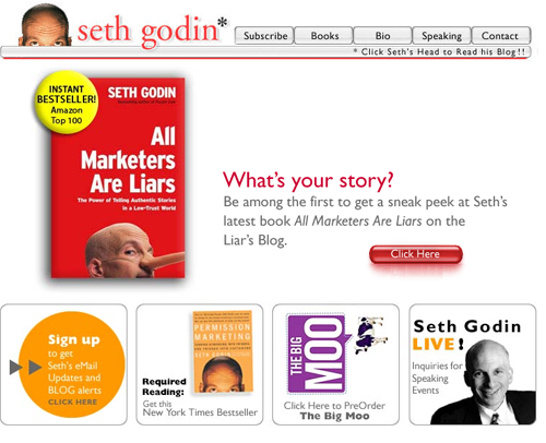
How hard would it be to put a sign-up box for the Godin newsletter right on the homepage, in the top left quadrant? See #1, Strategic Intent.
11. Content Freshness – F
I suppose the blog entries are fairly regular, but they’re not really on this site. SethGodin.com takes you to sethgodin.typepad.com to read them. That’s not a great idea, especially since there’s no easy way to return to SethGodin.com, except via your browser’s back button.
12. Load Time – B
Seth Godin: Author, Agent of Change downloads in 17.45 seconds at 56K according to the Website optimization tool.
13. Aesthetics – A
The site is clean, crisp and very attractive, as are the graphics/covers of Mr. Godin’s books. But as we learned in Design 101, form follows function, and this site is seriously dysfunctional.
14. Brand Preference – B
Mr. Godin is his own brand, which he would readily admit. His site supports that brand, but as detailed above, it needs a serious overhaul from a functional perspective.
Conclusion
Despite my quarrels with Mr. Godin’s website, I truly admire him, his style and the content of his books. I can only hope that some day in the future, on a return visit to SethGodin.com, I’ll discover a greater congruency between Seth Godin, the marketing genius, and his online marketing practices.


Comments are closed.