Customer-friendly separation between paid and free content encourages more random visitors to become paid subscribers
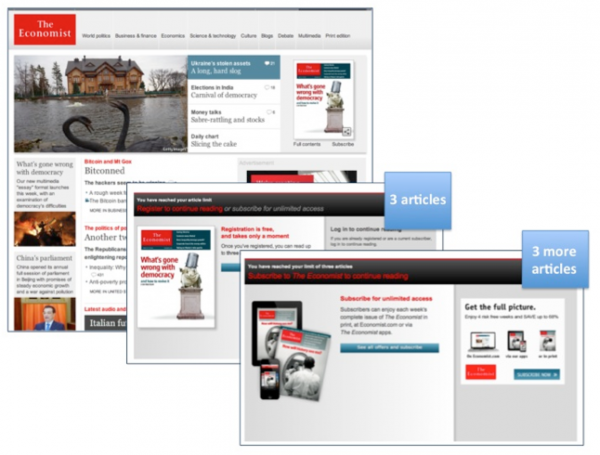
One of the most successful subscription websites in the world is The Economist, where the venerable news publication posts dozens of news articles every day, unique visitors from the US alone average 3 million per month, and its Online Media Index (OMI) is a healthy 3.61, meaning it has more than three times as many website visitors as it has US circulation.
The Economist’s website exists to engage visitors daily and to promote its products. If you’ve read our posts one or two times, you probably know we believe The Economist is one of the top operators in multiplatform publishing.
The one thing that gives us pause, however, is how The Economist blurs the lines between paid and free content. In this way, it’s a hybrid between a portal subscription website, like Forbes.com, where all content is free, and a periodical site, such as WSJ.com, where users must buy a subscription to access the content.
All content at The Economist is, in a way, both free and paid. It’s not specific content that’s set aside as premium; it’s simply anything after three articles a visitor reads per week. At that point, the reader is then treated to a registration wall that offers access to three more articles per week if you register with your email address. After those three additional articles, The Economist turns into a periodical site, serving up a paywall for subscriptions in order to read all the content.
Mequoda has built more than 50 systems, and our best practice is to never, ever mix free and premium content. For one thing, it muddies your revenue streams. But there are even more compelling reasons. Mequoda Chief Technology Officer and Lead Architect Aimee Graeber is one of the best in the industry at building these sites, and she knows that mixing free and premium content confuses your users.
[text_ad]
Some users may think they already “subscribe” when they’re simply “registered,” and may take out their frustration by simply walking away when confronted with a paywall.
And if there’s any text explaining the three-article limit on the Economist website, it’s not readily evident, making the sudden appearance of the registration wall an uncomfortable surprise, putting on the brakes just when you’re starting to enjoy the content.
If you’re truly engaged, maybe you’ll overcome your annoyance and register. Read that registration notice carefully, though, because then you’ll learn you’ll only get three more articles before being required to pay for the content. Are you a happy camper after all this? Do you feel inclined to get out your credit card after all these interruptions? Probably not.
As Graeber notes, this may make sense to The Economist, but it won’t make sense to users. Good website architecture design is all about what users, not management, want, need and expect. Remember that The Economist boasts three times as many unique visitors as paid subscribers; that could be just as much a function of driving users away without gaining them as subscribers as it could be a function of driving traffic steadily.
In fact, The Economist’s North American circulation has started sagging after experiencing a surge between 2010, at 822,695, and 2012, at 847,313. Halfway through 2013 it sank to 833,104, and actually dropped below its 2010 number to 816,665 by Dec. 31, 2013.
We believe this is an uncharacteristic misstep for The Economist. But it may be that they’re phasing out this confusing practice. Until very recently, visitors could get six articles per week before being required to register for free content, and six more before being required to subscribe to paid content. Cutting that access in half is an interesting development and one on which we will follow up.
How it’s done
The latest example of a Mequoda-compliant site that Graeber and her team have built is the Remonsy ETF Network site, an investing advice site focused on exchange traded funds, founded by Tom Vaughan, a longtime, highly successful stock advisor and investor in his own right.
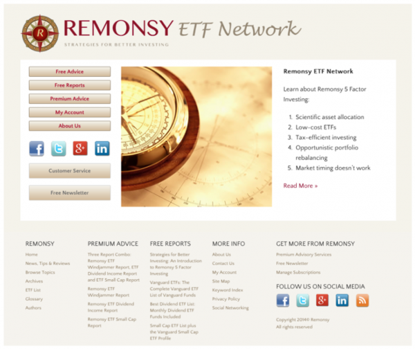

The network home page makes it crystal clear that there are free advice, free reports and premium advice. Period. Thus this network home page offers users a well-defined guide to what is free and what is paid content inside the network.
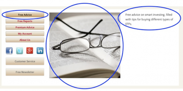
What’s more, to make things even more explicit, the second your cursor touches any of these buttons, the image changes – an instant visual clue that something has happened – and the message in the white field to the right changes to further explain the purpose of each.
The “Free Advice” page is the actual portal homepage. And the tabs across the navigation bar here also serve as guidance on what’s free and what’s not: Free Advice, Free Reports, Premium Advice.

You could certainly call your free content something like “Email newsletters,” but you’ll confuse users who think email newsletters are premium products. Graeber says that while Mequoda has always stressed clarity in architecture and naming, over the years adding the word “free” to content that is genuinely free has dramatically increased tab clicks.
[text_ad]
You can see this in practice on other new Mequoda portal sites such as Psychotherapy Networker – “Free Reports, “Magazine,” “Webcasts” and the like – and Nutrition Action – “Free Health Advice,” “Store,” and “Nutrition Action Healthletter.”
Words such as “magazine,” “newsletter” and “webcasts” imply a paid product, and “store” states it outright.

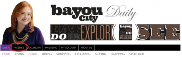
And for a lighthearted B2C approach, consider Bayou City’s word, “Freebies.”
Unlike the Economist site, there’s no need for a paywall, because free and paid content are so clearly separated.
Remember, a portal is intended solely to build an audience for your publication. They are specifically designed for SEO, email marketing, list building, and lead generation.
State-of-the-art portal subscription websites like Remonsy offer users free email newsletters, blogs, email alerts and RSS feeds that are all designed to directly and indirectly generate more page views and website revenue.
Here’s how a portal like Remonsy compares to the other eight subscription website archetypes, and how it meets the criteria we’ve documented for portals:
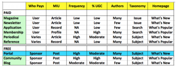
Who pays: As with the community and blog free archetypes, sponsors pay for all content on portals, which is free to registered users. At Remonsy, all content on the portal is free, and Remonsy is its own sponsor.
MIU: Portals, blogs and community archetypes all have posts as their minimum information units. On portals, the posts are from various authors associated with the publisher, or with syndicated content providers, while community posts are made by registered users, and Remonsy posts are made by one or several writers. This is precisely how Remonsy is set up, with Vaughan as the sole writer and comments invited from users.
Frequency: Content on a portal is updated constantly, as it is on a community site and also on periodical websites, such as WSJ.com, a periodical benchmark site. The blog free archetype has content that is updated at least daily, but not much more. Vaughan posts two or three “quick tips” daily, and several feature posts as well. This content is optimized to drive organic traffic.
User-Generated Content: A portal will have some user-generated content, such as Yahoo’s Group and Answers content, but mostly the content comes from the publisher or syndicated sources. This is similar to a blog. Almost all community content is user-generated. At this time, the only user-generated content at the Remonsy portal comments on blog posts.
Authors: There are many authors at a portal, including the publisher’s own staff and contributing sources – remember that Forbes.com says it has more than 1,000 authors! This is the same at magazine, membership, periodical, reference and community archetypes, where either users (community) or a large editorial staff (the premium sites just listed) deliver the content. Remonsy, as a brand-new operation, has just one author for now.
Taxonomy: Like its fellow free archetypes, and like a periodical or reference site, the portal is organized by subject, such as Forbes.com’s Business, Investing, Tech and Leadership categories. Remonsy offers Strategies for Better Investing, Vanguard ETF Funds, Dividend ETF Funds, and Small Cap ETF Funds. New categories are planned down the road.
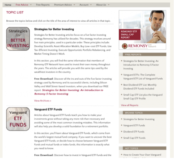
Homepage: With frequently updated news content, a portal’s homepage focuses on what’s new, as does a blog. Because Remonsy is a network, the homepage at remonsy.com serves merely as a guidepost. The “Free Advice” page at remonsy.com/daily-posts/ is the portal homepage, and the daily posts here mean the page is indeed organized by what’s new, with the most recent posts at the top.
Information architecture is one of the most complex subjects a publisher can wrestle with, which is why an expert like Graeber is a critical part of the team. Do you have any burning questions about portal architecture that clearly separates free from paid content? Do you find any advantages to a site like The Economist where the line is blurred?


